

The State of CSS survey has concluded for the year 2022; this year, it had a little over 14,300 respondents. Among the categories surveyed are features, frameworks, resources (including blogs), and a dedicated section for CSS-in-JS specifically.
So, much like I have done with my Front-end frameworks and Node.js frameworks resources, I am going to take this opportunity to dig a little deeper into one section specifically: CSS-in-JS.
Using the data from the survey ensures that I can actually use the phrase most popular because it is factually true. Below is a table that takes the Usage rank part of the survey. I’ve included the usage popularity for the last 3 years, and if you’d like to view an image – you can click here.
| Library & Usage Rank | 2020 | 2021 | 2022 |
|---|---|---|---|
| Styled Components | 1 | 1 | 1 |
| CSS Modules | 2 | 2 | 2 |
| Styled JSX | 3 | 3 | 3 |
| Emotion | 4 | 4 | 4 |
| JSS | 5 | 5 | 5 |
| Styled System | 6 | 6 | 6 |
| Stitches | 8 | 8 | 7 |
| Windi CSS | 9 | 8 | |
| Theme UI | 7 | 9 | |
| vanilla-extract | 12 | 10 | |
| Linaria | 7 | 11 | 11 |
| Twin | 10 | 12 | |
| Fela | 9 | 13 | 13 |
| Astroturf | 10 | 14 | 14 |
And now for the best part. Each library has a description, some of its unique features, and links to homepage, documentation, and the GitHub page.
#1 – Styled Components
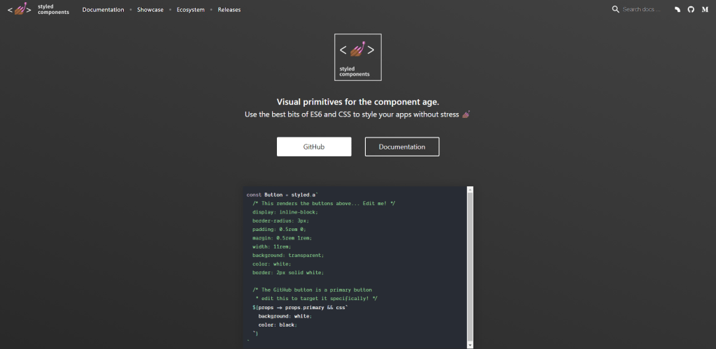
Styled Components makes it easy to create and manage styles for your web applications. It allows you to write styles in JavaScript, which can be more modular, reusable, and integrated with the rest of your application logic.
In addition, Styled Components allows you to use JavaScript expressions to create dynamic styles. This can be useful for situations where you want to style elements based on certain conditions, such as the width of the screen or the current user’s preferences. You can also use props (short for properties) to pass information from your components to your styles.
example
import styled from 'styled-components';

const Button = styled.button`
  background-color: ${props => props.primary ? '#333' : '#fafafa'};
  color: ${props => props.primary ? '#fafafa' : '#333'};
  border: 1px solid #ccc;
  padding: 0.5rem 1rem;
  font-size: 1rem;
  cursor: pointer;

  &:hover {
    background-color: ${props => props.primary ? '#222' : '#eee'};
  }
`;
Here are some of the library’s key features:
- A declarative syntax that makes your styles more readable and maintainable
- Support for dynamic styles through JavaScript expressions
- Ability to use props to pass information from your components to your styles
- Strong community support and a growing ecosystem of plugins and integrations.
#2 – CSS Modules
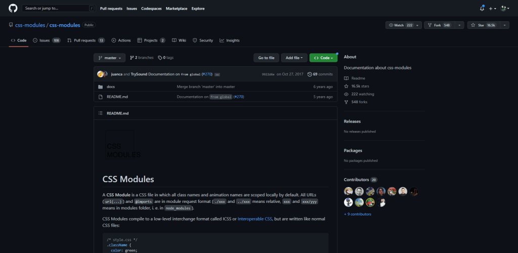
CSS Modules lets you write your styles in regular CSS files, and then import those styles into your JavaScript components. This can help you avoid some of the pitfalls of writing global styles, such as conflicts and unintended side effects, while still enjoying the benefits of using CSS.
One of the key features of CSS Modules is that it automatically generates unique class names for your styles. This means that you can write your styles just like you would in a regular CSS file, using familiar selectors and rules.
example
import React from 'react';
import styles from './button.module.css';

const Button = ({ primary, children }) => (
  <button
    className={primary ? styles.primary : styles.secondary}
  >
    {children}
  </button>
);
But when you import the styles into your JavaScript components, CSS Modules will automatically rename the class names to ensure that they don’t clash with other styles in your application.
This can help you avoid naming collisions and other common problems that can arise when working with global styles.
#3 – Styled JSX
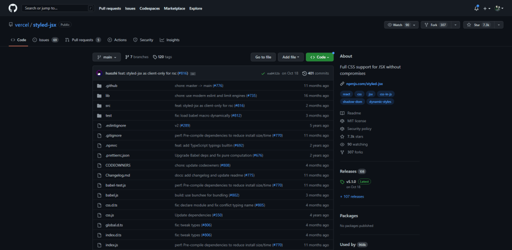
Styled JSX is a library that allows you to write CSS styles that are scoped to a specific component. Instead of placing your CSS in a separate file, you can write it directly inside your component files, giving you more flexibility and control over how your styles are applied.
One of the main advantages of using Styled JSX is that it allows you to write your styles in a way that is more closely aligned with the structure of your components. This can make understanding and maintaining your styles easier, especially in large projects with many components.
Styled JSX also makes it easy to style your components based on props or state dynamically. This can be useful for creating reusable components that can be customized to fit different scenarios.
example
function Button({ children }) {
  return (
    <button>
      <style jsx>{`
        button {
          background-color: blue;
          color: white;
          font-size: 16px;
          padding: 8px;
          border-radius: 4px;
        }

        button:hover {
          background-color: darkblue;
        }
      `}</style>
      {children}
    </button>
  );
}
Here are some of the key features of Styled JSX:
- Write styles directly in your JavaScript code
- Use the full power of JavaScript to create your styles
- Easy-to-read and understand syntax
- No need for separate CSS files
- Highly modular and reusable code.
#4 – Emotion
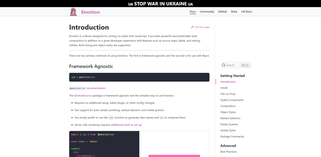
Emotion is a library that allows you to write styles in JavaScript. This is useful because it allows you to keep all of your styles together with your components rather than in a separate CSS file.
The library also provides numerous integrations, with Styled Components, for example. And has custom packages for Babel, ESLint, Jest, and others.
example
/** @jsx jsx */
import { jsx, css, Global, ClassNames } from '@emotion/react'

render(
  <div css={{ color: 'purple' }}>
    <div
      css={css`
        color: orange;
      `}
    />
    <Global
      styles={{
        body: {
          margin: 0,
          padding: 0
        }
      }}
    />
    <ClassNames>
      {({ css, cx }) => (
        <div
          className={cx(
            'some-class',
            css`
              color: red;
            `
          )}
        />
      )}
    </ClassNames>
  </div>
)
Here are some of the key features of Emotion:
- It automatically scopes your styles to avoid conflicts with other styles on the page.
- It uses a powerful template literal syntax that allows you to write CSS styles using the familiar CSS syntax, but with the added benefits of JavaScript.
- It allows you to use JavaScript expressions to define styles, which makes it easy to create dynamic styles based on props or state.
#5 – JSS
JSS supports all existing CSS features and generates unique class names by default to avoid global style conflicts. JSS also allows for code reuse, dynamic styles, user-controlled animations, and critical CSS extraction.
It has a plugin-based architecture, allowing for custom plugins and expressive syntax. JSS also integrates well with React, providing features such as dynamic theming and lazy evaluation. Overall, JSS provides a powerful and efficient way to use CSS in React applications.
example
import { createUseStyles } from 'react-jss';

const useStyles = createUseStyles({
  button: {
    backgroundColor: 'blue',
    color: 'white',
    fontSize: 16,
    padding: '8px',
    borderRadius: 4,
    '&:hover': {
      backgroundColor: 'darkblue'
    }
  }
});

function Button({ children }) {
  const classes = useStyles();
  return <button className={classes.button}>{children}</button>;
}
With JSS, you can write styles in a way that is familiar, easy to understand, and easy to maintain.
#6 – Styled System
Styled System is a library that helps you style your React components using a declarative approach, which means that you can specify what you want your components to look like, and Styled System will take care of the rest.
One of the best things about Styled System is that it’s built on top of popular CSS-in-JS libraries like Emotion and Styled Components. This means that it’s compatible with a wide range of existing tools and libraries, and you can use it in conjunction with either of the libraries to get the best of both worlds.
example
import { css } from 'styled-system'

const Box = styled.div`
  ${css({
    display: 'flex',
    alignItems: 'center',
    justifyContent: 'center',
    p: 2,
    m: 1,
    fontSize: 1,
  })}
`
Some of the key features of Styled System include:
- A simple and intuitive API that allows you to quickly and easily define your styles
- Built-in support for a wide range of style properties, including size, color, and spacing
- The ability to create responsive designs that adapt to different screen sizes (Grid and Flexbox packages)
- A robust ecosystem of plugins and utilities that make it easy to extend and customize your styles
#7 – Stitches
Stitches is a modern, lightweight library that helps you write modular, maintainable styles for your web applications.
One of the key features of Stitches is its ability to automatically generate unique, human-readable class names, which makes your styles more readable and easier to debug. This also helps avoid naming conflicts and makes your code more scalable.
example
import { createStitches } from 'stitches';

const stitches = createStitches({
  // options here
});

const useStyles = stitches.createStyles({
  button: {
    color: '#fff',
    backgroundColor: '#000',
    fontSize: '16px',

    ':hover': {
      backgroundColor: '#333',
    },

    '@media (min-width: 640px)': {
      fontSize: '18px',
    },
  },
});
Some other notable features of Stitches include:
- Built-in support for CSS variables, animations, and media queries
- Easy integration with popular frameworks like React, Vue, and Angular
- Small footprint and fast performance
- Extensive documentation and community support.
#8 – Windi CSS
The creator of Windi CSS (voorjar) made the library because he was using Tailwind CSS and noticed that the compilation speed became slow when his project became larger. So, he decided to make Windi CSS as a solution to this problem.
Unlike Tailwind CSS, which provides a large toolkit of utilities for developers to choose from, Windi CSS dynamically generates CSS based on the input provided by the developer.
example
<!-- All utilities of Tailwind CSS are supported in Windi CSS without any extra configuration.

You can use utility classes in your components and stylesheets as usual: -->

<div class="py-8 px-8 max-w-sm mx-auto bg-white rounded-xl shadow-md space-y-2 sm:(py-4 flex items-center space-y-0 space-x-6)">
  <img class="block mx-auto h-24 rounded-full sm:(mx-0 flex-shrink-0)" src="/img/erin-lindford.jpg" alt="Woman's Face" />
  <div class="text-center space-y-2 sm:text-left">
    <div class="space-y-0.5">
      <p class="text-lg text-black font-semibold">Erin Lindford</p>
      <p class="text-gray-500 font-medium">Product Engineer</p>
    </div>
    <button class="px-4 py-1 text-sm text-purple-600 font-semibold rounded-full border border-purple-200 hover:(text-white bg-purple-600 border-transparent) focus:(outline-none ring-2 ring-purple-600 ring-offset-2)">
      Message
    </button>
  </div>
</div>

<!-- Only the utilities you use will generate the corresponding CSS. -->
This means you can use it to create modular and flexible styles for your web applications. Windi CSS also works well with popular JavaScript frameworks like React and Angular. In a nutshell, you should try out Windi CSS if you’re having problems with your project’s performance (in the context of Tailwind) or want to try new features.
#9 – Theme UI
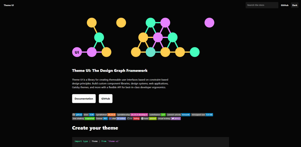
Theme UI is a powerful and flexible library for styling components. It lts you define design themes using JavaScript objects and to compose styles using functions and props. This makes creating highly customizable and reusable styles for your components easy.
example
import { jsx, Box, Text } from 'theme-ui';
import { useThemeUI } from 'theme-ui';

const MyComponent = (props) => {
  const theme = useThemeUI();
  const { color, fontSize } = theme.colors;

  return (
    <Box
      sx={{
        color: color.primary,
        fontSize: fontSize.body,
        fontWeight: 'bold',
      }}
    >
      <Text>Hello world!</Text>
    </Box>
  );
};
Some features of Theme UI include:
- Support for theming, which allows you to define a global design theme and apply it to all of your components
- Support for composition, which allows you to combine styles from different sources and create new styles using functions
- Integration with popular React UI libraries, such as React Router and Gatsby, which makes it easy to use Theme UI in your existing React applications
#10 – vanilla-extract
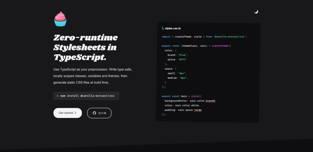
I recently started using the vanilla-extract library for my TypeScript projects, and I’m really impressed with it. The zero-runtime feature is great because it allows me to write stylesheets and have them compiled into static CSS files at build time. This provides the benefits of type-safety and locally scoped styles.
One of the standout features of vanilla-extract is its support for theming. I can create a global theme or multiple themes, all with type-safe token contracts, which makes it easy to customize the look and feel of my projects.
example
import { createTheme, style } from '@vanilla-extract/css';

export const [themeClass, vars] = createTheme({
  color: {
    brand: 'aquamarine',
    accent: 'honeydew',
  },
});

export const brandedSection = style({
  backgroundColor: vars.color.brandd,
Another thing I love about Vanilla-extract is that it is framework agnostic. It has official integrations for popular frameworks and bundlers like webpack, esbuild, Vite, and Next.js.
Overall, I think Vanilla-extract is a great library for anyone looking to write maintainable CSS at scale with the added benefits of TypeScript. It’s easy to set up and integrates seamlessly with your bundler of choice.
#11 – Linaria
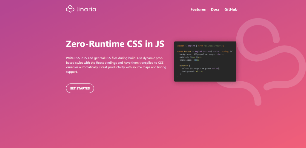
Linaria is a CSS-in-JS library that allows developers to write CSS in JavaScript and have the styles extracted to CSS files during build time. This provides the benefits of dynamic styles and the familiar CSS syntax with Sass-like nesting.
Besides being a zero-runtime library, Linaria also supports dynamic prop-based styles with the React bindings. This utilizes CSS variables behind the scenes, making it effortless to apply styles based on component props.
example
import { styled } from '@linaria/react';
import { families, sizes } from './fonts';

// Write your styles in `styled` tag
const Title = styled.h1`
  font-family: ${families.sansSerif};
`;

const Container = styled.div`
  font-size: ${sizes.small}px;
  color: ${props => props.color};
  border: 1px solid green;

  &:hover {
    border-color: purple;
  }

  ${Title} {
    margin-bottom: 16px;
  }
`;

// Then use the resulting component
<Container color="#222">
  <Title>Hello world</Title>
</Container>;Linaria consists of two main parts: a Babel plugin and a bundler integration. The Babel plugin is responsible for looking for css and styled tags in the code, extracting the CSS and returning it in the file’s metadata. It will also generate unique class names based on the filename hash.
When using the styled tag, dynamic interpolations will be replaced with CSS custom properties. References to constants in the scope will also be inlined. If the same expression is used multiple times, the plugin will create a single CSS custom property for those.
#12 – Twin
Twin is a library that enables developers to build better apps by combining the benefits of Tailwind CSS and CSS-in-JS.
Twin allows you to style frontend components using Tailwind classes, then compile them into any supported CSS-in-JS library. This eliminates the need for an extra client bundle. Twin is compatible with React and other React frameworks and has out-of-the-box support for Vue.
Features of Twin include:
- Basic styling with the tw prop for adding Tailwind classes to JSX elements
- Conditional styling using the css prop and nested styles in arrays
- Overriding styles using the tw prop after the css prop
- Cleaning up JSX by lifting styles out and grouping them in an object
- Styling elements with custom selectors and arbitrary variants
- Custom css with arbitrary properties and the css prop
- Advanced css styling with sass-like syntax and objects.
#13 – Fela
Robin Weser created the Fela library as an alternative to existing CSS-in-JS solutions that were deeply bound to React and offered numerous configuration options and APIs. The goal of Fela is to provide a simple and dynamic approach to styling that is framework-agnostic and high-performing.
Weser developed Fela based on his experience with CSS-in-JS techniques and the success of his own library, react-look. The key motivation for creating Fela was to solve the problems of CSS at scale and provide a new approach to handling these issues without needing additional tooling.
You can read the full story here: Intro / Motivation.
#14 – Astroturf
Astroturf is a library that lets you write CSS in JS without adding any runtime layer. This means that you can use existing CSS processing tools, such as Sass and PostCSS, and still write their style definitions in JavaScript files.
Also, Astroturf also allows for whole components to be written in a single file. By using a template literal, you can write CSS in the same file as JavaScript and use it as if it were in a separate file. Astroturf also provides scoped stylesheets, allowing developers to define styles from their JavaScript files without requiring a specific framework.
The library has built-in integration with React. Dynamic props are also supported, allowing for individual CSS property values to be specified at runtime.
Summary
That’s a wrap! This turned out a lot more in-depth than I thought it would be. That said, if you’re looking for a reliable library, the top 5 are not only that but also highly extensible. And if you’re looking to try out something completely new, I think there are a lot of choices for that, too.