
I’ve recently wrapped up an article on JavaScript charting libraries, some of which also specialize in concrete data visualization features. However, while you can use any of those libraries on your WordPress site through a CDN – it’s not guaranteed to function the way you want.
That is largely to do with the way the WordPress ecosystem works. It’s definitely possible to use external scripts from “outside” sources, but sometimes things like theme incompatibility get in the way. So, for this article, I’ll be taking a closer look at data visualization tools that have been built as WordPress plugins. This ensures the best compatibility and ease of use.
What to expect from the plugins mentioned in this article?
Data visualization spans many different categories and types, so in this context, we’ll be looking at two distinct data visualization use cases.
- Tables – displaying data through a table interface means you can showcase large datasets, and take advantage of features like pagination, filters, and search.
- Charts – these kinds of charts are best when you want to display smaller datasets while retaining elements like visual clarity and good presentation.
And the last thing is the cost of a plugin. The focus of this article is on plugins that are free to use, even if they have a premium model available (let’s be honest, these days, every single plugin does) – so if you’re looking to display data tables and charts in your WordPress posts, and do so for free – keep reading as we explore the most popular plugins for this purpose.
1. Chart Block

The Chart Block plugin from bPlugins is a relatively new solution for adding charts to a WordPress site, but it’s also one of the easiest ones to work with. I’m also a huge fan of their chart-creating interface, as it’s easy to work with and provides many customization options.
This is a block-enabled plugin, so Gutenberg is mandatory!
Here is an example chart created with Chart Block:
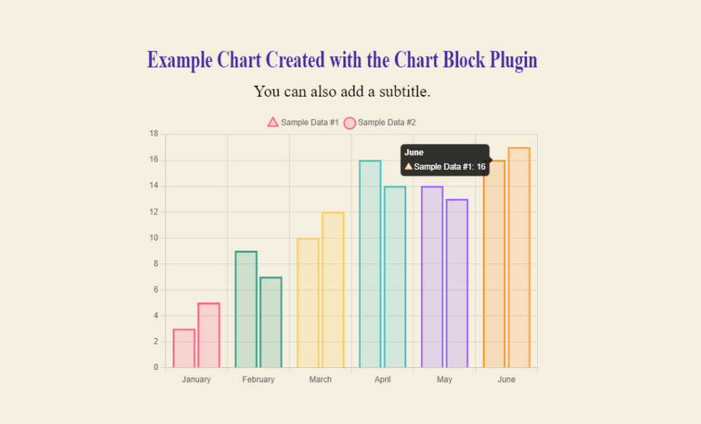
You have full control over how the data appears in the cart, including changing the colors, adding data points, and providing a title/sub-title. It’s also possible to add a Download button to your charts so readers can save the chart locally as an image.
What kind of charts can you create with Chart Block?
At this time, this plugin supports Line, Bar, Pie, Radar, Dougnut, and Polar Area charts.
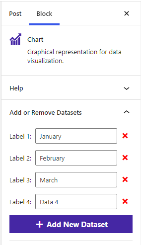
After you have installed Chart Block, you can go ahead and insert the Charts block inside the post where you’d like to display the chart. By doing so, the plugin will automatically create an example chart which you can modify with your own data, labels, and other settings.
As far as visualizing data in the form of charts and graphs, this plugin is as efficient as it gets.
2. Ninja Tables

Ninja Tables let you transform your data into a table presentation. Every single feature in this plugin is designed to be used through a visual editor. As such, you can visually build and preview your table design in real-time. Data can be added either manually, or by uploading a CSV/JSON file.
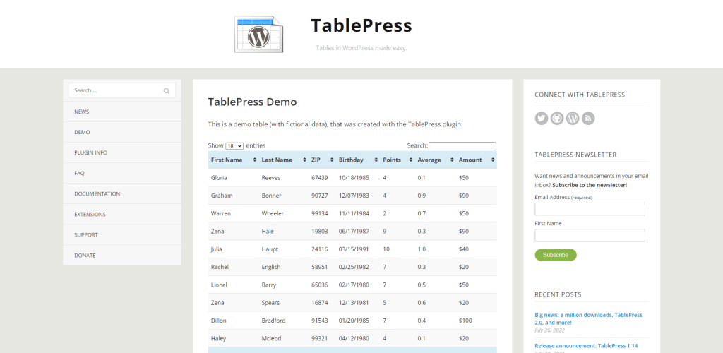
Here is what a typical data table looks like created with this plugin:
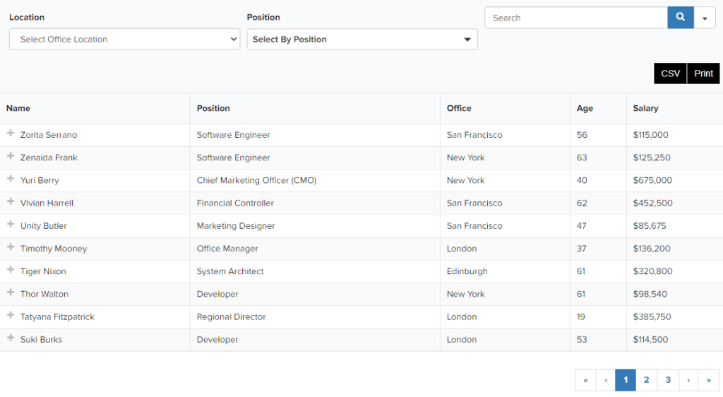
This is a fully interactive table. Your readers can sort data based on the filters you have provided. They can also search, and even export the table to save on their PC. And yes, Ninja Tables has many different themes you can choose from! But, this is not the only way you can visualize data.
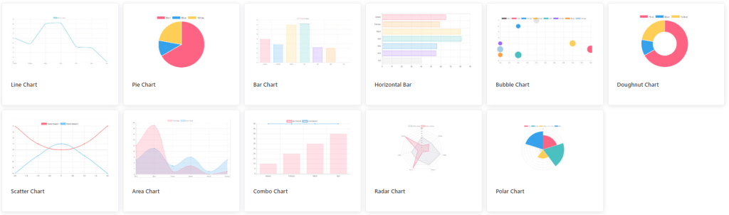
After installing the plugin, you can go to Ninja Tables -> Charts to enable and access the charts building interface. You have the option to choose between Chart.js and Google Charts as the rendering engine, and in total, there are 20 different chart designs.
After you select your chart type, you can move forward by specifying Data Source (manual or from Ninja Tables itself), and finally, format your chart and then get a shortcode. After you have the shortcode, it can be placed anywhere on your pages/posts to display the chart you created.
3. TablePress
The reason for including two different plugins that can display data in table format is because:
- Ninja Tables also provides a chart feature (TablePress doesn’t).
- TablePress is mostly free (as is Ninja Tables to an extent) except for a few premium extensions.
TablePress is using the DataTables jQuery library for its back-end.
And because it does, you get access to some really great features. Those features include real-time sorting, pagination, custom filters, and the ability to style your tables to your liking.
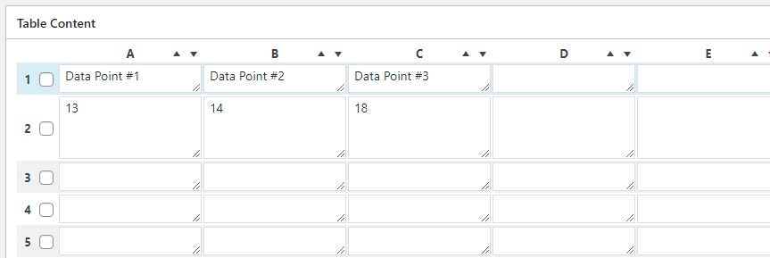
After you go through the initial process of creating your first table, you’ll be able to customize it and then specify the actual table content. An alternative to doing this manually is to import a pre-existing file that has all the data you’re looking to display in your table.
Here’s an overview of the key features:
- The tables you create are saved as shortcodes, allowing you to display your table in posts, pages, and even widget areas. It can also be added to your Theme by using the Tag function.
- Supports all content types, including Text, Images, and Code (HTML/JavaScript).
- Math formulas are supported for complex data displays.
- Rows and Columns are fully styleable, from colors to fonts.
- Import data in JSON, CSV, Excel, or HTML format. Support for External uploading, also.
- Real-time preview to make sure the Table functions as you intended it to.
Regarding visualizing large datasets, a plugin like TablePress simplifies the process enormously.
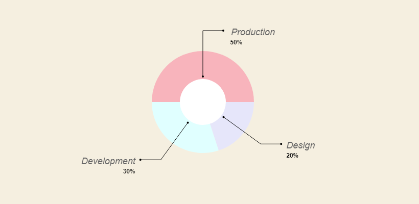
4. PieBuilder
The unique thing about PieBuilder is that it works only through shortcodes. This means that you have to manually enter the data yourself, including styling each segment’s color yourself. It’s a bit of extra work, but after testing the plugin, I found the final chart design quite good.
The shortcode itself looks like this:
[TP_PIEBUILDER_DOUGHNUT title="Chart Title" values="15, 25, 45" labels="Label #1, Label #2, Label #3" colors="#000, #111, #222"]
It’s pretty straightforward to use it; here’s a quick summary:
- Title – This is the title you want to apply to your chart.
- Values – these are the numerical values for the data you wish to display.
- Labels – the label for each numerical value, in chronological order relative to values.
- Colors – these are HEX-based color codes for each data point in the chart.
And the last thing to note is the shortcode name, which in the example above was “TP_PIEBUILDER_DOUGHNUT” – in total, there are 5 different chart types.
Here’s the full list of shortcodes for them:
TP_PIEBUILDER
TP_PIEBUILDER_DOUGHNUT
TP_PIEBUILDER_POLAR
TP_PIEBUILDER_BAR
TP_PIEBUILDER_HORIZONTAL_BAR
So, depending on the chart you want to display – you can use the shortcode to get that exact style.
5. Charts & Graphs
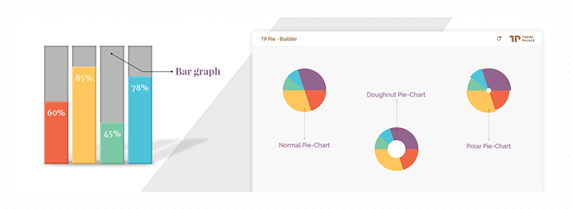
If messing around with shortcodes in their raw form isn’t for you, the Charts & Graphs plugin from Pantherius should be a great alternative. This plugin will generate a shortcode at the end, but the interface is almost 100% visual. Here’s an example of the visual builder:
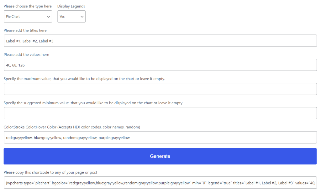
So, it’s very similar to PieBuilder in the sense that you have to enter the values manually, and you also have to set the colors yourself (check here for color scheme inspiration), though interestingly, you can specify multiple colors. And if you do, each time the chart will have a unique set of them.
Once you’re finished, you can click on the Generate button, and a pre-made shortcode string will be made for you. A live preview is then also generated below that string.
[wpcharts type="piechart" bgcolor="red:gray:yellow,blue:gray:yellow,random:gray:yellow,purple:gray:yellow" min="0" legend="true" titles="Label #1, Label #2, Label #3" values="40, 68, 126"]The charts created with this plugin are mobile-friendly (responsive).
Data Visualization & Charts Plugins: A Summary
If you’re going to be adding data tables or charts to your WordPress posts, these are the plugins to do it with. There are alternative methods, such as using third-party services for creating charts, but then you would have to embed those charts on your site from an external source. White is not inherently a bad solution; it might prove to limit your ability to control the data in long term.