

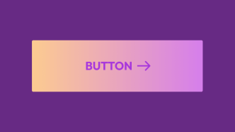
This snippet showcases how you can apply a gradient background to a container and animate it using @keyframes.
Example Container
Lorem ipsum dolor sit amet, consectetur adipiscing elit. Nullam ornare aliquet purus ut bibendum. Maecenas luctus cursus sem nec luctus. Aliquam ut risus quis ante tempor accumsan. Integer fermentum odio scelerisque, semper orci a, cursus enim. Mauris mollis commodo eros condimentum tristique. Suspendisse auctor volutpat magna eget euismod. Phasellus ut nulla urna.
/* apply this to the container you want to animate */

.gradient {
    background: linear-gradient(-45deg, #ffeb3b, #74efff, #9c27b0);
    background-size: 400% 400%;
    animation: gradient-bg 20s ease infinite;
}

@keyframes gradient-bg {
	0% {
		background-position: 0% 50%;
	}
	50% {
		background-position: 100% 50%;
	}
	100% {
		background-position: 0% 50%;
	}
}
You can control the speed at which the gradient floats around the container by changing the timer in the animation shorthand.
And you can also do a layered container to apply a noise background image, amplifying the gradient effect.
I’ve written about SVG pattern generators before, so you can check those if you’re looking for background patterns to experiment with.
Other than that, any noise picture should have a distinct effect on how the animated gradient appears visually.
Example Container (with Noise bg)
Lorem ipsum dolor sit amet, consectetur adipiscing elit. Nullam ornare aliquet purus ut bibendum. Maecenas luctus cursus sem nec luctus. Aliquam ut risus quis ante tempor accumsan. Integer fermentum odio scelerisque, semper orci a, cursus enim. Mauris mollis commodo eros condimentum tristique. Suspendisse auctor volutpat magna eget euismod. Phasellus ut nulla urna.
To make this work, you need to add a separate div inside the container that you’re applying the gradient to.
And then, you need to position it as absolute to ensure the noise image stays inside the container.
(Which means your main container has to be relative.)
<div class="noise-image"></div>And the CSS –
.noise-image {
  position: absolute;
  left: 0%;
  top: 0%;
  right: 0%;
  bottom: 0%;
  background-image: url("https://stackdiary.com/wp-content/uploads/2022/10/noise_img.png");
  background-position: 0px 0px;
  background-size: auto;
  opacity: 0.5;
}