


Today, when the shape and functionality of tech are limited only by the fantasy of its developers and users, delivering consistent and harmonious UX through aesthetically pleasing and exceptionally functional screens becomes a decisive driver of commercial prosperity.
In light of this, mastering all the nuances of crafting cross-platform UI design for even the most extraordinary and atypical screen, be it a foldable phone, an ultramodern tablet, or the latest model of a MacBook, is no longer an option, it’s a must.
Sounds complicated, doesn’t it? Then go through our guide composed by adept UI/UX designers to find out what the ins and outs of captivating cross-platform design are, step-by-step.
Never omit to turn to proficient business analysts first for extensive user research and analysis
Remember once and for all, going through this stage is compulsory if you don’t wish to waste your money later in the run by producing a cross-platform solution with every bell and whistle that doesn’t truly meet the emerging needs of your audience. By undergoing this stage, you’ll successfully formulate a cross-platform design roadmap that will effectively steer the entire development flow. In a matter of several weeks and in an extremely economical manner, you’ll perfectly perceive the motives, prompts, and limiting factors that inspire or, on the contrary, impede your users.
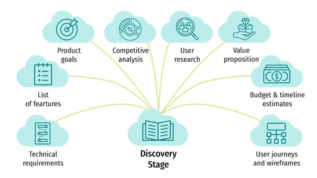
So what are, after all, the essential building bricks of this process?
- Outline user personas that are a quintessence of attributes, ambitions, inclinations, and problems of sundry user types that will be turning to your solution. These archetypes necessarily factor in considerations like generation, career, device application, and tech savviness of your audience. Thus, your designers will be in the right position to build on a detailed portrayal of your actual clients later in the run.
- Consider device-centric targeted behaviors that can be diametrically opposite for different screens. This dramatic divergence in actions is conditioned by the unique contexts in which users proceed toward completing targeted actions. Note the activities they are chiefly focusing on and the functions they predominantly leverage.
- Start building well-oiled relationships with your clientele even before you roll out your product by suggesting they take part in brief survey sessions that will record their true opinions on your cross-platform app design intentions.
- Make the utmost use of miscellaneous marketing analytics instruments, e.g. heatmaps and Google Analytics, to avail yourself of evidence-backed perspectives.
- When elaborating user journeys, pinpoint typical touchpoints, conversion points, and likely hindrances.
- As you surely know, if you don’t rationally use screen space, page visitors will soon get confused and, what’s worse, bored. To avoid this, we recommend specialists meticulously organize crux cross-platform functionalities and content.
- To effectively navigate through further development stages with no money losses, allocate some of your designers’ time to prototype creation and testing. Remember that it’s more acceptable to spend dozens of hours elaborating cross-platform wireframes that won’t be approved by the customer than to actually engineer an irrelevant end product.
- Finally, keep in mind that plans are made to be changed, especially if we, being true professionals, closely follow Agile best practices. Therefore, there is no need to zealously polish to perfection all elements and their configurations as customer requirements are subject to modification.
Establish solid UI design guidelines and proceed in accordance with them
To proficiently forge a consolidated user experience through robust cross-platform mobile app design, a team of specialists must closely fall back on cohesive and proven underpinning. What steps are needed to formulate these principles?
- First of all, you should carefully list crux graphic components, e.g. corporate identity attributes, character formatting, chromatic palette, symbolic representations, etc., that under no circumstances will be altered throughout diverse interfaces.
- Build upon universally acknowledged flex layout concepts that provide matrix systems, margins and padding conventions, viewport transition points, and more for sundry monitor extents and perspectives.
- Elaborate logical and uniform navigation schemes that configure miscellaneous control lists, content dividers, and directional panels in such a manner that they smoothly fit into the displayable area.
- Consistently organize caption text and parts of content by their significance so that fundamental particulars can be, literally speaking, seen with the unaided eye.
- Small but extremely significant details such as icon proportions, gaps, and reaction states should be given special attention with the dedicated section in your policy.
- Make sure that interconnected containers, entry fields, and pop-ups with their omnifarious relative sizes and placements are tailorable to accommodate cross-platform specifications.
- Delineate crux animation techniques you’re building on, e.g. those that relate to compression and expansion, framing, continuous and staggered animation, and more.
- Keep in mind that, in today’s inclusive world, if you don’t respect accessibility norms, e.g. readability criteria, effortless navigation by means of touch controls, and so on, you’re with a high probability doomed to failure.
- Verify your principles by inserting authentic material.
- Finally, draw up a unified cross-platform design file that all your team members will make the base and the cornerstone of their work.
Unquestioningly embrace responsive UI layout methodology
By closely following the underlying concepts that we will now briefly run through, you’ll be in the right position to elaborate outstanding cross-platform mobile app design that is faithfully unvarying across diverse displays.

- Bring about a keystone of versatile grids that instantly auto-modify content positioning proportional to screen extent.
- Always address cross-platform graphics and multimedia constituents with responsiveness as a concern.
- Set up interval markers with customizable typefaces and other visual attributes.
- As we’ve touched upon earlier, place significance on different levels of content; this can be brought to fruition by applying a mobile-first design that will help you give weight to the most subtle but essential nuances and aptly shape your overarching design preferences.
- Verify that clickable controls and other interactive constituents are adequately calibrated and positioned for touch manipulation.
- Think through typeface scales and line spacing in advance to guarantee homogeneous formatting that will inevitably amplify content perceptibility.
- Repeatedly test the outcomes, i.e. cross-platform program performance, on an extensive variety of actual gadgets and equipment; this will allow you to fine-tune software execution as deemed necessary, e.g. trim down file volumes, revise your coding strategies, and bring caching to fruition.
Devise uniform UI interaction formats that even a child will be able to navigate
To boost UI pattern recognition and involvement, suggest a system of highly predictable templates that includes the following steady structures:
- Easily discernible and persistent cross-platform navigation with recognizable feature arrangements will guarantee the perseverance of an easily identified format so that the app is exceptionally intuitive for consumers.
- Sliding, pressing, browsing, and performing other actions should foster uniformity and provide consistent responses over multiple interfaces.
- The above is true about forms as well, with the layout of fields, the input manners, and verification alerts upheld standardized and in the same sequence.
- When availing themselves of your app, its visitors should immediately know that their every movement is significant and resultful. Therefore, providing for unvarying visual confirmations, e.g. button motion sequences and mouseover responses, is highly advisable.
- To communicate supplementary insights in a compelling and coherent manner, as well as to competently log user responses, sundry modals should retain uniformity in the way they show up and conduct.
- Multiple drop-down lists, pop-up prompts, and modal overlays should all be programmed to unfailingly demonstrate unvarying shift effects to furnish an informative setting and contribute to getting the full picture.
- Of course, this list could be longer, but we’ll stop here, and we’d just like to, once again, emphasize the cruciality of accessibility in cross-platform app design, pursuing consistently in this regard to create equally rewarding experiences for everyone.
Tweak your app to each specific platform
When drafting a cross-platform UI design for your app, use the strong suits of each platform to your advantage while making the best of their drawbacks.
- While web pages, as a rule, don’t impose strict limits on content volume and layout, allowing for high-level animations, handheld devices, on the contrary, call for rational use of every pixel. There, being selective about the published content, simplifying the information-dense tabular and graphical representations, and using fold-away modules, footer tabbed menus, and other shticks is a must.
- In continuation to the topic of mobile space constraints, all so-called tappable components, be they pressable icons, anchor texts, and so on, must be appropriately adapted for fingertip actions. This means, among other things, that the spaces between them are big enough to permit completing the targeted actions.
- You don’t want page visitors to leave frustrated after some seconds of futile expectation until the content is finally displayed, do you? Then don’t forget to fine-tune visuals so that they can load in no time.
- Neither do you want to make your audience peer at tiny characters on handheld device screens, do you? Then polish the typographic elements accordingly while maintaining their hierarchy.
- When crafting UI, it’s crucial not to overlook the fact that smartphones are actually frequently used in instances of reduced or completely unavailable internet connection. Therefore, provide mechanisms for offline accessibility, e.g. data caching, synchronization, background sync, etc.
Involve various types of checks to draw on feedback and elevate app quality
Be it an MVP or an enterprise-grade cross-platform app, applying various kinds of checks and capitalizing on audience-oriented perspectives and feedback is one of the bedrocks of Agile-driven engineering. Below, we provide a rundown of possible verifications.
- Motivate diverse categories of users to explore your UI and perform all sorts of actions to detect every scenario when they stumble and, on the contrary, are delighted with your brilliant cross-platform app design. Nothing is so valuable for elevating UI consistency as these first-hand insights.
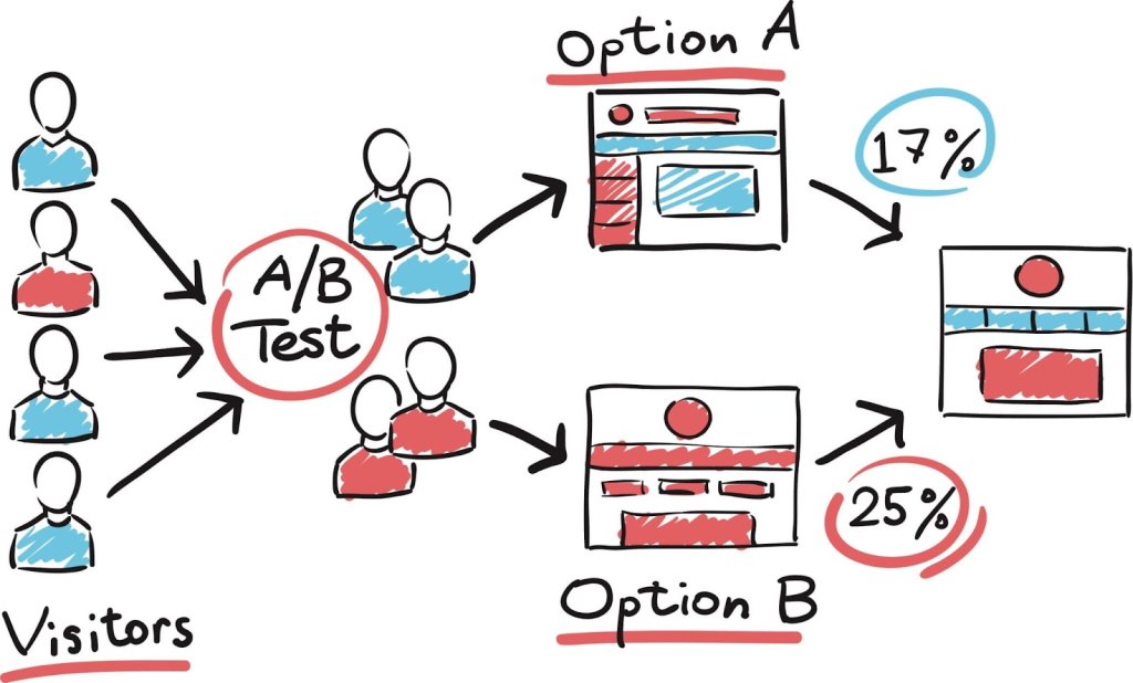
- Further on, give your audience the freedom of choice between the two design interpretations by leveraging A/B testing. By doing so, you’ll be in the right position to comprehend the participants’ likings and engagement gradations.
- Leveraging robust heatmap techniques and analytics instruments will allow you to garner a perception of frontmost click zones, scroll habits, and other frequently employed patterns.
- Arrange pathways for acquiring the opinions of the participants, e.g. in-app feedback widgets, forms, etc.
- With any new tweak and amendment, don’t be slack to check up on the changes in your UI performance, i.e. loading intervals, possible tech complications, etc.
- Last but not least, ensure that, throughout the testing, your QAs and designers are working in close coordination with other stakeholders to be able to smoothly carry on with the product along the entire engineering cycle.
Promote teamwork with the coders
As brought up earlier, working in close connection with programmers is vital to craft not only aesthetically stunning but also exceedingly practical UI.

- Encourage coders’ involvement as early as brainstorming for the first prototypes to guarantee that they formulate a concise grasp of the design outlook and all the required platform-targeted adaptations.
- Again, right from the start, promote pathways for unambiguous communication between the specialists to carefully log all the discussions so that nothing is missed.
- Jointly explore ways out when addressing tech viability, performance implications, etc.
- In your discussions, let both sides rest their eyes on simple dynamic demos to grasp the main design and tech concepts.
- Keep your professionals aligned by scheduling routine progress evaluations, as well as by employing teamwork-oriented solutions, e.g. version tracking platforms, shared design file hosting and coding environments, and so on. Thus, everybody will obtain a complete picture of the UI landscape, including its logic, user archetypes with their projected reactions, etc.
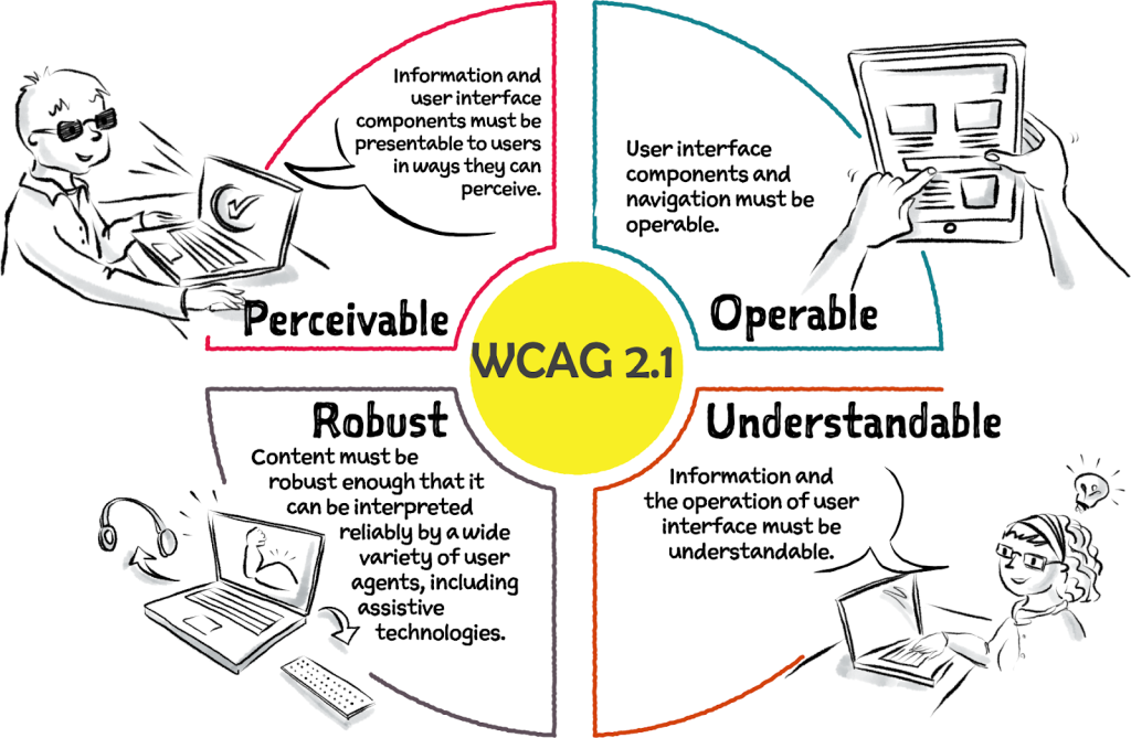
Verify all your actions against app accessibility
In conclusion, we want to make this clear once again: to succeed in envisioning and bringing to fruition your cross-platform mobile app design, make certain your app is easy-to-use for anyone, disregarding their aptitudes and the gadgets employed.
- Uphold WCAG as your source of truth when aiming at making your UI resilient, functional, and easily perceived.
- Employ descriptive HTML semantics extensively to adequately tag and thus, systematize the information.
- Never underestimate the cruciality of chromatic disparity when envisioning the principal text and underlying fields.
- This is a seemingly insignificant detail, however, don’t forget to consistently fill in alt descriptions for all non-textual items.
- To conclude, always build on empathetic design principles with inclusivity as a priority.
Note: This article was authored by Valentin Kuzmenko, Andersen’s CCO, who is renowned for shaping high-impact software solutions. A negotiation expert with a flair for strategic innovations, he’s steered market expansions and pioneered product introductions.
https://www.linkedin.com/in/valentin-kuzmenko/