

As I briefly mentioned in my introduction to CSS math functions – after publishing the useful CSS tricks article – I saw traffic coming to this site for keywords like “how to center CSS”. So, it only makes sense that I finally put together such an article myself.
I’m certain that the problem with centering stuff using CSS isn’t about remembering the justify-content: center; property. It’s more to do with the fact that different layout structures have their own rules, and might not respect a certain approach.
But, first things first, who is this guide created for:
- Front-end developers who feel overwhelmed with the “rules and regulations” of CSS.
- Anyone who finds it hard to get that div centered once and for all. Aaahhhh!!
- Website owners who are stuck with poorly structured templates/themes.
In CSS, centering is often referred to as Vertical, Horizontal, or Vertical & Horizontal.
You can also interpret it as Left, Right, and Left & Right. And in some cases, you may also see it being referred to as Top & Bottom. These are also going to be the terms we use throughout this guide. With that said, let’s start with the most sought-after approach of them all.
Inline & Block Elements: text-align
One of the things that might not seem obvious at first is that text-align: center; works for more than just paragraphs. As a property, it can be applied to any element that is considered a block. This means as long as your content is wrapped in <div> or a similar element, it can be centered using text-align.
CSS & HTML
<style>
.text-align-container {
  display: flex;
}
.text-align-container-style .item {
  background: #fff2ea;
  padding: 20px 0;
  text-align: center;
  width: 100%;
}
</style>

<div class="text-align-container text-align-container-style">
<div class="item">Hi, I am centered.</div>
</div>The nice thing about this approach is that it works for both Grid and Flexbox. As long as you wrap content inside the div, it will work just as fine for content such as images.
And it works well with lists too:
- I am a list item #1.
- And this is list item #2.
Let’s see what happens if we try to center a <span> element without wrapping it in a block container first.
CSS & HTML
.span-demo-container {
  background: #fff2ea;
  padding: 20px 0;
  width: 100%;
}
.span-demo-center {
  text-align: center;
}
<div class="span-demo-container">
<span class="span-demo-center">Am I in the center?</span>
</div>
And the result is:
The reason this <span> element isn’t centered is because it’s an inline element. For inline elements, you always want to set a parent.
So, if we go back and take the span-demo-center class and apply it to the <div> – the result will be like this:
If you work with a large codebase or use a poorly structured template, this is typically the number one reason centering doesn’t work. As such, always check for block and inline elements and see whether they’re nested properly.
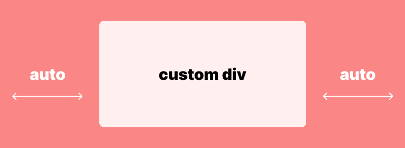
Centering block elements with a fixed width
Another popular method for centering elements is to use margin: auto; , which is most commonly used for block elements with a fixed width.
So, think of a custom div inside a larger container. And, then you’re trying to put content inside that custom div element and have it centered.
Let’s do a live example to see it in action:
CSS & HTML
.margin-auto-container {
  background: #fff2ea;
  padding:1rem;
}
.margin-auto-inner {
    width: 200px;
    padding: 1rem;
    background: #efba93;
    color: #fff;
    margin: 0 auto;
    text-align: center;
}
<div class="margin-auto-container">
<div class="margin-auto-inner">Div & Text centered.</div>
</div>In this example, the margin-auto-container class takes the container from this blog post – then we create a new class called margin-auto-inner and apply a fixed width to it with custom styling. Lastly, we apply margin: 0 auto; to make sure that our inner container is going to remain centered relative to the main container.
Why the 0? We add the 0 because we want to leave the Vertical (Top & Bottom) margin as is, and apply auto margin to the Horizontal (Right & Left) view. You can change this to specify individual margins such as "margin: 25px auto 50px;" which would leave 25px margin on the top, and 50px margin on the bottom.

Important: The reason your margin: auto; is not centering is because you haven't set a fixed width to the element you're trying to center.
We also specify text-align: center; as this will center the text inside the inner container.
Centering inline elements with a fixed width
In the case of an inline element, custom-set width is ignored.
Let’s look at a demo:
CSS & HTML
.margin-auto-container {
  background: #fff2ea;
  padding:1rem;
}
.margin-auto-inner-span {
    width: 150px;
    padding: 5px;
    background: #efba93;
    color: #fff;
    margin: 0 auto;
    text-align: center;
}
<div class="margin-auto-container">
<span class="margin-auto-inner-span">Inline <span> element with custom width. (Not centered).</span>
</div>
And the result is:
As you can see, despite setting margin: auto; the span inline element is not centered.
Fortunately, there is an easy fix for this. By adding display: block; property to our margin-auto-inner-span class – we can tell the browser that we want that specific element to be treated as a block. And now it should be centered:
At this point, you might be wondering which HTML elements are considered as Blocks and which as Inline. Understandable. I recommend looking at the MDN reference:
If you know the difference between Inline and Block, it will be much easier to find the centering solution that is appropriate for your problem.
Grid & Flexbox: The Modern Way
Grid and Flexbox are the two layout modules used in modern web design. Whereas Flexbox is a one-dimensional layout system, Grid is based on a two-dimensional approach.
And centering a div for both layouts can be done with just two lines of code.
Vertical & Horizontal: A Universal Solution
For both Grid & Flexbox layouts, you can use the place-content: center; property.
CSS & HTML
.center-div-grid-layout {
   display: grid;
/* display: flex; */
   place-content: center;
}
<div class="center-div-grid-layout">It's that easy.</div>The place-content property is a shorthand for align-content & justify-content.
With place-content you can do a multitude of placement variations, depending on the style of a layout that you’re working with:
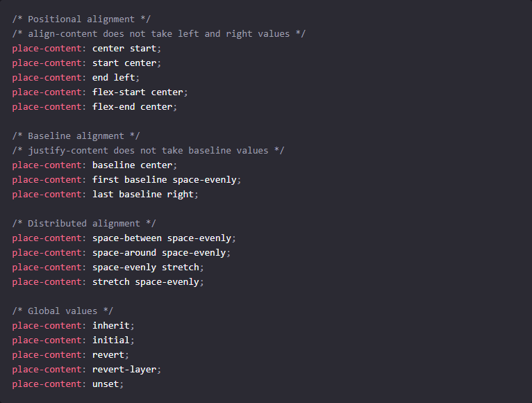
For full reference, please see this MDN page.
Overall, there is a very small number of edge cases where the outlined centering techniques wouldn’t be sufficient. If you’re working with an ancient layout, your best bet is to find inconsistencies in class names inside the stylesheet itself. Then find a way to properly nest the elements so that the specified centering logic is executed properly.
Absolute Centering: transform
The transform property is used when you want something to be centered “dead in the center” – Horizontally & Vertically (Left, Right, Top, Bottom).
CSS & HTML
.transform-example-container {
  height: 150px;
  position: relative;
  background: #fff2ea;
}
.transform-example-container .transform-absolute {
  width: 300px;
  text-align: center;
  background: #efba93;
  color: #fff;
  top: 50%;
  left: 50%;
  transform: translateY(-50%) translateX(-50%);
  margin: 0;
  padding: 10px 0;
  position: absolute;
}
<div class="transform-example-container">
  <p class="transform-absolute">Example: CSS transform</p>
</div>
Example: CSS transform
This works by setting the position to absolute for the child element you wish to center.
It’s important that the parent element has the relative position, otherwise, the transform property will use the main layout as its parent.
We use top and left to set the position relative to the top-left corner. After which, the element can be pulled into the center using translate().
The margin and padding should be set to 0, or you’ll experience a position shift.
And that concludes our tutorial/reference. If you want to master centering with CSS – fire up your favorite code editor and start putting these examples to the test.