

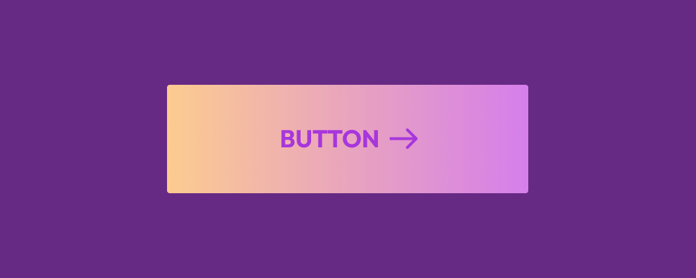
This is a practical example of how you can create a gradient-like hover effect for links and buttons, using the transition property. First, let’s create our link button, and then style it.
.gradient-hover-effect {
  display: flex;
  padding: 0.875em 2em;
  background: linear-gradient(90deg, #3f51b5, transparent) #2196f3;
  font-family: inherit;
  color: #fff;
  text-decoration: none;
  transition: background-color 1s;
  place-content: center;
}
.gradient-hover-effect:hover, .gradient-hover-effect:focus {
  background-color: #e91e63;
  color: #fff;
}
<a href="#" class="gradient-hover-effect">Hover over me!</a>And then if we render that, this is going to be the outcome:
Hover over me!The first thing we have to do is style our button or link. In this example, I am directly applying a background to the element as a linear-gradient. The nice thing about this is that you can actually just use a normal color as well, and then apply a different color for the transition.
Then, we specify transition which we use to call background-color and we also apply a transition time of 1s but this can be lower or higher, depending on the speed that you’re after for the animation itself. Feel free to check out my article on CSS animations.
And finally, we create a new :hover & :focus specification for our button, in which we set the actual background color we want to use for the gradient effect.
The CSS transition shorthand has a lot of possible properties. Including the ability to shift direction, but also to query multiple elements at once. MDN has all the goodies on the topic.