

CSS is in quite a good state right now. The new features being introduced are helping to solidify CSS as a true scripting language. We know that a proposal draft has been made to introduce @when & @else statements. Although not available right now, it does set a precedent for future potential to write conditional logic using CSS.
Michelle Barker wrote an article for Smashing Magazine discussing the upcoming CSS features. Check it out if you hadn’t had the time to catch up yet!
In my experience, it’s quite easy to overlook existing features unless you constantly check for updates. Properties like is() and where() but also attr() have been around for a while, yet are easily overshadowed by the potential of modern frameworks.
Hacking WordPress with CSS
My inspiration for this article comes directly from my experience of working with WordPress on a daily basis. I have been using WordPress for more than 10 years. And during that time, I must have written 10,000+ lines of CSS to customize various theme designs.
But, more specifically, I use CSS to overcome the need for plugins. The way WordPress works is that you need to use a plugin for almost everything. Unless you know a bit of CSS, of course. Want to show a tooltip? Get a plugin. Want to add an icon to a button? Get a plugin.
You get the idea.
How to use these CSS tricks
The only requirement is that you know a bit of CSS & HTML. I have provided sample templates that you can import directly into your projects.
You can use this template and save it as index.html:
<!DOCTYPE HTML>
<html>
<head>
    <title>CSS Tricks & Tips</title>
    <meta charset="UTF-8" />
    <style>
<!-- put the CSS code here -->
    </style>
</head>

<body>
<!-- put the HTML code here -->
</body>

</html>
Typing effect for text
Web designs are getting more creative by the minute. And with the help of CSS animation features, you can make your web pages feel alive. In this example, we are using the animation and @keyframes properties to achieve a typewriter effect.
Specifically, for this demo, we implement the steps() property to segment our text animation. First, you have to specify the number of steps() which in our case is the character length for the text we wish to animate.
And, second, we use @keyframes to declare when the animation is going to start. For example, if you wrote another word after “Typing effect for text” the animation wouldn’t work unless you change the number of steps() in the CSS snippet.
That said, this effect isn’t particularly new. However, most developers flock to JavaScript libraries despite the fact that the same result can be achieved using CSS.
.typing {
  height: 80vh;
  display: flex;
  align-items: center;
  justify-content: center;
}

.typing-effect {
  width: 22ch;
  animation: typing 2s steps(22), effect .5s step-end infinite alternate;
  white-space: nowrap;
  overflow: hidden;
  border-right: 3px solid;
  font-family: monospace;
  font-size: 2em;
}

@keyframes typing {
  from {
    width: 0;
  }
}

@keyframes effect {
  50% {
    border-color: transparent;
  }
}
<div class="typing">
    <div class="typing-effect">
Typing effect for text
    </div>
</div>
Shadow for transparent images
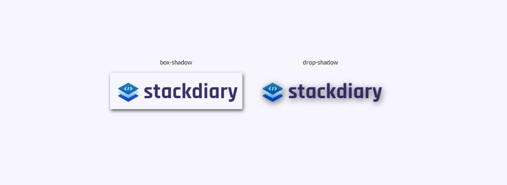
Have you ever tried adding a box-shadow to a transparent image only for it to look like you have added a border? I think we’ve all been there. The solution to adding shadow effects for transparent images is to use drop-shadow.
The way it works is that the drop-shadow property follows the alpha channels of the given image. As such, the shadow is based on the shape inside the image rather than being displayed outside of it.
.transparent-shadow {
  height: 80vh;
  display: flex;
  align-items: center;
  justify-content: center;
}

.margin-right {
  margin-right: 2em;
}

.margin-bottom {
  margin-bottom: 1em;
}

.align-center {
  text-align: center;
}

.box-shadow {
  box-shadow: 2px 4px 8px #3723a1;
}

.drop-shadow {
  filter: drop-shadow(2px 4px 8px #3723a1);
}
<div class="transparent-shadow">
<div class="margin-right">
<div class="margin-bottom align-center">
box-shadow
</div>
<img class="box-shadow" src="https://stackdiary.com/wp-content/uploads/2022/02/logo.png" alt="box-shadow example (transparent)">
</div>
<div>
<div class="margin-bottom align-center">
drop-shadow
</div>
<img class="drop-shadow" src="https://stackdiary.com/wp-content/uploads/2022/02/logo.png" alt="drop-shadow example (transparent)">
</div>
</div>Set a custom cursor
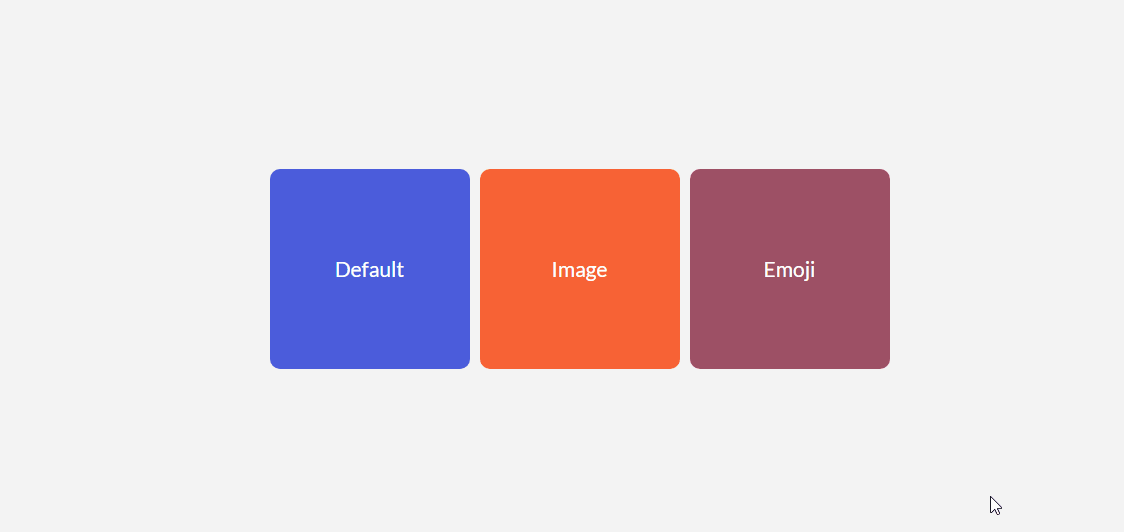
It’s unlikely that you’ll ever need to force your visitors into a unique cursor. At least, not for general UX purposes. Though, one thing to note about the cursor property is that it lets you display images. This is the equivalent of displaying a tooltip but in a photo format.
Some use cases include being able to compare two different photos without needing to render those photos in the viewport. E.g. The cursor property can be used to save real estate in your designs. Since you can lock the custom cursor to a specific div element, it won’t interfere with elements outside of it.
.custom-cursor {
  display: flex;
  height: 80vh;
  align-items: center;
  justify-content: center;
  background: #f3f3f3;
  padding: 0 10px;
}

.card {
    width: 200px;
    height: 200px;display: flex;
    align-items: center;
    justify-content: center;
    background-color: #D29A5A;
    margin-right: 10px;color: #fff;
    font-size: 1.4em;
    text-align: center;
  }

.card-image-cursor {
  background-color: #D11A5A;
  cursor: url(https://stackdiary.com/tools/assets/img/tools/html-beautifier.svg), auto;
}

.card-emoji-cursor {
  background-color: #D29B22;
  cursor: url("data:image/svg+xml;utf8,<svg xmlns='https://www.w3.org/2000/svg'  width='48' height='48' viewport='0 0 100 100' style='fill:black;font-size:24px;'><text y='50%'>?</text></svg>"), auto;
}
<div class="custom-cursor">
<div class="card">
Default
</div>
<div class="card card-image-cursor">
Image
</div>
<div class="card card-emoji-cursor">
Emoji
</div>
</div>Simple tooltip using attr()
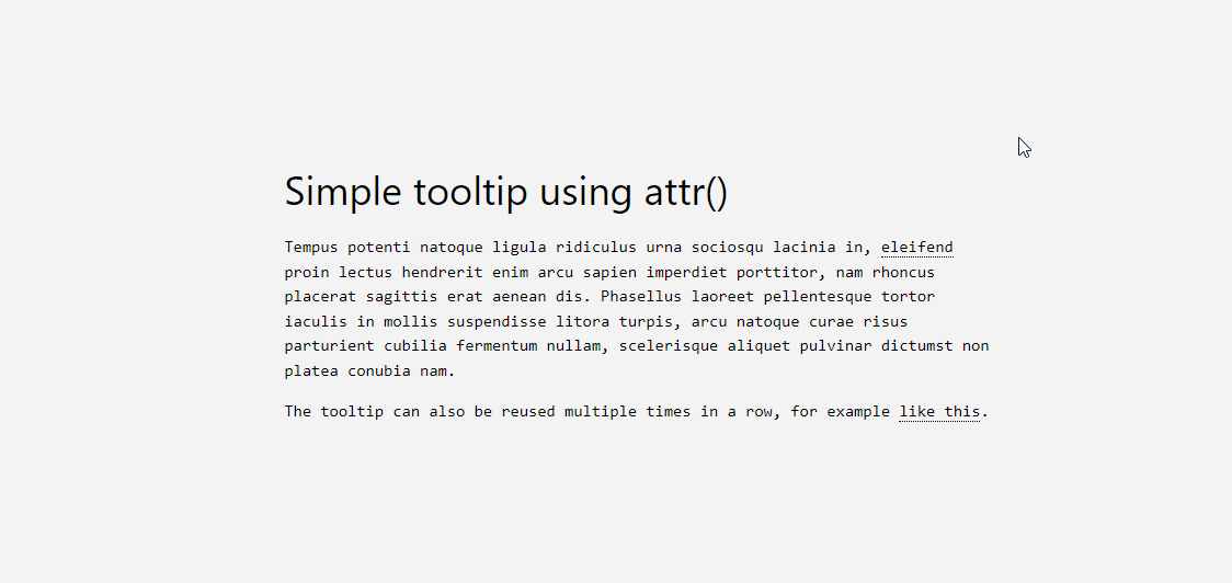
The attr() property is one of my favorite recent discoveries. I wanted to add a tooltip function to my WordPress blog, but doing so would require using a plugin that adds unnecessary bloat to my site. Thankfully, that can be circumvented using attr().
The way it works is quite simple, let me explain the code below:
- We use the
tooltip classto specify which element is going to be the tooltip. You can style this however you like, but for sake of the demo we use adotted border-bottom. - Next, we create a
:beforepseudo-element that will contain a content attr() function and its specification. In this case, we call it tooltip-data. - And finally, we create a :hover pseudo-class that will set the opacity to 1 whenever someone hovers over the tooltip itself.
Additionally, you have to include custom styling. Depending on your tooltip data, you might need to adjust the width but also the margin. And once you do set it all up, you can reuse the tooltip-data attr() class in any part of your design.
.tooltip {
  position: relative;
  border-bottom: 1px dotted black;
}

.tooltip:before {
  content: attr(tooltip-data);
  position: absolute;
  width: 250px;
  background-color: #efba93;
  color: #fff;
  text-align: center;
  padding: 15px;
  line-height: 1.1;
  border-radius: 5px;
  z-index: 1;
  opacity: 0;
  transition: opacity .5s;
  bottom: 125%;
  left: 50%;
  margin-left: -60px;
  font-size: 0.70em;
  visibility: hidden;
}

.tooltip:after {
  content: "";
  position: absolute;
  bottom: 75%;
  left: 50%;
  margin-left: -5px;
  border-width: 5px;
  border-style: solid;
  opacity: 0;
  transition: opacity .5s;
  border-color: #000 transparent transparent transparent;
  visibility: hidden;
}

.tooltip:hover:before,
.tooltip:hover:after {
  opacity: 1;
  visibility: visible;
}
<h1>
HTML/CSS tooltip
</h1>
<p>
Hover <span class="tooltip" tooltip-data="Tooltip Content">Here</span> to see the tooltip.
</p>
<p>
You can also hover <span class="tooltip" tooltip-data="This is another Tooltip Content">here</span> to see another example.
</p>Checklist in pure CSS
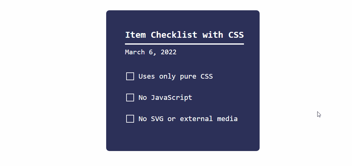
As I mentioned at the beginning of the article, CSS is maturing at a steady pace. And this demo of a dynamic checklist is a prime example of that.
The way it works is that we use the checkbox input type together with the :checked pseudo-class. And use the transform property to change the state whenever the :checked specification returns true.
You can achieve various things with this approach. E.g. Toggle hidden content when a user clicks on a specific checkbox. It works with input types such as radio and checkbox, but can also be applied to <option> and <select> elements.
.checklist {
	padding: 50px;
	position: relative;
	background: #043b3e;
	border-top: 50px solid #03a2f4;
}
.checklist h2 {
	color: #f3f3f3;
	font-size: 25px;
	padding: 10px 0;
	margin-left: 10px;
	display: inline-block;
	border-bottom: 4px solid #f3f3f3;
}
.checklist label {
	position: relative;
	display: block;
	margin: 40px 0;
	color: #fff;
	font-size: 24px;
	cursor: pointer;
}
.checklist input[type="checkbox"] {
	-webkit-appearance: none;
}
.checklist i {
	position: absolute;
	top: 2px;
	display: inline-block;
	width: 25px;
	height: 25px;
	border: 2px solid #fff;
}
.checklist input[type="checkbox"]:checked ~ i {
	top: 1px;
	height: 15px;
	width: 25px;
	border-top: none;
	border-right: none;
	transform: rotate(-45deg);
}
.checklist span {
	position: relative;
	left: 40px;
	transition: 0.5s;
}
.checklist span:before {
	content: '';
	position: absolute;
	top: 50%;
	left: 0;
	width: 100%;
	height: 1px;
	background: #fff;
	transform: translateY(-50%) scaleX(0);
	transform-origin: left;
	transition: transform 0.5s;
}
.checklist input[type="checkbox"]:checked ~ span:before {
	transform: translateY(-50%) scaleX(1);
	transform-origin: right;
	transition: transform 0.5s;
}
.checklist input[type="checkbox"]:checked ~ span {
	color: #154e6b;
}
<div class="checklist">
<h2>Item Checklist with CSS</h2>
<label>
<input type="checkbox" name="" id="" />
<i></i>
<span>Item #1</span>
</label>
<label>
<input type="checkbox" name="" id="" />
<i></i>
<span>Item #2</span>
</label>
<label>
<input type="checkbox" name="" id="" />
<i></i>
<span>Item #3</span>
</label>
</div>Styling elements with :is() and :where()
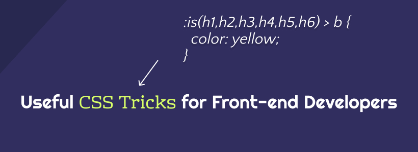
One of the ways in which modern CSS frameworks work is through the use of conditional logic selectors. In other words, the :is() and :where() properties can be used to style a variety of design elements at once. But, more importantly, you can use these properties to query elements that you would otherwise have to specify individually.
The CSS snippet below includes a variety of examples. I’ve added comments to explain what each query does. You can learn more at MDN: :is() & :where().
/* this query will select the b element within a heading and change its color. */

:where(h2,h3,h4) > b {
  color: yellow;
}

/* here we query the paragraph element for a footer that is nested inside an article.
this lets us select specific parts of the design and style them accordingly. */

article :is(footer) > p {
  color: black;
}

/* want to create various styles simultaneously?
the :where property can be used to select specific elements within a dynamic theme style.
you can further nest the elements by specify (button,a) for example. */

.dark-button-style :where(button) {
  background-color: red;
}

/* the above query works for selecting multiple styles at once, too */

:is(.dark-button-style, .red-button-style) :where(button) {
  color: red;
}

/* here we select the h2 element which is located inside a specific div element */

:is(h2):where(.content-title) {
  text-transform: uppercase;
}

/* we can further improve the query by applying the changes to a specific subset */

.title-area:is(h2:is(.content-title)) {
  font-weight: 900;
}
Accordion dropdown using keyframes
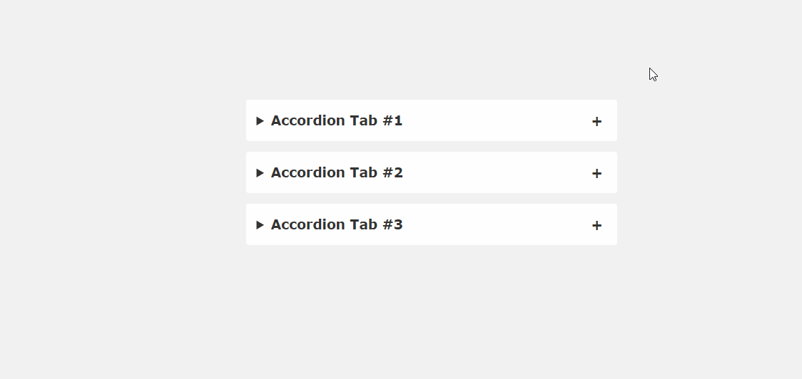
The problem with JavaScript libraries (jQuery, Cash, etc.) is that you typically have to load the entire library even for small-scale functions. Fortunately, a lot of the CSS tricks we’ve looked at so far circumvent that requirement. As is the example with this accordion snippet.
If you take a good look at current web design trends, it won’t take long to find accordions on landing pages. It’s such a simple way to condense content that would otherwise take up design space. FAQs, product features, usage tips – a lot of information types can be put inside an accordion. And this snippet showcases the implementation of it in pure CSS.
/* .tab-content can be styled as you like */
main {
  max-width: 400px;
  margin: 0 auto;
}
p {
    text-align: justify;
    font-family: monospace;
    font-size: 13px;
}
summary {
  font-size: 1rem;
  font-weight: 600;
  background-color: #f3f3f3;
  color: #000;
  padding: 1rem;
  margin-bottom: 1rem;
  outline: none;
  border-radius: 0.25rem;
  cursor: pointer;
  position: relative;
}
details[open] summary ~ * {
  animation: sweep .5s ease-in-out;
}
@keyframes sweep {
  0%    {opacity: 0; margin-top: -10px}
  100%  {opacity: 1; margin-top: 0px}
}
details > summary::after {
  position: absolute;
  content: "+";
  right: 20px;
}
details[open] > summary::after {
  position: absolute;
  content: "-";
  right: 20px;
}
details > summary::-webkit-details-marker {
  display: none;
}
<main>
<details open>
<summary>Accordion Tab #1</summary>
<div class="tab-content">
<p>your text goes here</p>
</div>
</details>
<details>
<summary>Accordion Tab #2</summary>
<div class="tab-content">
<p>your text goes here</p>
</div>
</details>
<details>
<summary>Accordion Tab #3</summary>
<div class="tab-content">
<p>your text goes here</p>
</div>
</details>
</main>Hover effect sidebar
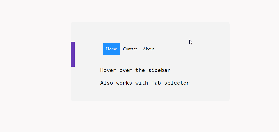
Is it possible to implement a dynamic hover-effect sidebar with CSS? Absolutely. Once again, this is largely possible thanks to properties like transform and :hover.
As for compatibility, I tried it out on various mobile configurations and it seemed to work just fine. Though, it might work better on desktop since mobile screens can feel cramped.
In practice, this approach should work just fine with position: sticky; to create a sticky sidebar effect.
.css-dynamic-sidebar {
    overflow: hidden;
    position: relative;
    height: 15em;
    max-width: 15em;
    margin: auto;
}

.site-content {
    margin: auto;
}

nav {
    display: flex;
    flex-direction: column;
    position: absolute;
    right: 100%;
    padding: 1em;
    background-color: #f3f3f3;
    transform: translateX(1em);
    transition: 0.2s transform;
}

nav:hover,
nav:focus-within {
    transform: translateX(100%);
}

a {
    white-space: pre;
    color: black;
}

p {
    font-size: 2em;
    font-family: monospace;
    text-align: center;
}
<div class="css-dynamic-sidebar">
<nav>
<a class="" href="#">Menu #1</a>
<a class="" href="#">Menu #2</a>
<a class="" href="#">Menu #3</a>
</nav>
<div class="site-content">
<p>Hover over the sidebar</p>
<p>Also work with Tab selector (for accessibility)</p>
</div>
</div>Letter dropcap using first-letter
In CSS, it is possible to select certain first-of-type elements. And, in this example, we target the ::first-letter pseudo-class to create a dropcap effect. The nice thing about this class is that it gives us the freedom to style the letter as we like. As such, you can adjust the appearance of the dropcap to match your design.
Speaking of this property, you can achieve a number of things with it. As long as a certain element appears on the page for the first time, it can be individually styled using first-of-type. But, as shown in the snippet below – you can also use it to target multiple elements despite them having appeared before.
/* here we target the .content-section wrapper and select the p element.
then append first-of-type and target first-letter specifically.
you can then reuse the same option in other parts of your design
by changing the wrapper variable */

.content-section p:first-of-type::first-letter {
	color: #f3f3f3;
	float:  left;
	font-size: 4rem;
	line-height: 4vw;
	padding-right: 8px;
 /* border: 0.25em double; */
}

/* you can also add custom properties like border to create a creative dropcap effect, ideal for book presentations, etc,. */
You can also experiment with the line-height property to properly align the dropcap with your container.
Add an icon before buttons using ::before
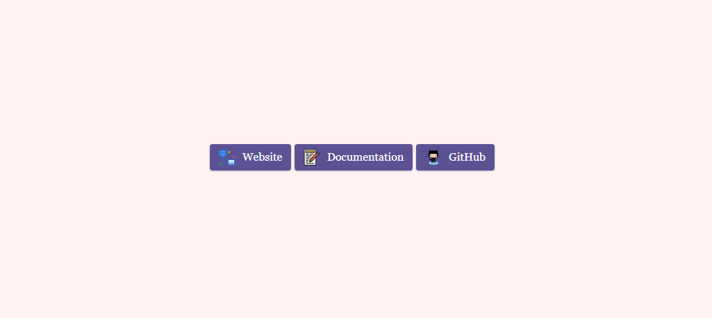
One of my goals for starting this blog was to try and be more creative with how I display content. And, because I write listicles and various roundups, I wanted to make sure that they have a personal touch. I’m not the first or the last person to start a blog like this, but I think custom design elements can go a long way.
And, in this case, whenever I link out to external resources, I use buttons with custom styling added to them. Specifically, buttons with an added icon. You can find plenty of “button generators” with a simple Google search, but I was mostly interested in having a universal solution I can reuse whenever I like.
So, to achieve my goal, I created a custom :before class for the specific button. Just to clarify, the content:"\0000a0"; in this snippet is escaped Unicode for .
You can adjust the icon size by changing the width and height properties to reflect the button size you’re trying to style.
/* select the global button design and then query the specific button class
for which you wish to use the custom icon or image */

.btn-primary .btn-docu:before {
content:"\0000a0";
display:inline-flex;
height:24px;
width:24px;
line-height:24px;
margin:0px 10px 0px 0px;
position:relative;
top:0px;
left:0px;
background:url(https://stackdiary.com/docu.svg) no-repeat left center transparent;
background-size:100% 100%;
}
<div class="card">
<div class="card-body">
<a href="" target="_blank" class="wp-block-button btn btn-web btn-primary" rel="noopener">Website</a>
<a href="" target="_blank" class="wp-block-button btn btn-docu btn-primary" rel="noopener">Documentation</a>
<a href="" target="_blank" class="wp-block-button btn btn-gh btn-primary" rel="noopener">GitHub</a>
</div>
</div>More than anything, these CSS tips and tricks highlight the potential of not needing JavaScript for certain design features. And, the nice thing is that you can implement these tricks in any design. These examples can be mixed together to achieve even more creative design freedom.
If you like to play around with CSS, check out my dedicated page for CSS Animations. It's still a work in progress, but I am slowly adding more and more animation examples. Additionally, I've recently put together a guide on how to center elements in CSS.