


Chrome 111 has just been released, and it ships with a couple of interesting features:
- View Transitions API (Chrome 111+)
- Support for CSS Colors Level 4 [W3C]
- Support for Level 4 Colors in DevTools
For this article, I will focus specifically on the View Transitions API, explaining what it is and looking at a few practical examples you can learn from and implement yourself.
View Transitions API: What is it?
The View Transitions API is a new feature that simplifies the process of creating animated transitions between different states or views in web applications. This API allows developers to update the web page’s content while also animating the changes in a single step.
Before the View Transitions API, creating view transitions on the web was challenging. It typically involved writing a lot of CSS and JavaScript to handle the loading and positioning of old and new content, animate the changes, prevent accidental user interactions with old content, and remove the old content once the transition was complete.
Additionally, there were accessibility issues to consider, such as loss of reading position, focus confusion, and strange live region announcement behavior. Cross-document view transitions were also impossible.
The View Transitions API simplifies this process by providing an easier way to handle the required DOM changes and transition animations. With this API, developers can create seamless view transitions with less code and fewer accessibility issues.
Want to learn more?
Check out the following resources, particularly the official page from the Chrome dev team, with many interesting details and examples.
- Smooth and simple transitions with the View Transitions API (Chrome Developers)
- View Transitions API (MDN)
If we look at Mobile UI design patterns, this kind of transition behavior is extremely common.
However, achieving this in a single-page application (SPA) would have been very difficult or impossible. The API takes care of heavy lifting in the browser using simple JS/CSS, eliminating the need for complex code and libraries.
// Transition between display results before and after function execution
document.startViewTransition(() => {
  // perform DOM update processing
});
.header-icon {
/* name the elements to be shared during the page transition */
view-transition-name: header-icon;
contain: paint;
}Additionally, animations during transitions can be controlled using traditional CSS Animations and JS Web Animation APIs, giving developers plenty of expressive power.
This new feature significantly improves the user experience of web applications and makes it easier for developers to create visually appealing transitions.
Let’s create a simple SPA.
There are plans/talks about supporting this API for MPA (Multi-page applications), but it is an extremely difficult process, and getting done for SPAs is already a massive achievement.
The first step is to create a single SPA, to which we can then apply the API.
And we can see what it looks like:
The next step is to add our transition effect using document.startViewTransition() – you can provide a function as an argument to update the DOM; even asynchronous functions are allowed.
The transition effect in the browser is based on the display results before and after the function is executed.
// page switch
document.startViewTransition(() => {
      document.querySelectorAll('[data-page]').forEach((page) => {
        page.hidden = to !== page.dataset.page
      })
})
With just this wrapper, we can easily add a crossfade effect to the page switch experience:
Great!
Here is the JSFiddle too:
How does it work?
The View Transitions API enables transition effects in CSS pseudo-elements, such as:
::view-transition-group::view-transition-image-pair::view-transition-image-old::view-transition-image-new
instead of in the element itself.
During the transition, these pseudo-elements and their descendants are displayed over the screen.
When the transition starts, the browser captures the state of the screen before and after the transition as a captured image.
These captured images are replaced with the groups that represent the entire screen, which are named:
root(::view-transition-group(root))::view-transition-image-old(root)::view-transition-image-new(root)
and animated with each other.
By default, a fade-out effect is applied to ::view-transition-image-old() and a fade-in effect to ::view-transition-image-new(), as defined by CSS properties. If you want to change the behavior, you can modify these animations with CSS.
MDN has a somewhat detailed explanation of this: ::view-transition.
Let’s look at some examples to understand better how you can apply this API yourself.
Creating a sliding animation
@keyframes slide-left {
  from {
    left: 0%;
  }
  to {
    left: -100%;
  }
}

@keyframes slide-right {
  from {
    left: 100%;
  }
  to {
    left: 0%;
  }
}

::view-transition-old(root) {
  animation-name: slide-left;
}

::view-transition-new(root) {
  animation-name: slide-right;
}
This example defines two keyframe animations: slide-left and slide-right, which is a basic @keyframes specification to move from one side to another.
The ::view-transition-old(root) and ::view-transition-new(root) pseudo-elements are used to apply these animations to the captured images before and after a transition, respectively. When a transition starts, the old image is replaced by the new image using the slide-left animation, and the new image is inserted using the slide-right animation.
And the JSFiddle:
Multiple element transitions
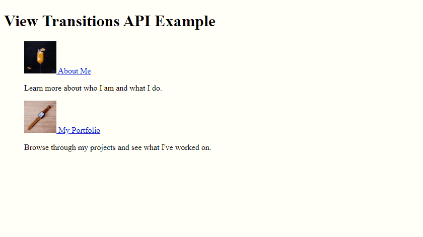
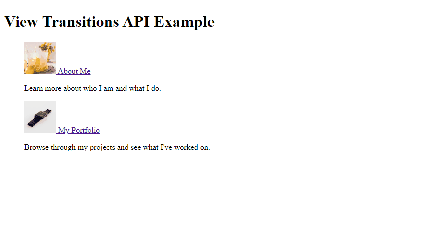
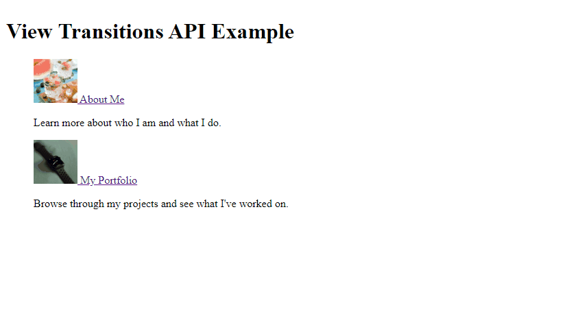
Let’s create a smooth image transition between the two pictures we’re using for our demo.
To do this, we’ll assign class names to our pictures (pic-one and pic-two), and then apply view-transition-name to each one. We’ll also specify contain: paint;, which for the time being, is mandatory to be used, though there is a discussion about it on GitHub.
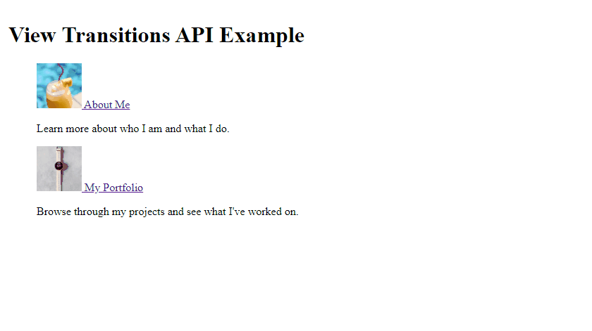
<img class="pic-one" src="https://api.lorem.space/image/drink?w=300&h=300" width="300" height="300" />
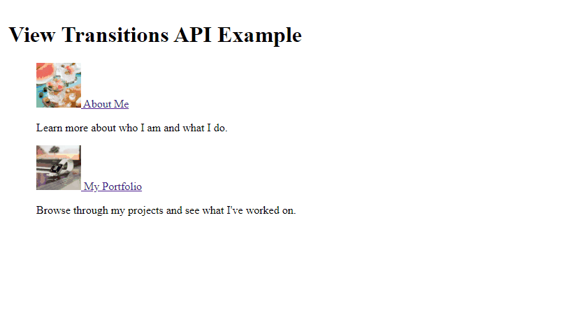
<img class="pic-two" src="https://api.lorem.space/image/watch?w=300&h=300" width="300" height="300" />.pic-one {
view-transition-name: pic-one;
contain: paint;
}
.pic-two {
view-transition-name: pic-two;
contain: paint;
}Keep in mind, we’re not doing anything else here, here is the result:
And the JSFiddle:
With the View Transitions API, it’s possible to animate mutually different DOM elements. This means that the elements don’t necessarily have to be the same image or even the same type of element.
For instance, it could be an <img> element paired with a <div> element.
In the context of web applications, it’s useful to pair elements that don’t change position across transitions, such as headers. This makes the header appear to stay fixed even during page transitions, providing a more seamless user experience.
By using view-transition-name property, you can uniquely identify and group elements together that need to be animated together, even if they are of different types or have different positions on the page.
How do multi-element transitions work?
By assigning view-transition-name to our pic-one element, a new transition group is created, and the element is transitioned separately from the rest of the page.
The result is a shared axis transition with a fixed element, where the element stays in place and cross-fades with the rest of the page.
View transitions use a flat structure, so during the transition, their respective ::view-transition-groups are siblings. This is useful when animating items from one container to another, as there’s no need to worry about clipping from parent elements.
::view-transition
├─ ::view-transition-group(root)
│ └─ ::view-transition-image-pair(root)
│ ├─ ::view-transition-old(root)
│ └─ ::view-transition-new(root)
└─ ::view-transition-group(pic-one)
└─ ::view-transition-image-pair(pic-one)
├─ ::view-transition-old(pic-one)
└─ ::view-transition-new(pic-one)If multiple rendered elements have the same view-transition-name at the same time, the transition will be skipped. Therefore, view-transition-name must be unique.
It’s also possible to animate an entire group altogether, which adds an even deeper layer of customization; for example, we can take our previous animation a step further:
::view-transition-group(*) {
animation-duration: 2.5s;
}
Here is the final code.
::view-transition-group(*) {
animation-duration: 2.5s;
}
.pic-one {
  view-transition-name: pic-one;
  contain: paint;
}

.pic-two {
  view-transition-name: pic-two;
  contain: paint;
}
.page {
position: fixed;
top: 0;
left: 0;
right: 0;
bottom: 0;
box-sizing: border-box;
overflow: auto;
padding: 1rem;
}
.top {
background: #fff;
}
.about {
background: #fffff8;
}
.portfolio {
background: #fffff8;
}
ul {
list-style: none;
}<!-- Top page -->
<div class="page top" data-page="top">
<h1>View Transitions API Example</h1>
<ul>
<li>
<a href="#about" data-to="about">
<img class="pic-one" src="https://api.lorem.space/image/drink?w=300&h=300" width="64" height="64" />
About Me
</a>
<p>Learn more about who I am and what I do.</p>
</li>
<li>
<a href="#portfolio" data-to="portfolio">
<img class="pic-two" src="https://api.lorem.space/image/watch?w=300&h=300" width="64" height="64" />
My Portfolio
</a>
<p>Browse through my projects and see what I've worked on.</p>
</li>
</ul>
</div>
<!-- About page -->
<div class="page about" data-page="about" hidden>
<h2>About Me</h2>
<p>
<img class="pic-one" src="https://api.lorem.space/image/drink?w=300&h=300" width="300" height="300" />
</p>
<p>Hi, my name is Alex. Find me on <a href="https://stackdiary.com/">Stack Diary</a> or <a href="https://twitter.com/stackdiary">Twitter</a>.</p>
<p><a href="#top" data-to="top">Back</a></p>
</div>
<!-- Portfolio page -->
<div class="page portfolio" data-page="portfolio" hidden>
<h2>My Portfolio</h2>
<p>
<img class="pic-two" src="https://api.lorem.space/image/watch?w=300&h=300" width="300" height="300" />
</p>
<p>Check out some of the projects I've worked on recently. I'm always looking for new opportunities to collaborate, so feel free to reach out!</p>
<p><a href="#top" data-to="top">Back</a></p>
</div>document.querySelectorAll('a[data-to]').forEach((a) => {
a.addEventListener('click', (e) => {
e.preventDefault();
const to = e.currentTarget.dataset.to;
document.startViewTransition(() => {
document.querySelectorAll('[data-page]').forEach((page) => {
page.hidden = to !== page.dataset.page
})
})
})
})You can also read through the CSS View Transitions Module Level 1 working draft to get a more in-depth overview of the technical aspects that have gone into this new API.
I do think that the Chrome team releasing this now is going to open the floodgates for developers to build libraries and various endpoints to make the implementation of this API as easy as possible.