

Mobile detection has always been a crucial aspect of app development. It is relevant both for apps, but also software and websites. There are countless reasons to check for mobile browser agents. Most importantly, the ability to render a unique user experience.
The UAParser.js library alone gets millions of weekly package downloads. And, in most cases, it is enough if you’re building something from scratch. But, what about alternative ways to detect mobile browsers with JavaScript?
Sometimes you might just want a simple solution that does the job without any libraries. And in this article, I am gonna lay out for you a handful of JavaScript techniques for detecting mobile users. Let me know if I missed any!
navigator.userAgent
The holy grail of browser detection is the navigator.UserAgent property.
if (/Android|iPhone/i.test(navigator.userAgent)) {
  // This checks if the current device is in fact mobile
}

// an alternative structure to check individual matches
if (
  navigator.userAgent.match(/Android/i) ||
  navigator.userAgent.match(/iPhone/i)
) {
  // making individual checks
}
This is, of course, a very primitive way of doing it. It can easily be manipulated as the User-Agent property can be spoofed. But, you can still use it in various projects because it does the job. E.g. Landing pages or making a custom redirect to a mobile version.
How to display a warning message if the user uses an unsupported or outdated browser?
One way this property can be used is to check whether or not the user is using a specific version of a browser, and, if not – perform an action.
In this example, it’s a simple alert message:
// get the user agent string and extract the browser version
var userAgent = navigator.userAgent;
var browserVersion = userAgent.substring(userAgent.indexOf("Chrome") + 7);

// check if the browser version is less than the minimum supported version
if (parseFloat(browserVersion) < 107) {
  // show a warning message
  alert("Your browser is outdated and not supported. Please upgrade to the latest version.");
}
☰ What does the “+ 7” do?
In this case, the number 7 in the browserVersion string is used to specify the index at which to start extracting the substring from the userAgent string. The userAgent string is a property of the navigator object in JavaScript that contains information about the user’s browser, such as its name and version number.
In this case, the code is using the indexOf method to find the index of the first occurrence of the string "Chrome" within the userAgent string. This method returns the index of the string’s first character that it is searching for. The number 7 is added to this value, which means that the substring extraction will start at the 8th character of the userAgent string (since array indexes in JavaScript start at 0). This allows the code to skip the first seven characters of the userAgent string (i.e. the characters “Chrome” plus the space after it) and start extracting the substring at the character immediately following the space.
How to redirect users to a mobile version of the site if they’re browsing from mobile?
To detect mobile devices and serve a mobile-optimized version of the website, you can use the navigator.userAgent property to check for common mobile user agents. For example:
// check for common mobile user agents
if (navigator.userAgent.match(/Android/i) || navigator.userAgent.match(/webOS/i) || navigator.userAgent.match(/iPhone/i) || navigator.userAgent.match(/iPad/i) || navigator.userAgent.match(/iPod/i) || navigator.userAgent.match(/BlackBerry/i) || navigator.userAgent.match(/Windows Phone/i)) {
  // the user is using a mobile device, so redirect to the mobile version of the website
  window.location = "https://www.yoursite.com/mobile";
}
How to use navigator.userAgent to detect browser type and display content based on the specific browser?
Alright, so, there might be a unique use case where you want to detect a specific browser, such as Chrome and Firefox (or in this case, Android and iPhone), and then use that data to display specific content. This approach is often used to provide/change download links for specific browsers.
In such a case, you can use the following function.
function detectBrowser() {

    let userAgent = navigator.userAgent;
    let browserName;

    if (userAgent.match(/chrome|chromium|crios/i)) {
      browserName = "Chrome";
    } else if (userAgent.match(/firefox|fxios/i)) {
      browserName = "Firefox";
    } else if (userAgent.match(/safari/i)) {
      browserName = "Safari";
    } else if (userAgent.match(/opr\//i)) {
      browserName = "Opera";
    } else if (userAgent.match(/edg/i)) {
      browserName = "Edge";
    } else if (userAgent.match(/android/i)) {
      browserName = "Android";
    } else if (userAgent.match(/iphone/i)) {
      browserName = "iPhone";
    } else {
      browserName = "Unknown";
    }

    document.querySelector("div.form-style h3").innerText =
      "You are browsing with: " + browserName + "";
  }
You can comment out the various else if statements for the browsers you don’t want to check, and likewise – you can add additional browsers you do want to check.
TouchEvent
One method to detect mobile users is to check if the device has a touch screen.
Using the GlobalEventHandlers.ontouchstart property you can make a simple check to see how the user interacted with your app. If the interaction came from a touch screen, you can then return a mobile version of the app or page.
if ("ontouchstart" in document.documentElement)
{
  // content for touch-screen (mobile) devices
}
else
{
  // everything else (desktop)
}
Touch-screen devices like Surface do not have this property. So, users coming from desktop-based touch devices will still see the desktop version of your pages.
Window.matchMedia()
The Window.matchMedia() is one of the best properties for detecting mobile users with JavaScript. And it is so because it lets you interact with CSS directly.
In a lot of cases, media queries are superior because they have built-in mobile detection tools. For example, you can make a call to check if “pointer:coarse” is true.
This specific statement validates whether the device’s pointer is fine or coarse.
let isMobile = window.matchMedia("(pointer:coarse)").matches;Alternatively, the device might have both a fine and coarse pointer. For this use case, we can check if any pointers are coarse.
let isMobile = window.matchMedia("(any-pointer:coarse)").matches;Keep in mind that this only validates the query as true or false. A more refined way to check for mobile devices is to use media queries directly.
let isMobile = window.matchMedia("only screen and (max-width: 480px)").matches;This query will directly check the max-width of the device and assert whether it matches the criteria. Again, this is quite a lot of work for getting all devices correctly. As such, it’s easier to use a pre-built library with all the device types already defined.
Useful in certain contexts
Over the years, there have been many JavaScript properties for detecting device types. Many of them got deprecated, but most others got integrated into libraries. Which also happens to be the best way to do proper mobile detection.
Last but not least, most modern frameworks already include mobile detection as part of the framework itself. It’s worth looking into if you don’t want to do all the legwork.
Libraries for Detecting Mobile Devices
This section will list the most popular JavaScript libraries for detecting mobile devices. Again, I emphasize that these are specific to JavaScript. Refer to the docs for proper implementation in your app.
UAParser.js
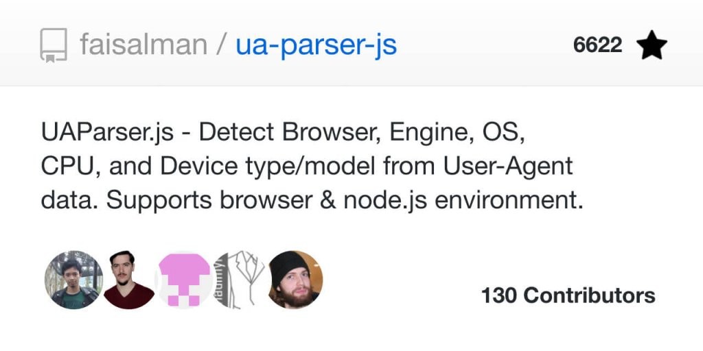
As far as complete libraries go, UAParser is the best there is. With more than 10 million weekly downloads on npm alone – UAParser is the defacto solution for detecting mobile devices. As the name gives it away – the library works by parsing User-Agent strings.
However, what makes it so popular is the fact that you can parse hundreds of device variations. And, all of it is very well documented. You can go from practical device vendors to more intricate detection patterns like CPU architecture.
mobile-detect.js
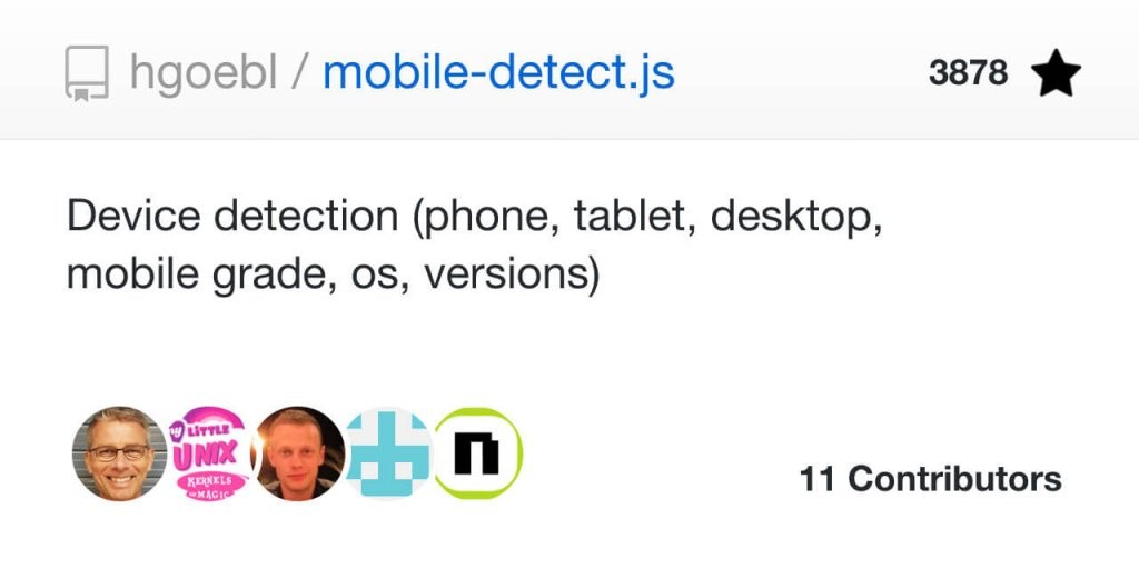
This is a fairly straightforward port of the Mobile Detect library for PHP, provided to the community by Heinrich Goebl. The library itself uses User-Agent for detection, so as we discussed earlier – not the best option.
Still, it should do the job when it comes to practical HTML templates or portfolio projects.
isMobile
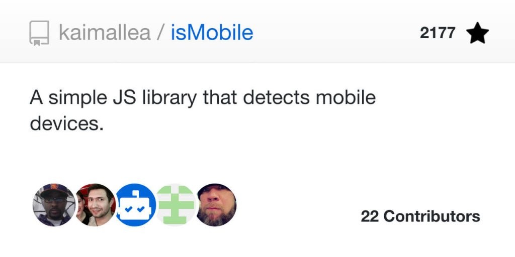
Here we have another take on the User-Agent Navigator property from Kai Mallea. While still a simplistic solution, I like that isMobile provides a variety of specifications. For example, you can test for any mobile devices or specific ones like phone or tablet.
react-device-detect
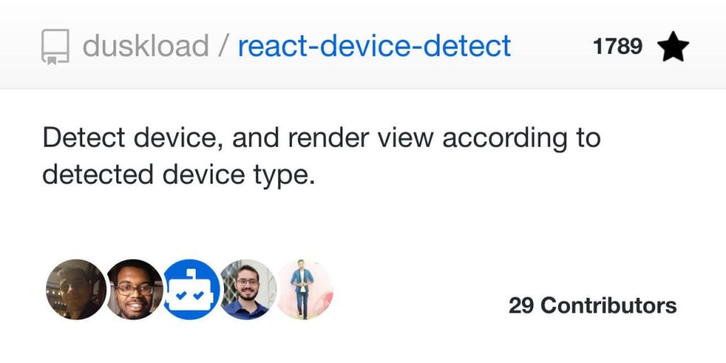
Are you a React.js developer?
Then this library from Michael Laktionov is for you. It works as you would expect – first the library detects device type, then renders the view based on that type. Works flawlessly with component integration, and can be further customized through API calls.
One interesting fact is the number of selectors this library includes. It covers devices like smart TVs, wearables, a variety of iPhone devices, and much more. This gives you a broad selection of design choices when building an app for a specific device.
Summary
In summary, mobile detection remains a critical component for modern web development, influencing not only the user experience but also the efficiency of your application. While dedicated libraries like UAParser.js offer comprehensive solutions, sometimes a more straightforward approach suffices.
The JavaScript techniques explored here—ranging from the age-old navigator.userAgent to the more sophisticated Window.matchMedia()—present an array of options tailored to various needs and project scopes.
Remember, each method has its own merits and limitations, so choosing the right one is all about understanding your project’s specific requirements. Whether you’re a seasoned developer or just starting out, these techniques and libraries provide a solid foundation for detecting mobile users, empowering you to build more responsive and adaptive digital experiences.