


React has been around for over a decade, which is crazy to think about. But, despite its age – the React library pulls in more than 14 million weekly downloads. More than 80,000 other open-source projects also depend on React to function.
A lot of those projects extend React extensively. Specifically, developers create custom elements and components that can be reused during app development. In fact, working with React is almost exclusively about components. If you want to put together an MVP or create an app layout quickly – components make the process fast and accessible.
If you want to refresh your understanding of React – check this article by Linton Ye.
Should you use a React UI component library?
React is, by nature, a library for building User Interfaces. Components in this context are pre-built UI elements you can reuse in your development process. React components (or any other framework) aim to accelerate the pace at which you build apps.
But, there are also some substantial benefits to using a component library:
- Development pace. Because the components are pre-built, you can quickly create a working prototype of what you plan your app to look like.
- Productivity. Every single component library covers design elements like forms, buttons, and sections. As such, you can skip having to design those elements yourself.
- Design familiarity. Creativity has its place, but providing a familiar design experience to your users is essential if you want to provide a frictionless experience.
- Latest standards. In particular, most modern libraries are developed to have components compliant with the latest accessibility standards.
As for the potential downside, well, in most cases, you’ll be relying on support from the developer/community. And, it’s also a bit of a learning curve to master a new library, but definitely small potatoes of a problem in the bigger picture.
What is a Design System?
React components fall into a variety of categories. You can pick and choose from “individual” components or a full-fledged UI component library. And, in many cases, these full-fledged libraries include a complete design system.
In simple terms, a design system is a complete set of components that can be used to build applications at scale. You have likely heard of Google’s Material UI, the Polaris design system from Shopify, and many others.
If anything, a design system helps to create a consistent user experience by reusing the same UI components. Fortunately, each library brings forth a unique design concept.
Simple criteria
When putting together this roundup – I followed simple criteria to ensure this list stays relevant and is up to date:
- Complete. As in, each library is fully extended and covers a vast array of UI elements.
- Accessibility. This is specific to development experience. My primary concern is that the given component library should be easy to work with from a developer’s perspective.
- Active. The library has both an active following and is frequently updated.
I also took into the account things like GitHub popularity, and general traction amongst web development tutorials, etc. If a new React component library pops up and shows promise, I’ll do my best to include it in this list eventually.
Let’s take a closer look.
Mantine
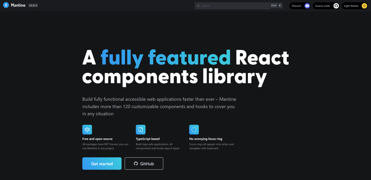
Mantine has over 120 components & 40 hooks; the documentation has framework guides for Next, Vite, Remix, Gatsby, and React. The project has over 15,500 stars on GitHub.
Mantine is an extensive UI components library that covers various elements and includes hooks for each one. Created by Vitaly Rtishchev, the library has attracted a large following since its first release in 2021. Mantine includes a native Dark Theme, and all components are available in both Light and Dark styles.
In total, there are 120+ custom components. If you’re looking for styled versions of these components, you need to visit the Mantine UI page.
The documentation covers a wide range of usage cases, including how to use Mantine with Next.js and Gatsby. The project is very much in active development. And, as some developers have said, “The documentation is unparalleled.”.
Chakra
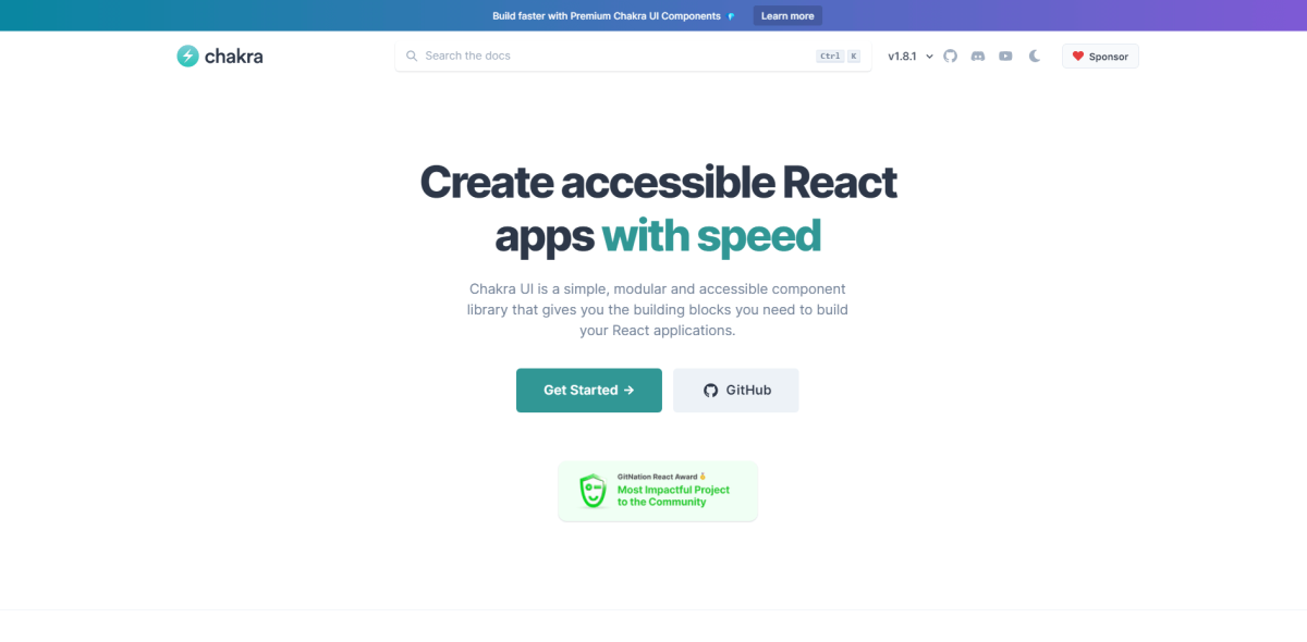
Chakra has over 60 components; the documentation has framework guides for Next, Vite, Remix, Gatsby, Meteor, and React. The project has over 29,500 stars on GitHub.
Chakra is one of the fastest-growing React UI libraries. The premise of simple and accessible components means you can start bootstrapping your apps instantly. On top of that, Chakra follows a strict design principles ethos. Each component comes with a unique style prop, meaning that you can customize component styles individually.
If comparing Chakra to more rigid component libraries, it’s evident that Chakra functions in an unopinionated environment. As such, scaling apps and interfaces becomes easier as you won’t need to depend on strict property specifications.
Other notable features include TypeScript support, accessibility through WAI-ARIA and a11y, and Styled System for prop styling.
Material UI
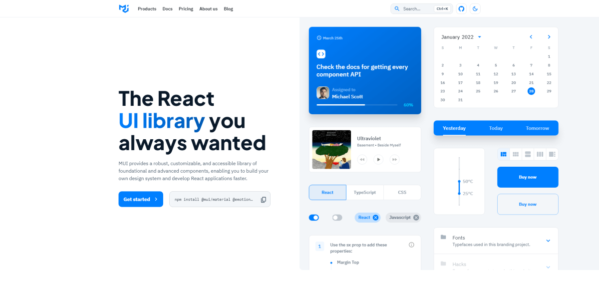
Material UI has over 100 components; the documentation has a general guide for all React-based frameworks. The project has over 82,000 stars on GitHub.
Does Material Design even need an introduction anymore? The MUI library implements the entire Google design system into an extended React library. MUI is also one of the most loved libraries in this branch. So, what makes it such a success?
First and foremost, MUI is run as a brand instead of solely an open-source project. This means that to protect their brand integrity – the components are styled to perfection. The same goes for documentation, which is not your average “here is an example” type.
The best part, though, is how many people depend on MUI. Because the project is so popular, there are countless free resources to help you get started. Landing page templates, a mockup of blog design, and portfolio styles. Think of a project; chances are someone has already published a boilerplate for something similar.
Gestalt
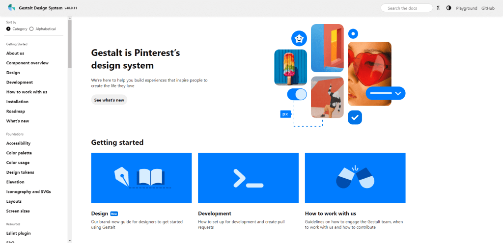
Gestalt has over 50 components; the documentation has a general guide for all React-based frameworks. The project has over 4,000 stars on GitHub.
Gestalt is “A set of React UI components that supports Pinterest’s design language”. In other words, it’s the design system used by the Pinterest developer and designer teams.
Taking a closer look, Gestalt differs from other design systems by offering a robust foundation based on modern web standards. Those standards include accessibility, persistent color options, and in-depth variable optimization.
And because Pinterest uses React in production themselves, every single component in this library has a pre-made React component readily available.
PrimeReact
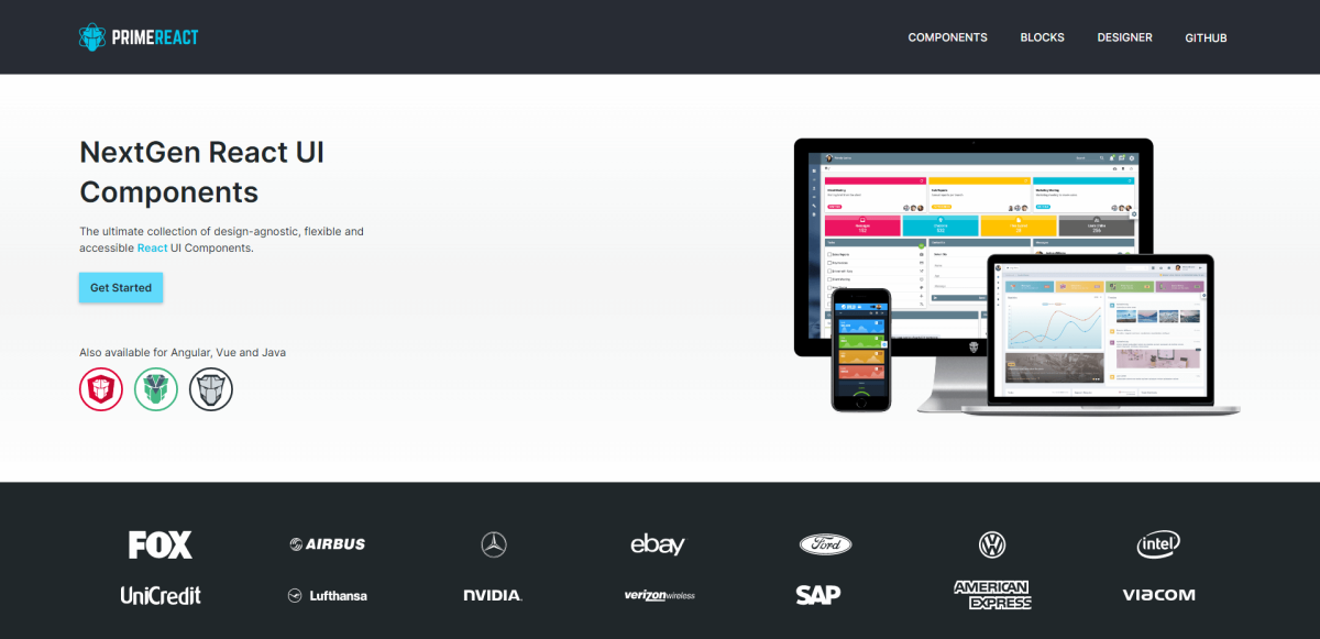
PrimeReact has over 80 components; the documentation has a general guide for all React-based frameworks. The project has over 3,300 stars on GitHub.
PrimeReact might not have the marketing budget of giants, but it is nonetheless an exceptional library. Because of its agnostic nature, PrimeReact is style-independent.
As such, you can use it with popular style guides like Tailwind, Material, Bootstrap, Arya, and others. You can choose the Base theme using their Designer feature.
The components themselves cover everything you would expect from an extensive library. Menus, a variety of panels, data tables, and a lot more. PrimeReact is part of the PrimeFaces project. This lets you quickly tap into their other resources like Themes and Blocks.
Bootstrap
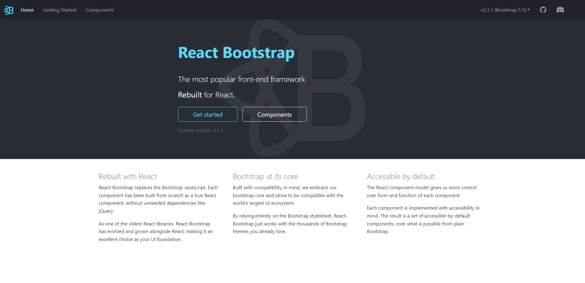
React Bootstrap has over 100 components; the documentation has a general guide for all React-based frameworks. The project has over 21,200 stars on GitHub.
Can you even call yourself a front-end developer if you have never tried Bootstrap? The all-time favorite front-end toolkit (subjective) also has a React library. And, it has been built from the ground up to be React-first. Each component has been custom designed to include Bootstrap features but is independent of jQuery.
One notable feature of this library is that it uses the Bootstrap style guide exclusively.
As such, it’s possible to use React Bootstrap with designs that are based on the original stylesheet. For example, you can take a WordPress theme based on Bootstrap, and quickly restructure it as a React-based design.
Evergreen
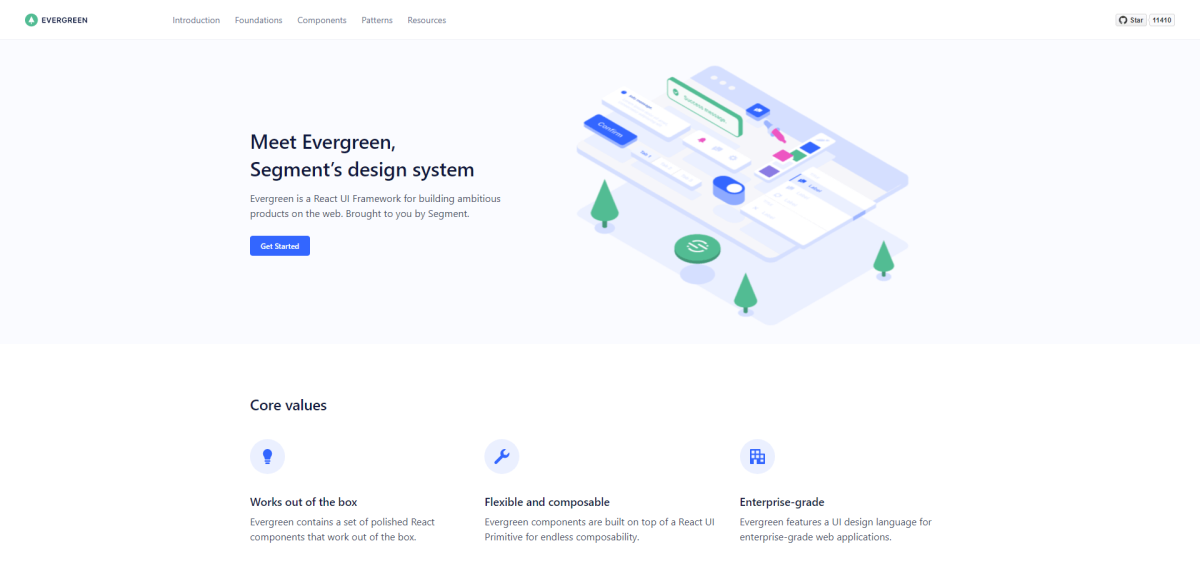
Evergreen has over 55 components; the documentation has a general guide for all React-based frameworks. The project has over 11,900 stars on GitHub.
Evergreen is the first library in this list that is also a design system. And, it is generously provided by Segment. So, if you look at Segment’s website and its product, you know that it is built on the back of Evergreen. That said, this library won’t lock you into a specific configuration or require unorthodox integration.
In their own words, “Instead of creating fixed configurations that work today, Evergreen promotes building systems that anticipate new and changing design requirements.”.
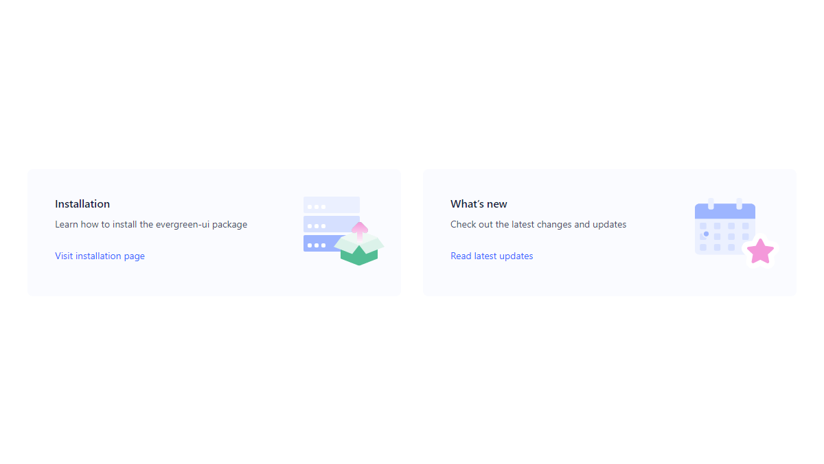
All the components are also available as a Figma file.
The library ships with 2 custom themes: classic and default. And you have the option to define custom styles for each theme or create a new one from scratch.
Arco Design
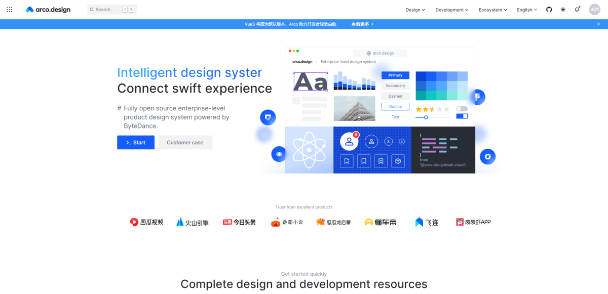
Arco Design has over 65 components; the documentation has a general guide for all React-based frameworks. The project has over 3,500 stars on GitHub.
The Chinese developer community has done some impeccable contributions to open-source. And, Arco is no exception. This enterprise-grade components library will transform the process of building modern interfaces. It’s also a design system, which ensures that your entire design foundation follows a strict routine.
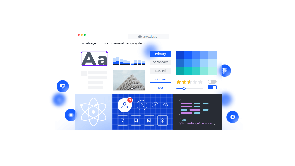
Arco stands out because of its refined design philosophy. Their design system emphasizes accessibility but also user experience. An example of this is their approach to form design.
The forms largely try to complete an action synchronously. Instead of providing an external modal, Arco specializes in real-time feedback based on user input. Their components can also be downloaded to be used within Figma and Sketch, respectively.
Geist
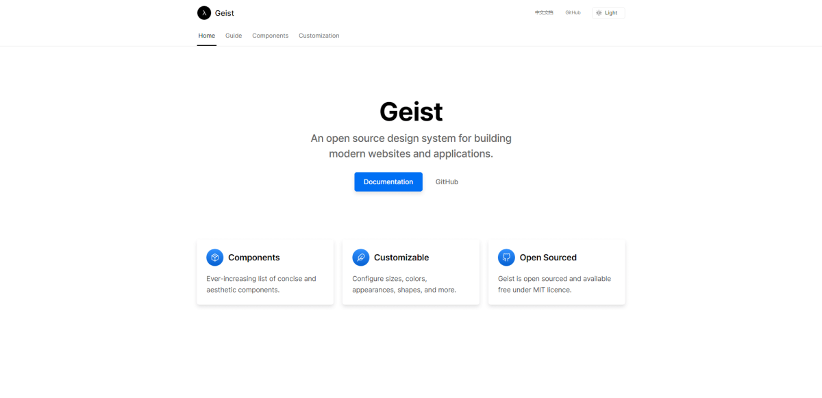
Geist has over 30 components; the documentation has a general guide for all React-based frameworks. The project has over 3,400 stars on GitHub.
Geist UI was created by forking the design system provided by Vercel. My first impression of Geist is that it’s rather minimalistic, which makes it perfect for building landing pages, and portfolio websites.
Though, evidently, it has seen use in both web applications and more intricate project deployments. In recent updates, Geist has implemented the ability to add themes.
So, if you like the structure and component variety – implementing a custom style is straightforward. You can also call custom styles for individual components.
Fluent UI
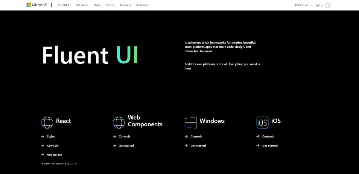
Fluent UI has over 25 components; the documentation has a general guide for all React-based frameworks. The project has over 14,200 stars on GitHub.
React is such a breakthrough technology that the entire Microsoft 365 suite is based on it.
Well, through Fluent UI, of course.
Fluent is Microsoft’s take on what a React components library should be like.
And, honestly, even though it does provide UI components, it does a lot more.
The Fluent UI Utilities package includes many Classes, Functions, and Interfaces. These will help you create rich and interactive user experiences. More than building apps, Fluent helps you build true enterprise experiences.
It’s also managed by Microsoft. So, things like reliability issues are out of the question.
Radix
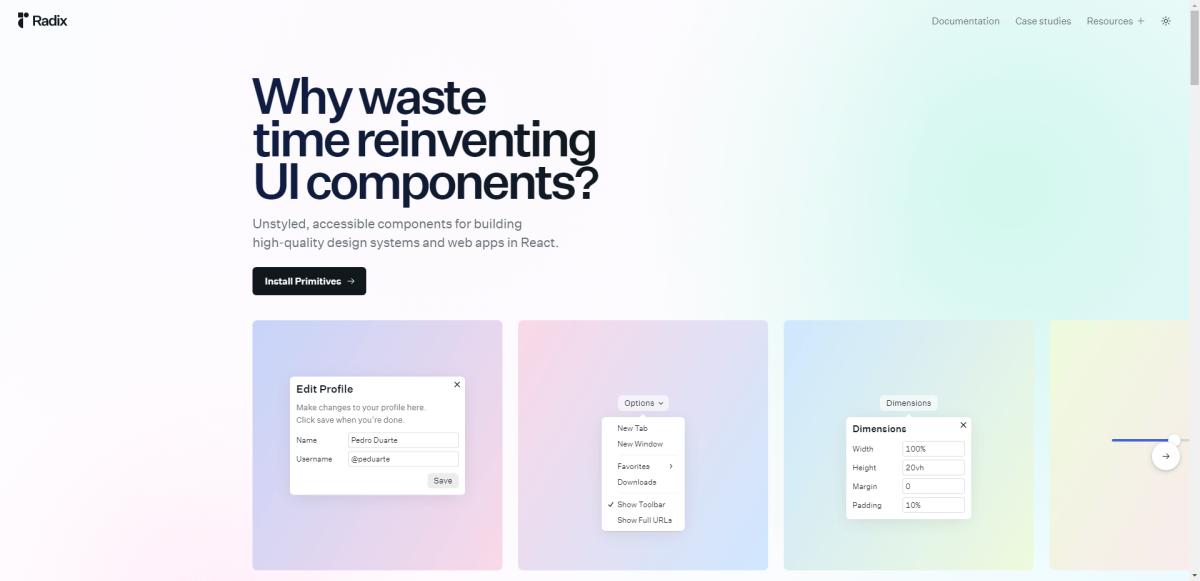
Radix has over 30 components; the documentation has a general guide for all React-based frameworks. The project has over 6,500 stars on GitHub.
One of the main attractions of any kind of component library is the style. Is it neat, geeky, or professional-looking? Does it replicate a popular web app? These are all valid questions.
Though, Radix UI specializes in a different approach.
Radix, which is a low-level components library, emphasizes accessibility and the potential for custom styling. It does so by introducing the components as a barebone base.
Because the components are shipped raw, you can dig deep into the creative freedom to style them yourself. In return, Radix provides native accessibility implementation. Further, components are designed to be granular, enabling a custom style guide integration.
Reakit
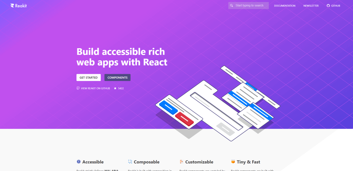
Reakit has over 20 components; the documentation has a general guide for all React-based frameworks. The project has over 6,300 stars on GitHub.
Reakit is an extensive toolkit for maintaining rich web applications. It is accessible by design and implements a bundle-style structure. This means you can use individual components, and disable others. As a result, the package size can be trunked immensely.
Important to note that Reakit does not come with a default style. This also makes it a “low-level” component library. Welcome UI – using Reakit – is one example of how you can create custom styles. Though, it shouldn’t be difficult to use with something like Tailwind.
Semi
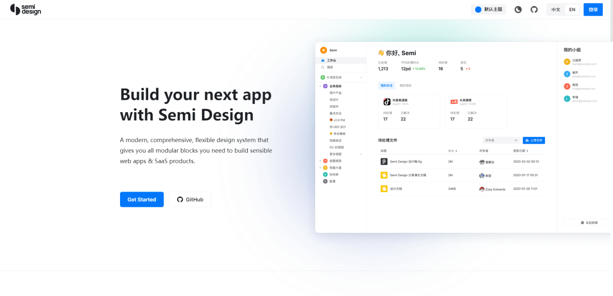
Semi has over 30 components; the documentation has a general guide for all React-based frameworks. The project has over 6,400 stars on GitHub.
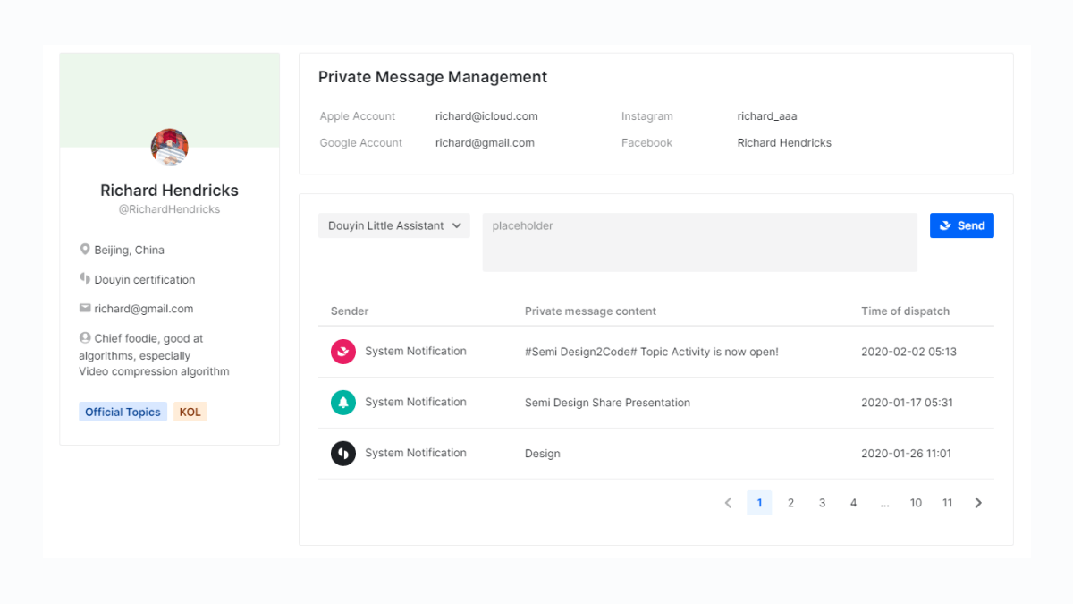
The Semi Design system powers the entire TikTok front end. It is built as an enterprise-first comprehensive UI library. Most notably, apart from the modular components, Semi also publishes its UI kit on Figma. This helps to accelerate the process of designing your apps and getting developers on board.
As for theming, Semi has a custom “do it yourself” platform built for the purpose. The goal is to accelerate the pace at which you define a system and then put it into production.
Ant Design
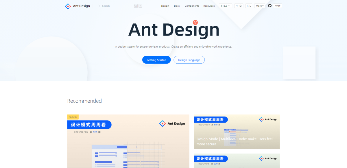
Ant Design has over 40 components; the documentation has a general guide for all React-based frameworks. The project has over 82,500 stars on GitHub.
The influence of modern and accessible from the far East is hard to overlook. Ant Design is the most popular components library on GitHub. At least for React. Not only does it provide UI components, but it’s also a design language. See details here.
One of the things that make Ant so popular is the available resources. The core team maintaining Ant has done exceptional work in this area. You can pick from pre-built templates, custom mobile experiences, or dive deep into the documentation.
Also, to minimize bloat – Ant implements a third-party structure. While their library covers many UI elements and layouts, adding additional features is best done through external libraries. A lot of such libraries already follow the Ant design specification.
React Suite
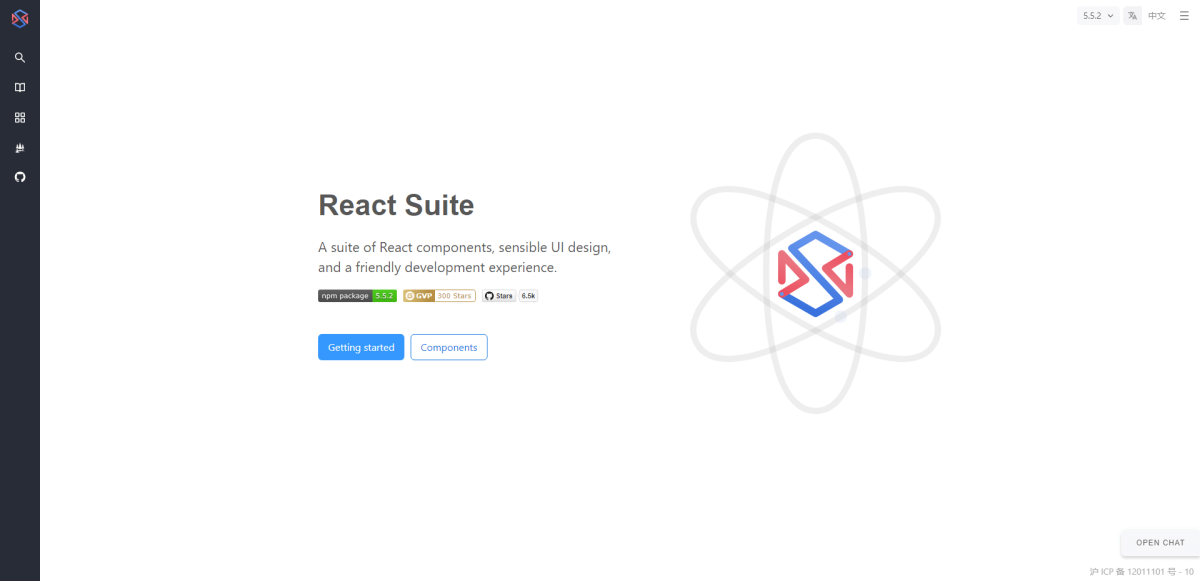
React Suite has over 45 components; the documentation has a general guide for all React-based frameworks. The project has over 7,200 stars on GitHub.
React Suite specializes in easy-to-access interactive design components. It is built specifically to be used for back-end-style projects.
However, you can implement it in any front-end workflow.
The library provides a selection of distinct themes: light, dark, and high contrast. As for custom styling – you’ll be using Less.
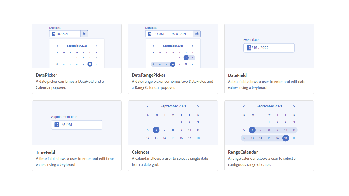
Spectrum
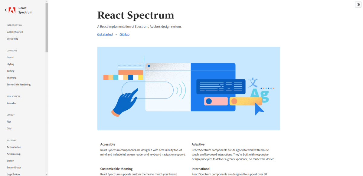
Spectrum has over 30 components; the documentation has a general guide for all React-based frameworks. The project has over 7,400 stars on GitHub.
Adobe will be inducted into the hall of fame for its contributions to design. And it is no surprise that they have made their design system Spectrum, available to the open-source community. It is the very design system Adobe uses itself.
Spectrum uses both Flex and Grid for implementing layouts. And, a number of their components are based on a custom Slots layout. These “Slots” let you style individual layouts and assign specific elements to their nested group.
Interestingly, Adobe discourages developers and designers from customizing their pre-built style. The idea is that Spectrum is already built with consistency in mind. And, rather than messing with the style – the goal should be to build seamless user experiences.
In recent news, Adobe is also working on React Aria – a collection of React Hooks that function as accessibility-first UI primitives. Ultimately, the goal for React Aria is to give you the freedom to build your own component library by implementing accessibility best practices from the get-go.
Base Web
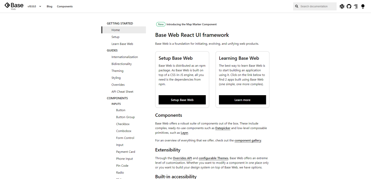
Base Web has over 50 components; the documentation has a general guide for all React-based frameworks. The project has over 8,000 stars on GitHub.
One of the main attractions of component libraries is that they have been field-tested. And in the case of Base Web – it is the design system used by Uber. Yep, the ride-sharing app.
Base specializes in customization across many applications at once. The goal is to provide a simple solution to reuse components across different development paths. So, for example, when you start work on a new design – the theming environment remains the same.
All theming with Base can be done in JavaScript, Flow, and TypeScript.
Circuit UI
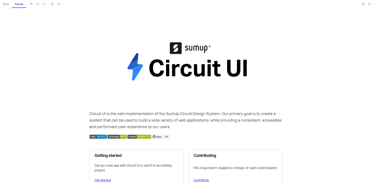
Circuit UI has over 50 components; the documentation has a general guide for all React-based frameworks. The project has over 800 stars on GitHub.
It’s great to see private sector companies like SumUp make such significant open-source contributions. Circuit UI is the design system used on the SumUp infrastructure. It is built on the back of a select few principles that ensure the best possible user experience.
Those principles include code testing before committing, full-scale accessibility, standardized naming, and more. Besides the main package, you also get access to their Design Tokens (primitives) and an Icons pack.
NextUI
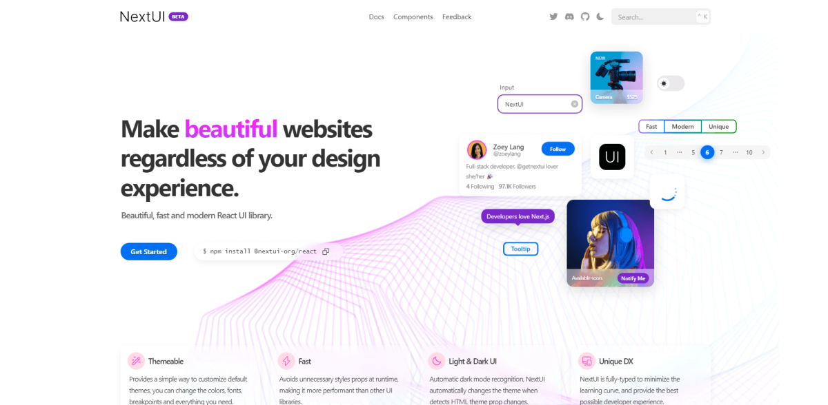
Next UI has over 40 components; the documentation has a general guide for all React-based frameworks and Next.js specifically. The project has over 8,200 stars on GitHub.
NextUI uses one of the libraries – as the base – we looked at earlier – Geist. The intricate approach to detail by NextUI enables even the least experienced designers to put together beautiful websites and apps. And, the extensive documentation does a fantastic job at explaining how to deploy your first NextUI project.
Some notable features include:
- Server-side Rendering with full cross-browser support.
- Integrated accessibility features with full WAI-ARIA compliance.
- Uses Stitches to avoid loading unnecessary CSS. Load only what you need.
And lastly, it’s becoming an extremely popular choice with Next.js users.
Tiny UI
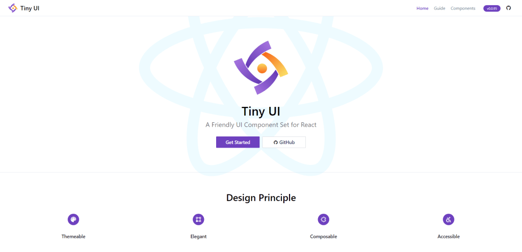
Tiny UI has over 45 components; the documentation has a general guide for all React-based frameworks. The project has over 200 stars on GitHub.
Tiny UI provides React Hook components that are written in TypeScript. The main attraction of this component library is its small size, yet customizable nature.
Specifically, you can pre-define a custom theme before starting your new project.
The components range from small layout elements to more specific stuff like feedback forms, modals, and config managers.
Component-driven web development
Thanks to all these wonderful libraries, you may now relieve yourself from ever writing CSS again! All jokes aside, there are a lot of great choices in this list.
If you ever felt swayed away from building complex design structures, these libraries will alleviate some of that uncertainty. Apart from extensive documentation, many of the aforementioned libraries have strong community backing.
As such, you can always find additional extensions and implementations.