


If we look at purely charting libraries, there are probably around 30-35 active projects on GitHub alone. And that number grows way higher if you include libraries for mapping, data grids, and 3D data visualization tools. That said, this article explicitly focuses on JavaScript charting libraries, with a few criteria points to help make this list relevant.
Those points include framework compatibility (see here for popularity), TypeScript support, and whether the library is open-source as opposed to having a proprietary license.
Before we get started, if you’re interested in animation – make sure to check out my previous article on JavaScript animation libraries. I’ll try and follow the same structure here, to provide concrete examples, but also links to additional resources and learning materials.
What is a JavaScript chart library?
A JavaScript chart library is a collection of scripts and tools written in JavaScript, purposed for the creation and management of charts and graphs within a web environment. These libraries provide a way for developers to visualize data interactively and aesthetically on a webpage, without the need for server-side rendering.
The core of these libraries consists of pre-written code which generates various types of charts – be it bar, line, pie, or more complex visualizations like heatmaps and scatter plots. By employing a JavaScript chart library, developers can save time, ensure cross-browser compatibility, and maintain a level of professionalism in presenting data, which might be cumbersome to achieve from scratch.
The choice of a JavaScript chart library can significantly impact how data is perceived by the end-user. Libraries such as Chart.js, Highcharts, or D3.js offer a range of styles and functionalities, each with their own set of advantages and trade-offs.
For instance, while Chart.js might appeal for its simplicity and ease of use, D3.js is revered for its flexibility and powerful data manipulation capabilities, albeit with a steeper learning curve. Integration is generally straightforward, with developers only needing to reference the library in their HTML, and then customizing the charts via JavaScript. Through a well-chosen chart library, conveying complex data in an understandable and visually appealing manner becomes a less daunting task.
Chart.js
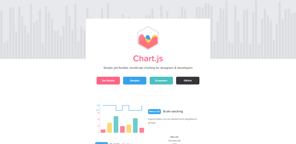
Chart.js is a practical charting library that uses HTML5’s <canvas> to render the charts.
The library is easily the top choice for simple projects, for reasons such as that it is responsive by default, and you can also apply animation effects based on user behavior.
Here are the 8 types of charts that you can create with Chart.js:
- Area Chart
- Bar Chart
- Bubble Chart
- Doughnut and Pie Charts
- Line Chart
- Mixed Chart Types
- Polar Area Chart
- Radar Chart
As far as ease of use goes, the syntax is simple, and even if you have never worked with JavaScript before, creating a new chart is straightforward.
const data = {
  labels: [
    'Red',
    'Blue',
    'Yellow'
  ],
  datasets: [{
    label: 'My First Dataset',
    data: [300, 50, 100],
    backgroundColor: [
      'rgb(255, 99, 132)',
      'rgb(54, 162, 235)',
      'rgb(255, 205, 86)'
    ],
    hoverOffset: 4
  }]
};
If you’d like to extend the charts with dynamic functions and data pooling, the library has a Plugins system that you can use to add new functionality.
Chart.js Example
See the Pen Proof of concept: Chart.js with Background Gradient by Sven (@hofmannsven) on CodePen.
D3.js
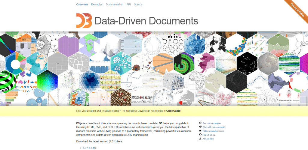
Let me start by saying that D3 is a data visualization tool rather than a traditional charting library.
D3 lets you specify a data set and bind it to the DOM, afterward you can use the libraries functions to transform that data into a unique visual representation. As for visual presentation, D3 takes advantage of HTML tables, SVG, and <canvas> for rendering the data on a page.
If you’ve ever seen one of those geo-based spinning globes with multiple interactive data points on them, chances are that presentation was built with D3. However, it works well for practical uses also, such as the basic chart you can see in the demo below. Ultimately, you’ll want to refer to the official Tutorials section for D3 to explore its more intricate capabilities.
D3.js Example
See the Pen D3 Chart + ReactJS by Web Dev (@ronaldmarin) on CodePen.
Highcharts
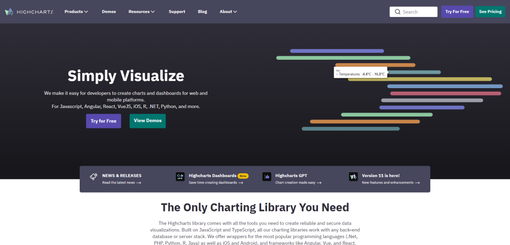
Highcharts is a widely utilized library in web development circles for rendering interactive and visually engaging charts on web pages. Created initially in 2009, this JavaScript library has carved a niche due to its straightforward API and a myriad of chart types it supports – be it line, spline, area, areaspline, column, bar, pie, scatter, angular gauges, arearange, areasplinerange, columnrange, bubble, box plot, error bars, funnel, waterfall, polar, or any other variant you could think of.
Here’s the drill-down:
- Ease of Use: Highcharts is praised for its ease of use. With a straightforward setup process, developers can get a chart up and running with just a few lines of code. The library offers a clear, well-structured API, enabling a smooth ride even for those new to charting libraries.
- Interactivity: A standout feature is its interactive capabilities. Users can easily hover over data points to view values, zoom in and out, and even drill down for more detailed information. This interactivity is not just a superficial layer; it’s woven into the fabric of Highcharts, enabling developers to create a highly interactive data visualization experience.
- Customization: Tailoring charts to match the aesthetic or branding of a project is a breeze. Highcharts offers a plethora of options for customization – colors, fonts, layouts, and much more are at the developer’s disposal. This degree of customization ensures that the visuals meld seamlessly with the rest of the project.
- Compatibility: In the realm of web development, compatibility across browsers is a requisite. Highcharts shines in this department as well, with support for older browsers like Internet Explorer 6. This backward compatibility is a strong selling point, especially when aiming to reach a broad audience.
- Export and Print: Highcharts comes with built-in export and print functionality. Users can easily export charts to PNG, JPG, PDF or SVG format, or print them directly from the web page. This feature enhances the usability and accessibility of the data represented.
- Server-side Rendering: Highcharts also supports server-side rendering, which is a boon for SEO and for users with disabilities. This feature allows the charts to be rendered on the server, which can be beneficial in many scenarios.
- Extensive Documentation and Community: The extensive documentation and an active community are the linchpins that hold the Highcharts ecosystem together. Any roadblocks? There’s a good chance someone has faced it before and there’s a solution waiting in the forums or documentation.
- Licensing: On the flip side, Highcharts is not free for commercial use. While it’s free for non-commercial, personal, or academic use, a license is required for commercial applications, which is something to consider when choosing a charting library.
Highcharts has positioned itself as a reliable, easy-to-use solution for developers in need of interactive charting capabilities. Its extensive customization options, interactive features, and broad browser compatibility make it a robust choice for data visualization tasks.
The library’s architecture allows for a modular approach, meaning you can load only the parts of the library you need, making it a flexible choice for different project requirements.
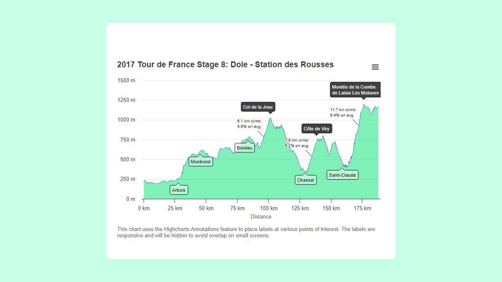
Highcharts Example
Mermaid
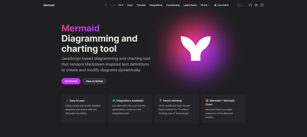
Mermaid is a potent tool that embeds itself in the arsenal of developers and writers keen on illustrating data or workflows in a visually intuitive manner. At its core, Mermaid is a JavaScript library that takes the simplicity and readability of Markdown and extends it to the realm of diagrams. With a few lines of text, one can conjure up flowcharts, sequence diagrams, class diagrams, or Gantt charts among others, right within a document.
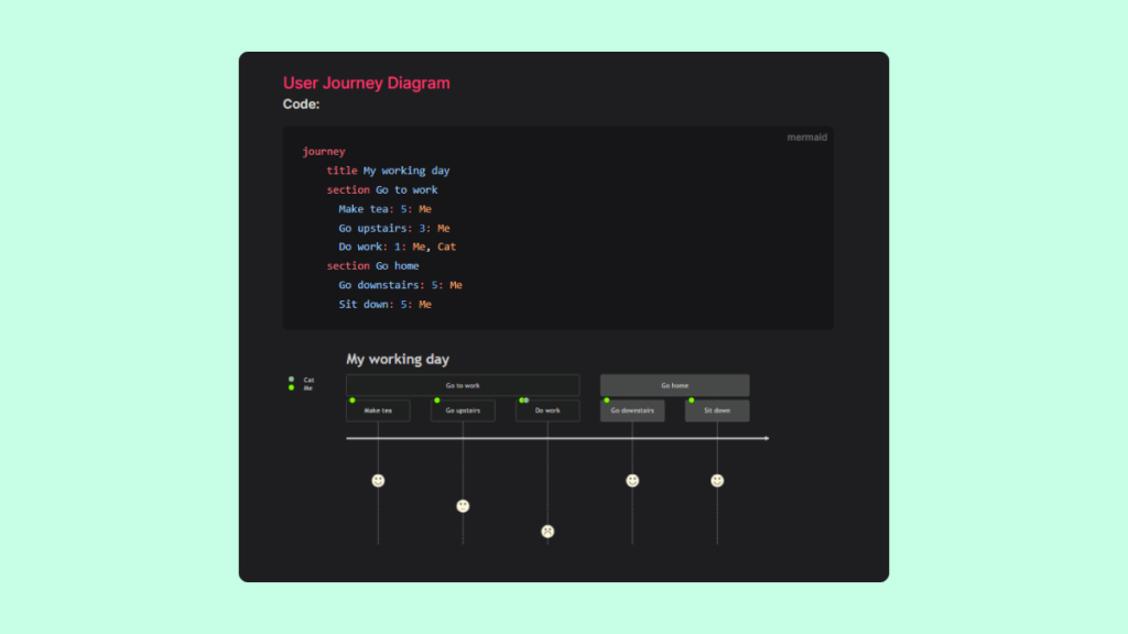
The essence of Mermaid lies in its text-to-diagram philosophy. With just a snippet of text written in a Markdown-inspired syntax, Mermaid breathes visual life into the structured textual description. This text-centric approach not only makes version control a breeze but also simplifies the diagram creation process, shunning the often cumbersome point-and-click affairs of traditional diagramming tools.
As a JavaScript library, Mermaid is versatile and finds itself at home in various environments. It can be utilized within a web browser, integrated into markdown editors, or even orchestrated alongside other developer tools to auto-generate diagrams from code or data. Its ability to render diagrams dynamically makes it an invaluable companion for documentation, presentations, or any scenario where visual depiction aids in better understanding.
Mermaid Example
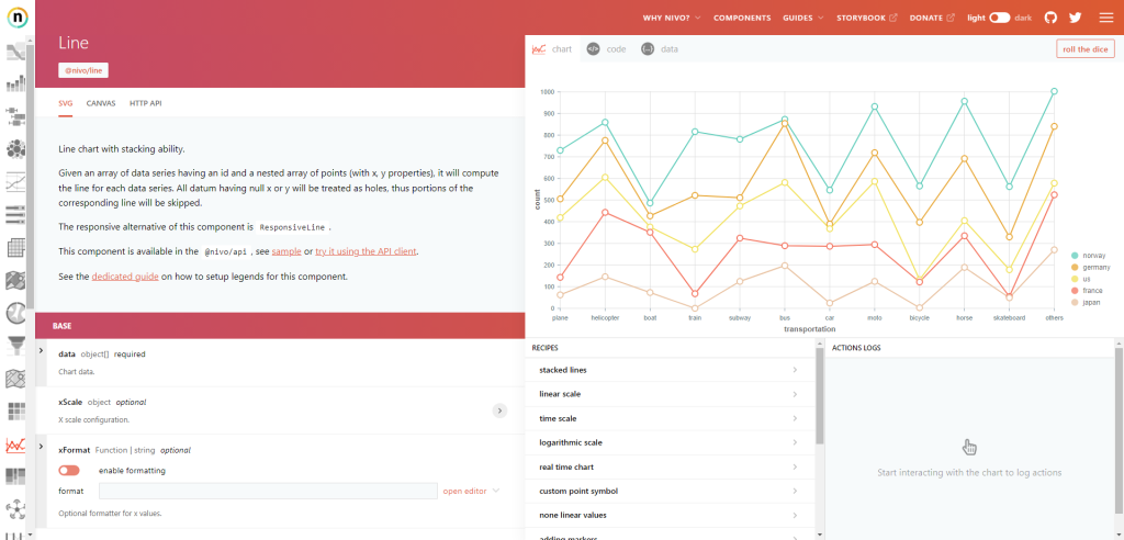
nivo
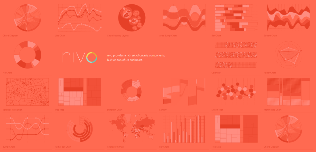
Nivo offers a comprehensive suite of data visualization components, seamlessly integrating with the robust frameworks of D3 and React. It’s a veritable toolkit for developers looking to create interactive and aesthetically pleasing visual representations of data without getting entangled in the weeds of D3’s steep learning curve.
At its core, Nivo streamlines the process of rendering charts and graphs, ensuring a smoother developer experience. It encapsulates the power of D3, abstracting away much of its complexity, while embracing the declarative nature of React. The marriage of these technologies under Nivo’s roof lends a harmonious blend of capability and ease-of-use.
With Nivo, a variety of visualizations are at your fingertips. Whether it’s bar graphs, line charts, heatmaps, or more complex hierarchical diagrams, Nivo has you covered. Each component is highly customizable with a rich set of properties, allowing you to tailor the look and feel to your liking. Moreover, it comes with a set of pre-designed themes, ensuring your visualizations are sleek right out of the box.
One of the unsung heroes in Nivo’s toolkit is its responsiveness. In a world where data consumption occurs across a myriad of device sizes, having visualizations that adapt gracefully is no longer a nicety but a necessity. Nivo’s components are built with this reality in mind, ensuring your data looks as compelling on a smartphone as it does on a desktop.
Moreover, Nivo extends a friendly hand towards accessibility, an often overlooked but crucial aspect of web development. It adheres to modern web standards ensuring your visualizations are accessible to as wide an audience as possible.
nivo Example
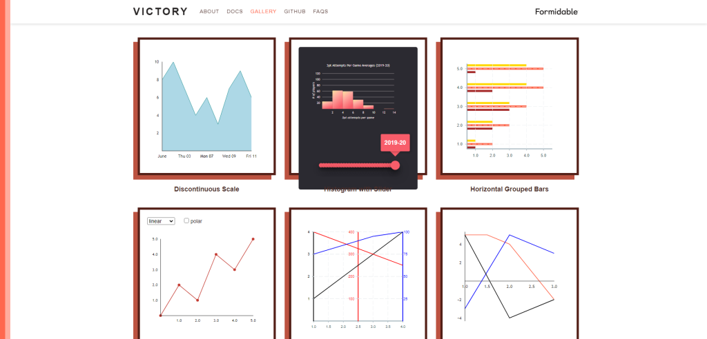
Victory
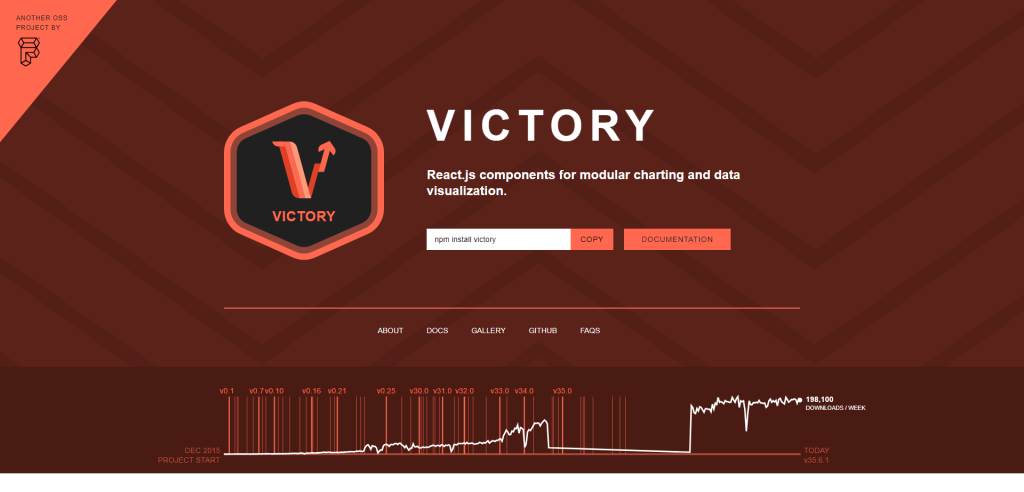
Victory is indeed a gem in the realm of data visualization. It offers a set of modular charting components tailored for React and React Native, smoothing the path for developers at the onset, while leaving room for intricate customizations. The allure of Victory doesn’t just stop at its ease of use or flexibility. It steps up the game by ensuring a seamless experience across both web and React Native applications through a unified API. This is a boon for cross-platform charting, reducing the redundancy in efforts while catering to different platforms.
Diving into its canvas, Victory empowers developers to paint unique data visualizations, with its toolkit of fully customizable styles and behaviors. This isn’t just about changing colors or fonts, but about having the reins to morph the charts to align with the narrative the data is meant to convey.
Why does this matter? In a realm where data is abundant, making sense of it, and more importantly, narrating the data story well, is crucial. Victory hands over the brush to the developers, allowing the creation of visualizations that are as unique as the data they represent. This isn’t just a technical advantage, but a narrative one. Through Victory, the data doesn’t just speak; it sings.
And how does Victory manage to offer this ease and flexibility without turning into an unwieldy beast? The modular architecture is the hero behind the scenes. It allows a pick-and-choose approach, ensuring that the developers have exactly what they need, without being bogged down by a monolithic library. This modular design is not just a nod to efficiency but a bow to the developer’s freedom to create.
Victory Example
Chartist
Chartist.js is a simple yet flexible library for rendering responsive charts in web applications. Created as a lightweight alternative to other more comprehensive charting libraries, it provides a clean and unobtrusive way to add interactive charts to web pages. The library excels in scenarios where simplicity, performance, and responsiveness are paramount, offering a modest but robust set of features.
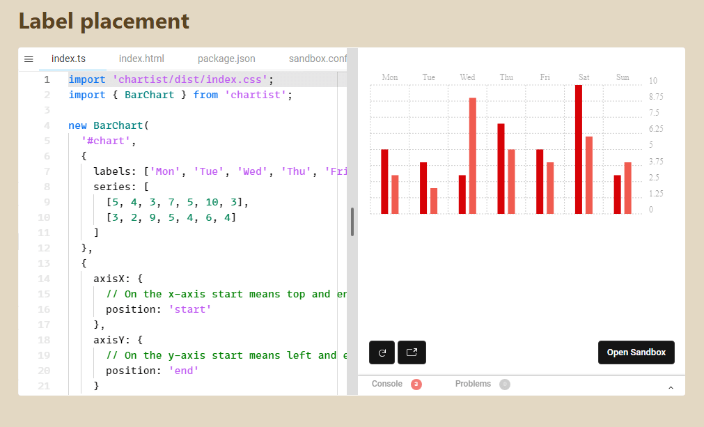
At its core, Chartist.js uses SVG (Scalable Vector Graphics) to draw charts, ensuring they remain crisp and legible regardless of the screen size. This use of SVG also enables the flexibility and customization that Chartist.js is known for. Developers can style their charts with CSS3, animate them with SVG animations, and even extend functionality with Chartist.js plugins or their own code.
Chartist.js shines when tasked with rendering basic charts like line, bar, and pie charts without the need for a heavier, more complex library. It supports responsive configurations, making it a suitable choice for modern, mobile-first web development. This is key in a time when user experience and performance can significantly impact both user engagement and search engine rankings.
However, it’s not without its limitations. Chartist.js may fall short in scenarios requiring advanced chart types, complex data visualizations, or high-level interactivity. In such cases, other libraries like D3.js or Highcharts might be more appropriate. Chartist.js strikes a balance, offering a straightforward way to create beautiful, responsive charts with a minimal footprint, yet may require developers to look elsewhere for more advanced features or functionality.
Chartist.js Example
Apache ECharts
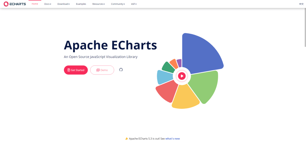
One of the reasons Apache ECharts is so popular is that you get access to hundreds of pre-made chart examples straight out of the box. You can check this out yourself by visiting the Examples directory. This page cover charts and examples in categories like lines, bars, pie charts, scatter, heatmaps, graphs, and so much more.
And, every single example has JavaScript and TypeScript code examples included. But that’s not all, there are some real-world benefits to using this library. Here are a few of them:
- Data streaming. Want to create interactive charts with millions of data points? ECharts uses WebSockets to stream data so that it can be loaded asynchronously even with extremely large data sets.
- Mobile-friendly. When users view an EChart on their mobile devices, the chart itself has been optimized to provide interactive features – zoom, panning, and SVG rendering to ensure best deliverability.
- Dynamic Data. You can feed ECharts multiple (separate) data points, and the library will automatically animated the chart to give users an interactive experience.
- Accessibility. Apache ECharts (v4.0 and up) is built to follow the WAI-ARIA guidelines.
You can also display your charts on your website using an external CDN.
Apache ECharts Example
See the Pen Apache Echart Example by Vale (@vsigno) on CodePen.
Plotly
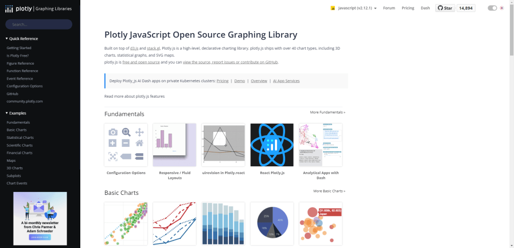
Plotly is the parent company of Dash, a low-code solution for data application deployment. And they develop their own graphing library – Plotly – on the premises.
With Plotly, you can create the most basic chart visualizations, but the library’s real power lies in the ability to produce stat-based charts, 3D data representations, and charts based on financial data.
It’s available both as a Node.js module, but also can be used directly from a CDN.
Plotly Example
See the Pen Add annotation on click event by plotly (@plotly) on CodePen.
Frappe
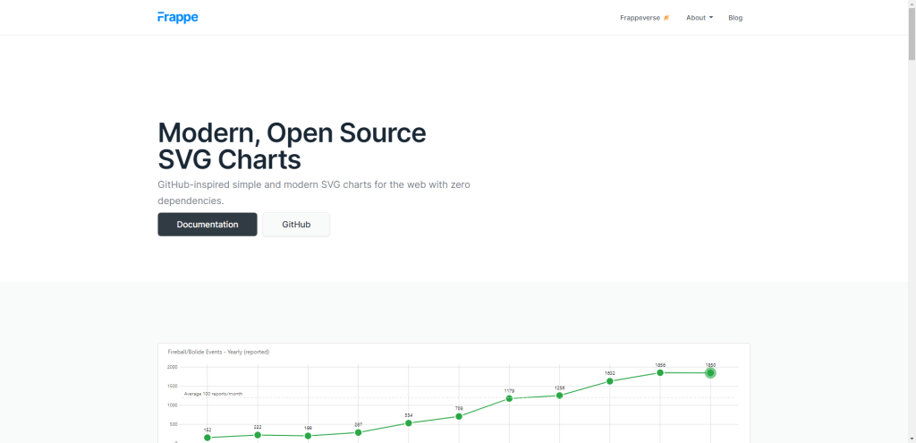
The Frappe charts library is made by the folks that created the Frappe Framework. This library is as simple as it gets. And that simplicity is a major contributing factor to the library’s popularity.
The library requires no external dependencies and can render mobile-friendly SVG charts in just a few lines of code. Here’s a code example for a basic Axis chart:
data = {
    labels: ["Sun", "Mon", "Tue", "Wed", "Thu", "Fri", "Sat", "Sun"],
    datasets: [
        { values: [18, 40, 30, 35, 8, 52, 17, -4] }
    ]
}

new frappe.Chart( "#chart", {
    data: data,
    type: 'bar',
    height: 180,
    colors: ['red']
});
And this small snippet would translate to a chart like this:
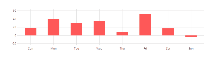
There’s also support for mixed charts (multiple charts in one), annotations, heatmaps, and an API is available if you plan to update data in real time, or export it.
Frappe Example
See the Pen Frappe Hello World by Jang Rush (@weakish) on CodePen.
ApexCharts
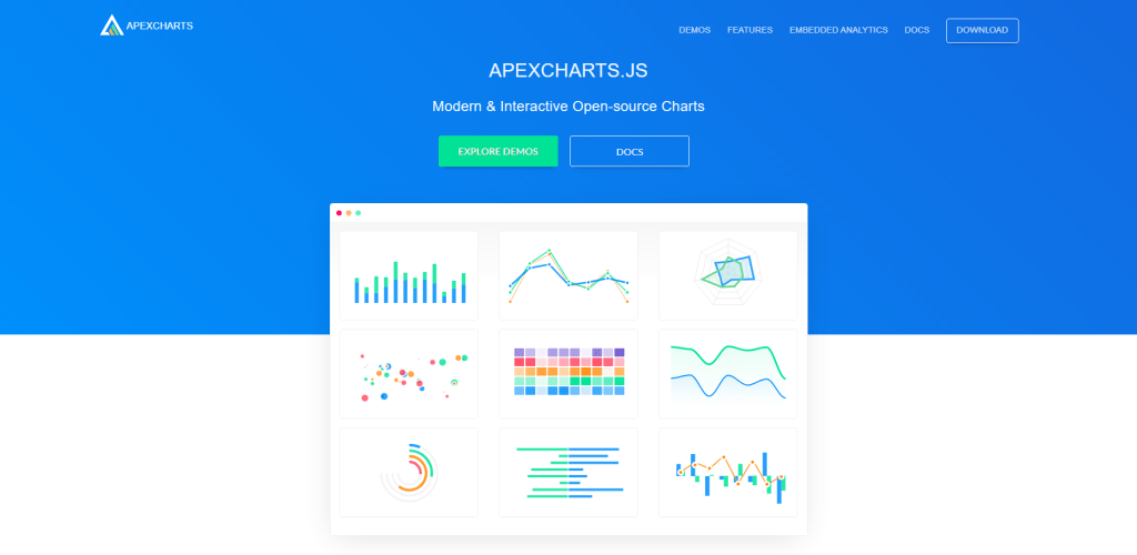
ApexCharts is very much a traditional charting library. The main difference between ApexCharts and Frappe (for example) is that ApexCharts provides slightly more demos. But, also, offers native support for popular frameworks such as React, Vue, and Angular. This also means that all the demo charts have their respective samples written in the syntax of the said frameworks.
As for features, all charts are generated in SVG format and are mobile-friendly by default. You can also take advantage of features like smooth animations, and annotations, and customize your chart theme palette by picking one of the 10 sample styles.
ApexCharts Example
See the Pen Realtime Dashboard by ApexCharts (@apexcharts) on CodePen.
roughViz
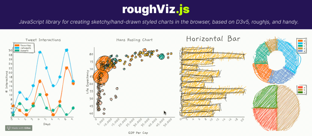
The roughViz library from Jared Wilber is a combination of 3 different libraries: D3.js, Rough.js, and handy – a hand-drawn sketch processor. As you can tell from the example screenshot above, this isn’t your typical charting library. roughViz is built entirely with the purpose to help you create hand-drawn, sketch-style charts using JavaScript.
This type of library will make a great addition to personal projects, in other words – projects that require a more creative spark than the traditional professional-style approach. And the syntax itself is as simple as it could be, very much in line with the likes of Frappe and ApexCharts.
You can see that for yourself in the demo below.
roughViz Example
See the Pen RoughViz Demo by Danny Englishby (@DanEnglishby) on CodePen.
Lightweight Charts
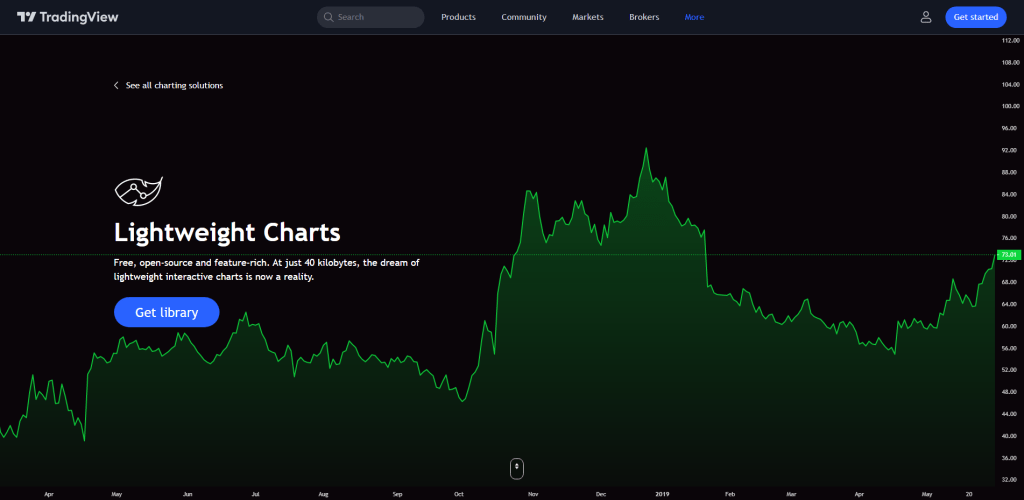
If you’re working on a finance-related project (or cryptocurrency for that matter), it’s quite clear that many of the previously mentioned chart libraries just won’t cut it. As such, here is Lightweight Charts – a charting library built specifically for displaying finance-based charts and graphs.
Not only is this library open-source and lightweight, but it also packs all the necessary features that would be required for displaying chart data about finances and their dynamic structure.
One of those features is data streaming, which lets you pass real-time data to your canvas and then have it updated without the user needing to refresh the page. And another factor you may be considering is performance, which should be a non-issue as explained on this library’s homepage,
“Our charting solutions were engineered from the start to work with huge data arrays. Charts stay responsive and nimble even with thousands of bars even with updates multiple times per second with new ticks.”
Check out the demo below to get a feel for it, but also many of the chart options and features.
Lightweight Charts Example
See the Pen tradingview advanced chart by truong (@truong160196) on CodePen.
Billboard
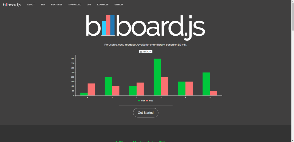
Billboard is an interface chart library based on D3. It has all the modern features you’d expect – SVG rendering, touch support for mobile devices, a simple interface, and great API documentation.
However, my favorite feature, and arguably for many others also is that Billboard provides over 230 examples of the charts you can create with this library. These examples are divided into chart categories like Basic, Axis, Data, Grid, Interaction, Region, and many others.
This means that you can not only find the correct chart type for your project and its requirements, but you can also explore other options and see if a particular example captures your attention.
Billboard.js Example
See the Pen Chart Requests – Billboard.js by DTCC (@dtcc) on CodePen.
Perspective
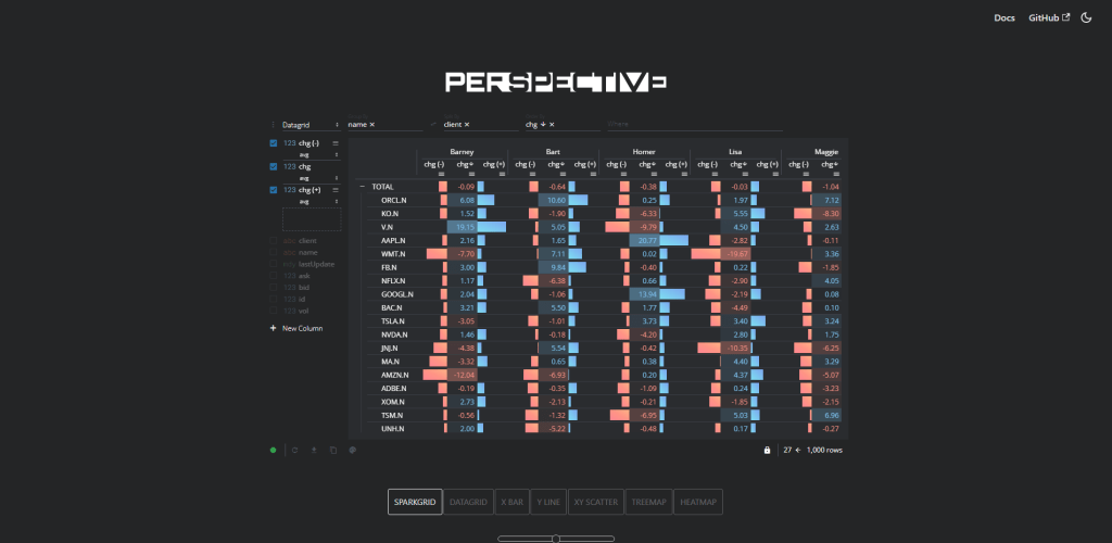
Perspective is one of the projects that FINOS (Open-Source Fintech) operates, and FINOS itself is also part of the Linux Foundation. Much like Lightweight Charts – Perspective.js is oriented around providing chart solutions for finance-based projects. However, it is capable of much more than that and sees frequent use in projects related to eCommerce, data grids, and shipment segmentation.
If you’ve ever seen charts about Covid-19, Airports, and major sporting events like the Olympics, there’s a good chance the interface and data stream integration was done with Perspective. It has a rich User Interface, optimized for data streams and complex real-time analysis.
It’s available for JavaScript and Python developers and uses Custom Elements Web Component.
Toast UI Chart
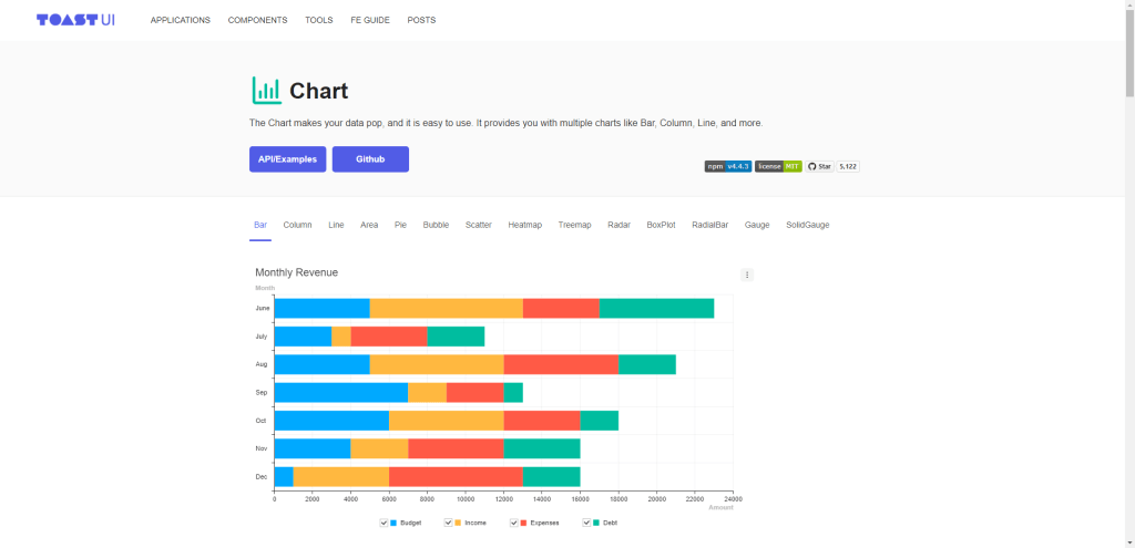
If anything, the Toast UI charting library is yet another choice to consider as far as chart styles and their design goes. The functionality here is very similar to libraries we’ve already looked at.
I think the area in which Toast UI differs from other choices is its API specification. It’s probably one of the better APIs you can get your hands on, and it comes with complimentary in-depth documentation. One of the API features is Instances, a way for you to dynamically change chart data either because your data source has changed, or because of user input.
The chart types that Toast supports include bars, columns, lines, areas, bubbles, treemaps, radars, radial bars, and others. The preferred way to use this library is through npm, but a CDN is available, and all you have to do is specify a div id="chart" container for where you want the chart displayed.
Recharts
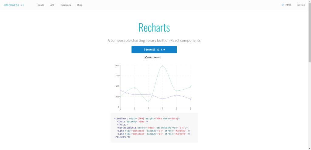
If you’re working primarily with React.js, the Recharts library is built on top of D3.js with React. It respects the native React.js component architecture, and charts created with Recharts can be decoupled and reused as individual components on the pages you require.
All the chart examples have their component structure pre-written in case you want to try them in an existing project. The library was first released in 2016 but is still in active development.
Recharts Example
Summary
In wrapping up, the arsenal of JavaScript chart libraries furnishes developers with a rich palette of options to depict data in a visually compelling and intelligible manner. Among the 18 libraries dissected, each has its unique strengths, be it the sheer aesthetic appeal, ease of use, or robust functionality.
Libraries such as Chart.js and D3.js have emerged as prevalent choices, owing to their expansive feature sets and vibrant community support. However, newcomers like Frappe Charts are also carving a niche with their simplistic yet powerful approach. The choice of a library could very well hinge on the specific needs of a project – a more complex dataset might call for a library with advanced analytics capabilities, while a straightforward data visualization could be aptly handled by a more basic library.
The landscape of JavaScript chart libraries is both dynamic and expansive, offering a fertile ground for developers to not only portray data effectively but to also experiment and innovate in how information is visualized and interpreted. As data continues to burgeon in importance and volume, having a reliable and capable charting library is becoming less of a luxury and more of a necessity for web developers.