

Getting the colors of your design project just right is no small feat. You’re probably familiar with all the online tools that help you generate a “color scheme” from a single color. You know, enter one color and get four matching colors back kind of thing.
But as the folks from Tailwind Labs pointed out in their Refactoring UI article, this isn’t always practical in everyday design work. Not unless you want your final design to look like this:
At first glance, it doesn’t look so bad, right? There’s decent whitespace balance for everything, except that the text is extremely difficult to read. In fact, the contrast ratio for text elements is way out of the range of what it should be to meet modern requirements, particularly for accessibility.
Interested to learn more about color contrast and accessibility?
Check out this article published on web.dev by Rachel Andrew and Rob Dodson. Additionally, check this guide on how to validate the contrast ratio directly from your browser.
Generating a color palette with a live preview
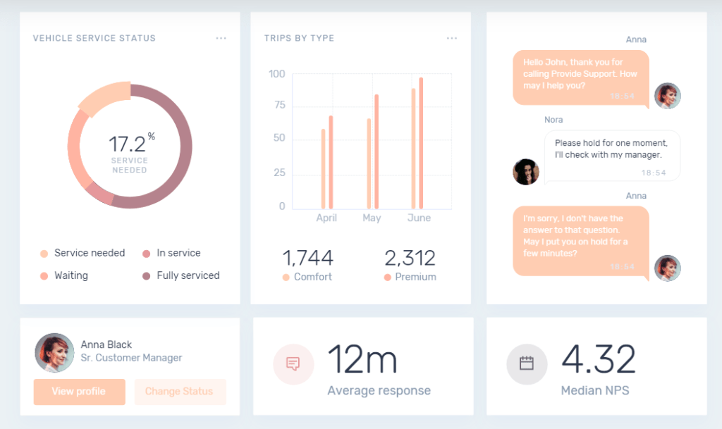
Another “pain point” with many of these standalone generators is that they don’t provide a direct example of what those colors will look like on a real design. So, ultimately, you’re stuck with having to go back and forth and check the final composition between multiple tools or pages.
For this article, I will focus on color palette tools that let you preview the color palette in a real example design. Many of these tools have been created to meet industry-standard design principles, color matching, and contrast ratio requirements.
I’ll also talk about some “non-conventional” generators and explain my reasoning for including them in this article below each one. Having said that, I think it’s time to look at all the options to generate or create a color palette from scratch and see what it would look like in an actual design.
Happy Hues
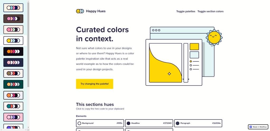
Happy Hues was built by Mackenzie Child back in 2019, but to this day, it is one of the first sites I go to whenever I’m starting a new project from scratch. The reason I love this tool so much is its simplicity.
Once you pick a palette on the sidebar, the site refreshes using the palette you picked, and you have a fresh design with 5 unique sections. For each section, you get the addition of “This section’s hues” – which is the combination of colors used for that specific section. Click on any color to copy it.
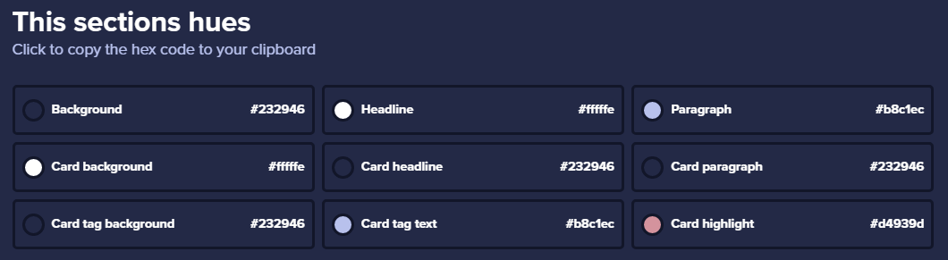
There is, however, one downside. And the downside is that you can’t specify your own colors.
This is because the site was built with Webflow. So, no way to add external libraries that provide color toggle. That said, there are 18 palettes you can choose from, and altogether it comes out as 90 different color schemes considering that each section has its own design.
I highly recommend Happy Hues to anyone just starting out with web design. Make sure you read the information presented in all the sections, too. Mackenzie has populated those sections with many interesting and useful design information.
Huemint
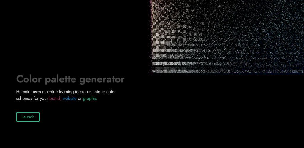
If you’ve never heard of Huemint before – you’re in for a treat. This absolute banger of a tool uses Machine Learning to power its color-generating capabilities. And the amount of features you get is exceptional, especially for a free-to-use tool.
Interested to learn more? Make sure you read the About Huemint page to understand how the software works, and the model it uses to generate the color palettes.
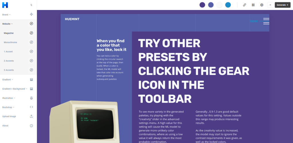
Once you launch the tool, you’ll get access to its main dashboard. To begin using Huemint, you first need to select one of the concepts on the left-hand sidebar. These “concepts” refer to design projects such as Branding, Websites, but also Websites with Illustrations or Gradients. It is as much of a tool for generating color palettes for websites as it is for real-world product launches.
After you have selected your concept, you can start using the Generate button on the top-right corner of the dashboard. All the concepts have separate designs and examples so that you get the most realistic example of what those colors look like in the final design.
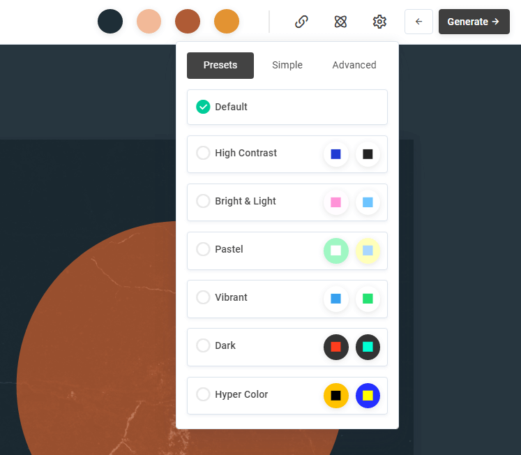
You also get a few other options, including the ability to lock in specific colors and regenerate the palette, but also apply custom Presets. The presets can be accessed by clicking on the gear icon next to the generate button. And you can even do things like extract colors from images, and then lock those colors in and generate various color scheme previews.
couleur
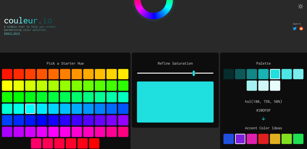
Couleur is a tool that focuses on creating harmonizing color palettes. And the author’s description does a pretty good job of explaining what that means:
This tool makes use HSL color values in CSS to create a palette based on a selected starter hue, a value between 0 (red) and 360 (red again) and a selected saturation level (a value between 0% and 100%). A palette of 10 color swatches is then created using varying lightness levels on the selected hue and saturation. This makes for a palette of colors that are harmonized and work well together since they all share the same hue and saturation.
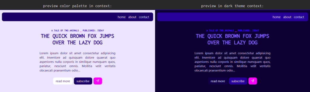
Once you find your perfect color, then select the matching accent; you’ll get a preview of what those colors look like in both Light and Dark mode design examples.
And when you’re happy with a particular result, you can copy the CSS variables that were used to make your design directly to the clipboard.
Muzli Colors
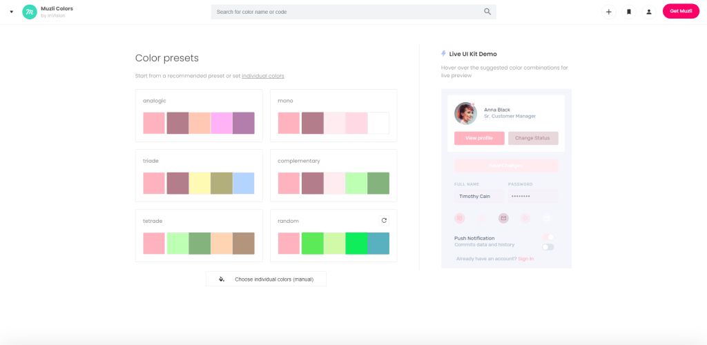
I’ve been talking about Muzli a lot recently, but I have to give them some credit in this article also, as they do maintain their own tool for generating color schemes.
Muzli Colors lets you select an initial color that you’re going for, and will then generate custom color presents in categories such as analogic, mono, triade, complementary, and tetrade. You can also select the Random preset and then regenerate the color choices. Each time you do (select a preset or generate a new one) – Muzli will apply that color palette to a Live UI Kit example.
You can pick from 2 different UI kits to test your colors on. Additional features include selecting Shades for the colors you have picked. You can then either copy the link to the palette you’ve created or download your set of colors as an SVG file.
Coolors
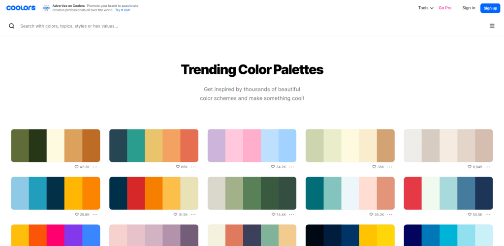
Coolors is one of those “five for one” projects I discussed at the start of the article. But, I don’t necessarily want to talk about their color scheme generator. Instead, I often refer to Coolors because of their trending color palettes pages. This page has hundreds of popular and trendy color palettes which you can start using right away. They also have a superb search function for this.
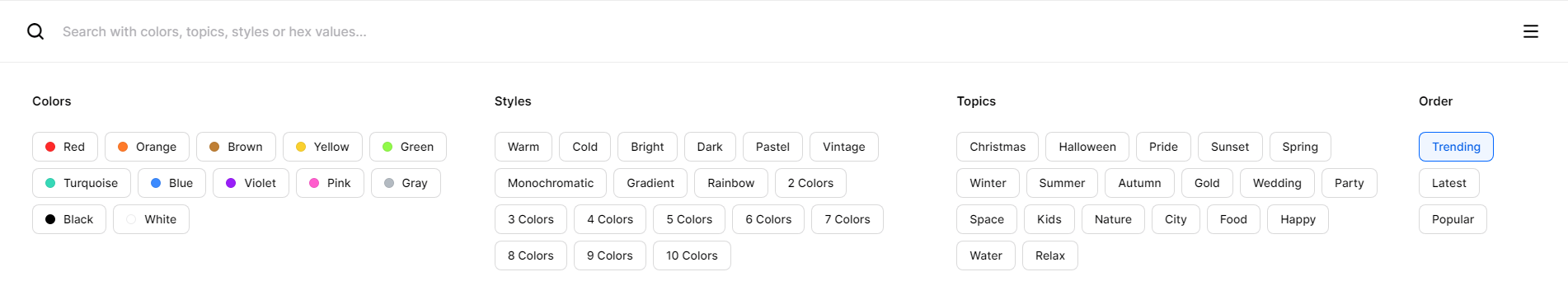
If you click on the search form – you’ll get additional options for filtering your palettes, including by categories like colors, styles, and specific topics.
You can use pretty much all of the Coolors features for free, but if you want to save specific palettes for reference, you’ll need to create an account. That said, all of the palettes shown on their trending page can also be directly exported. It is possible to do so as raw CSS code, but also in formats like images (PNG and SVG), as well as JSON arrays (nice!) and XML strings.
pppalette
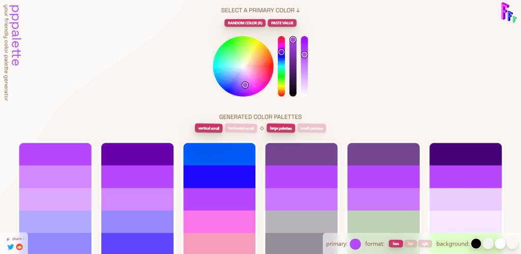
We already looked at one of Seb’s tools in this article (couleur), and this is another project of his to provide the means to generate cohesive color palettes. The idea is that you pick a color, and then blend or mix that color with all the other colors inside the palette.
This results in a color scheme that emphasizes color familiarity. If you’d like to learn more about this approach, make sure you scroll down below all the color palettes to read the full explanation provided by the tool’s author. It’s way too detailed to mention it here properly.
Accessible Palette
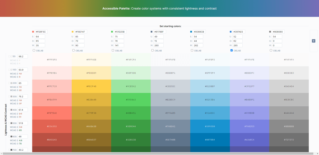
Accessibility is everywhere! Over the last couple of years, accessibility has become one of the pillars upon which new designs and their respective systems get built. The Accessible Palette tool was built by Eugene Fedorenko on the principle of fighting back against HSL usage in color systems.
Interested in learning about accessible colors? Here are my top 3 picks
This tool goes hand in hand with everything we’ve explored so far. Once your color palette is chosen, you can send those colors to Accessible Palette to get recommendations.
Gradient Generator
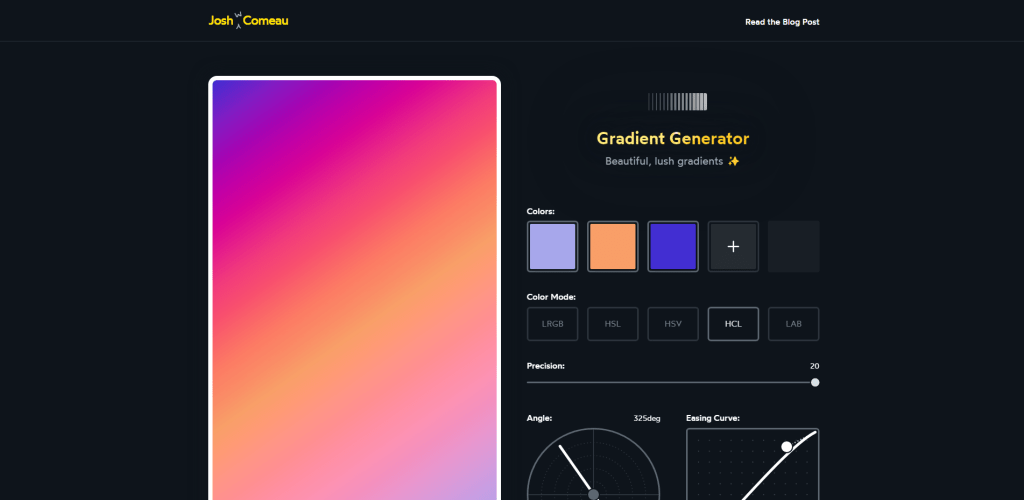
If you haven’t been following Josh W Comeau – you totally should be! He writes some of the best front-end content and occasionally releases fantastic tools. If you’d like to read it, here is the link to the backstory about how this gradient generator was made.
As to including it in this article – I’ve done so because gradients are extremely popular as far as the current web design trends go. And if you’re going to be using gradients, why not make them perfect?
Ideally, you’ll have found your color palette from any one of the tools we’ve already covered. As such, once you have your colors – you can use Josh’s tool to generate matching gradients and customize them to your liking. It’s also a nice tool to have bookmarked anyway.
Alwane
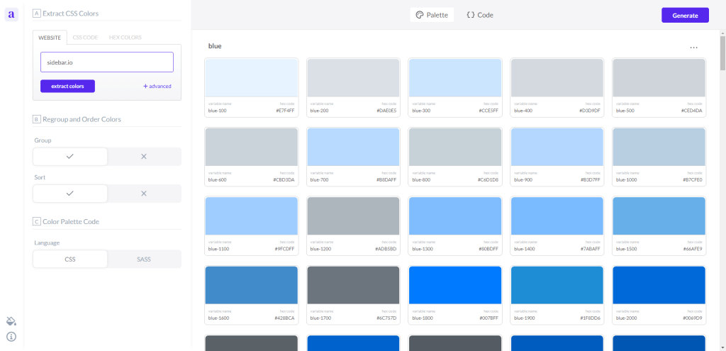
If you like a specific website’s color scheme, but are unsure how to copy its entire color catalog , the Alwane tool is a great way to do it. This tool can extract all CSS colors used on any website/page. This includes accents.
The color palette code is available in CSS (variables) and SCSS format.
Picular
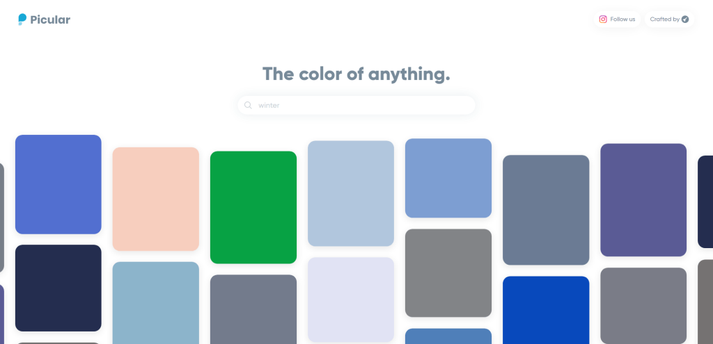
So, now that you know about so many great tools – it’s time to put them to the test by creating at least a few color palettes of your own. And if you’re unsure where to start – I recommend giving Picular a whirl. This nifty tool can interpret any object, scenery, or concept and convert it into colors.
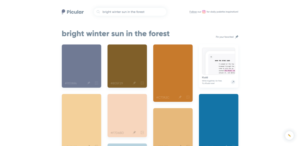
And to be honest, it’s also a fun way to design. Rather than going the traditional route of selecting an initial color, you could choose the initial theme instead. Perhaps Picular is more of a novelty project than a tool to make a part of your daily workflow.
Not sure where to start? See what others are doing.
It’s fun and exciting to work on a color scheme from scratch, adding colors and styles that match your preference and your creative drive. But when I feel like my inspiration isn’t quite there, I generally look at what other designers are doing.
One of the best ways to do that is to check web design inspiration sites and galleries. And I have previously written about the most popular inspiration sites – check the article here.
Not only are those sites great for seeing what is possible as far as web development goes, but it’s also a great way to explore exciting color schemes, composition, and general design flow. As I’m sure you’re already aware – colors are only half the battle; you have to get typography right, too.