

When someone mentions the phrase CSS frameworks, for a lot of people, the first thing that comes to mind is Bootstrap, Tailwind CSS, or Semantic UI. Fair enough. They are all incredible frameworks for building complex and in-depth layout structures.
But, generally speaking, such frameworks are intended for projects where the design transpires across multiple pages. For a simple project – portfolio, blog, resume pages – a framework that has a bundle size of 50kb+ seems a bit overkill.
Why choose a minimal CSS framework?
I think one of the trends happening in modern web dev right now is that developers simply don’t care about the page size of their final designs. The average size for a webpage today is around 2.5Mb once all the JavaScript has finished rendering. It’s a bit crazy, to say the least. Update: The new Almanac report shows that this number has kept rising from 2021 to 2022.
For me, a lightweight CSS framework gives me the tools to create my main containers, assign a few elements to them, and then I can focus on custom styling if I need it. I don’t need to get caught up with rules and design options that I will never use in practice.
And as I said earlier, bundle size for modern frameworks can be absurdly high.
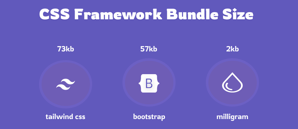
This bundle size example is relevant in the context of fetching the framework directly through a CDN. It is typically possible to reduce the size of the bigger frameworks to something much more modest. But, out of the box, a framework like Tailwind CSS or Bootstrap is not intended to be minimal or lightweight by default.
In fact, Tailwind CSS’s uncompressed bundle size is 3.5Mb!
The main advantages of lightweight frameworks
Apart from direct improvements in performance, what are some other reasons to use smaller CSS frameworks? Personally, I love the idea of using a framework that gives me quick access to pre-defined layouts and additional style components. All without requiring me to do code gymnastics to get the design working across multiple devices.
Additionally, a smaller framework has a much more forgiving learning curve. In particular, if you’re just starting out with styling things yourself – a lightweight framework helps you to understand how the design comes together on a barebones level.
And not needing to depend on JavaScript goes a long way, too. Last, but not least, it’s a lot easier to add custom CSS to a small framework base because of no class interference. When you don’t have a thousand different classes depending on one another, it’s much easier to add custom CSS snippets you find in tutorials or on sites like CodePen.
Let’s get cracking, then.
Pure
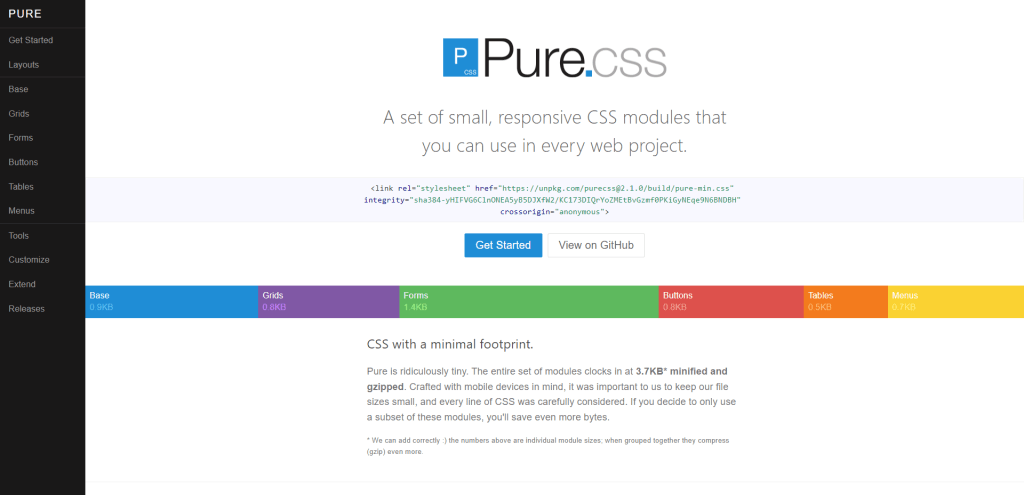
The mission statement for the Pure.css library is lovely, “Include only the absolutely necessary configuration to reduce cascading overhead.”. In practice, this converts to syntax that is both easy to understand, but also easy to style yourself. As a mobile-first library – it is an absolute delight to work with. And, has extensive availability of pre-made media queries.
If you look at the Layouts section in the docs. The examples provided there showcase how you can build a functional blog layout in just 100 lines of HTML.
And, because of the modular nature – the responsive grid included makes the design mobile-friendly out of the box. It’s a great starter framework for anyone getting into CSS.
Chota
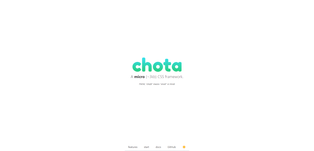
Jenil Gogari has done quite a few notable open-source contributions. And the micro-framework Chota is no exception. Not only is it lightweight, but also doesn’t use preprocessors so it’s very simple to get started with. Additionally, I love that Chota implements :root variables to define the overall design scheme.
Of course, variables have been around for a while now. However, older CSS frameworks that haven’t been updated in 2-3 years just haven’t got them implemented by default. So, in that context, using Chota feels really good if you’re already familiar with the concept.
In terms of styling, Chota stands out with its intricate grid layout. Columns are tagged separately (12 in total), letting you bootstrap a multi-layered design in minutes.
Picnic
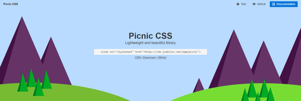
Picnic has everything you’d need from a CSS framework but in a compact size! The library is written using the SCSS preprocessor and is by default based on variables. Furthermore, the modular nature means you can pick and choose the layout elements you need.
And, of course, because Picnic employs placeholder classes – you have complete freedom to style it yourself. With a little over 3,500 stars on GitHub – it’s the go-to minimal framework for personal projects and simple layouts.
Skelet
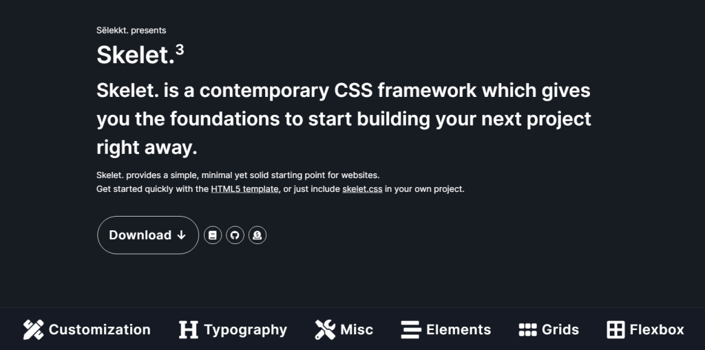
Skelet (not to be confused with Skeleton) is a building-blocks CSS framework with an emphasis on specific modules. It’s also written entirely in modern CSS, utilizing variables, fluid typography, and data types to substitute the use of JavaScript.
As the author implies, it is a fully functional framework ready to be used in production.
Notable features include in-built animations, both Flexbox and Grid, and also a demo of nearly a dozen custom layouts. If you’re into WordPress, the author has built a separate boilerplate template for structuring a theme based on this framework.
Milligram
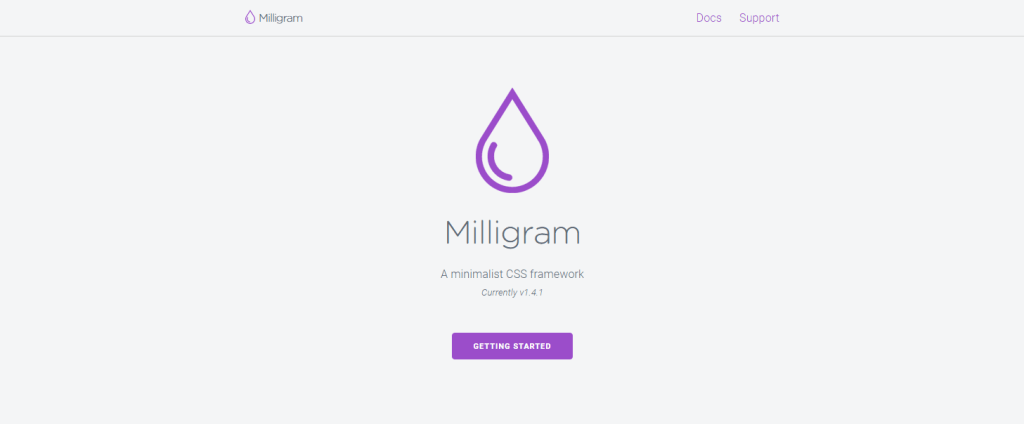
It seems that CJ Patoilo (the author) is caught up with life since his GitHub profile is looking a little bleak for the last 2 years. However, because Milligram is a complete framework – it is more than functional and usable for rapid layout prototyping.
More importantly, it is only 2kb when fully compressed.
Though, you might be wondering, “What do I even get for only 2kb?!”. And the answer is – pretty much everything you need to design a personal website. Grid is included, as are elements like headings, forms, tables, floats, and ways to display code syntax.
Spectre
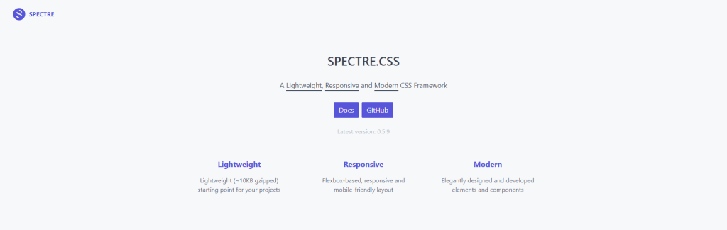
Yan Zhu, the author of Spectre, has done some incredible contributions to the CSS community. And the Spectre framework is one of his best works, too. Despite having been around for years, Spectre manages to pull in around 1,000 daily downloads on npm.
So, what is the framework all about? It is based on the concept of being a lightweight design base, with a focus on using Flexbox for responsiveness. Unlike similar barebones solutions, Spectre components are custom-designed to provide a sense of personality to the design.
And with the number of components available, you can go ahead and use Spectre to build anything from landing pages to application interfaces. Check out the docs for a live demo!
Mustard UI
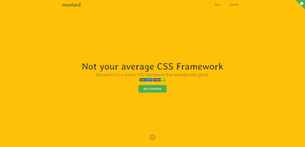
Not all frameworks are built to overcome difficult problems. In fact, while Mustard UI is a lightweight library, it’s more about the design style it provides.
The goal is to have a solid (modular) starting base that can be used to prototype clean layouts. That is also how Mustard UI is structured. If you need additional features, you can customize them yourself. In the docs you’ll find plenty of examples hosted on CodePen.
And, last but no least, Mustard UI has full support for utilities, too. A general theme can be set prior to you starting work using pre-defined variables.
Bonsai
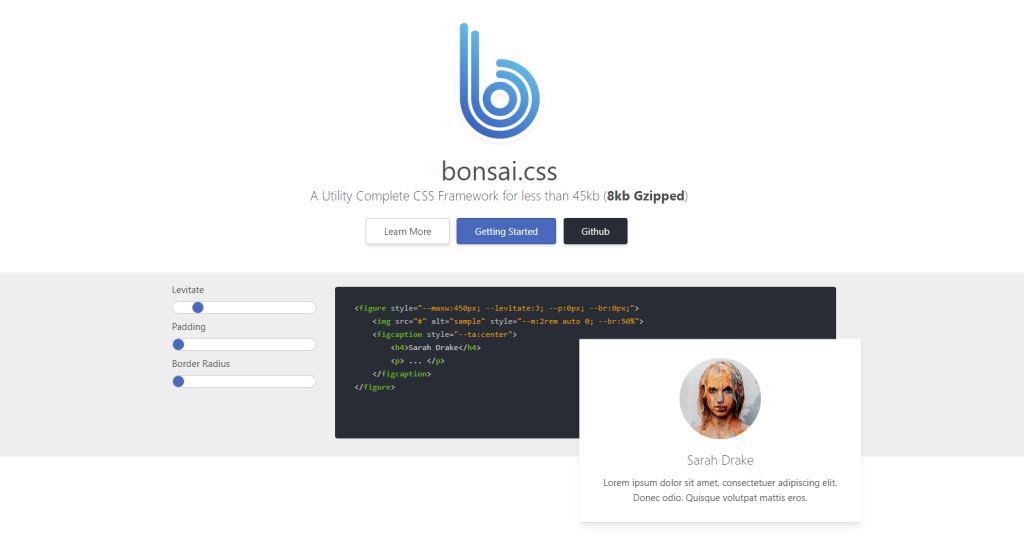
Bonsai provides both base components as well as utility classes. Just the base style alone is enough to produce creative and stylish interfaces. The framework doesn’t intrude with custom classes, so you can in fact apply Bonsai to an existing (unstyled) HTML page.
This will result in your page being transformed with all the Bonsai style specifications.
As for utilities, Bonsai absolutely knocks it out of the park. There are around 100 custom-built utility classes included in the framework. Each class provides you with the freedom to add custom styles and additional design features.
And the majority of those classes are fully compatible with media queries: responsive.
Lit
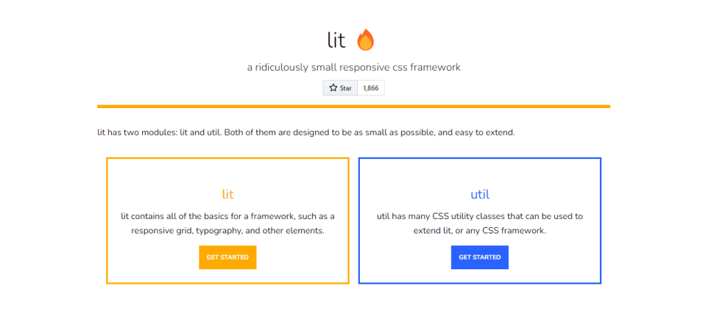
How small can a framework be, really? As it turns out, very small. Production-ready “lit” framework is only 400 bytes. And yet, delivers comprehensive tooling to get a responsive website layout going. The framework itself is focused on providing a responsive grid interface, but also adds some common elements like cards, lists, and table design.
You can however take it a step further with the “util” extension. The utilities (1kb) include various additions of components and spacing options. All in all, the lit framework is an exceptional choice for a starter framework. And the performance is unmatched.
Cutestrap
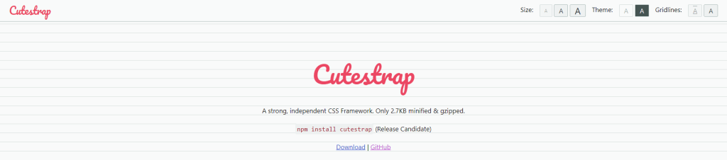
Cutestrap is a CSS framework that prioritizes minimalism without sacrificing utility. Weighing in at just 8KB, it gives you the essentials to construct a responsive, aesthetically pleasing website without overwhelming you with features you may never use. What sets it apart? For starters, Cutestrap uses a custom 12-column flexbox grid, which offers high flexibility in layout design. But it’s not just about flexibility; it’s about reducing the learning curve for newcomers and lowering the barrier to entry.
Have you ever been bogged down by a plethora of classes and elements in other, more bloated frameworks? Cutestrap avoids this problem by offering a focused set of components, streamlining the development process. It employs a “classless” design for base HTML elements. This means that Cutestrap applies sensible default styling to standard HTML elements like headers and paragraphs, reducing the need for multiple classes. Less time tinkering with classes equates to more time refining your website’s unique features.
Is customization a concern? Cutestrap’s got you covered. The framework uses custom properties extensively, allowing you to tailor the look and feel without sifting through a labyrinthine stylesheet. This is particularly useful if you have brand-specific requirements that demand a departure from the out-of-the-box styling.
So, what’s the real-world impact of using a minimal framework like Cutestrap? For one, smaller file sizes translate to quicker load times, enhancing the user experience. Furthermore, the framework’s simplicity encourages a deeper understanding of CSS, making you less reliant on prefab components. At the end of the day, it’s a tool that strikes a balance between ease of use and flexibility, making it a viable choice for developers who wish to work smart, not hard.
Summary
So, what’s the big takeaway? Minimal CSS frameworks offer a sleek, efficient alternative to their bulkier counterparts. They’re the pocket knives of the development world—small but incredibly versatile. But does that mean they’re the go-to for every project? No, of course not. If you’re building something akin to a Swiss Army command center, you’ll need more than a pocket knife.
Why are minimal frameworks gaining traction? It’s not just about keeping your project lightweight; it’s also about understanding and maintaining the codebase. These frameworks are like a well-curated toolbox: no more rummaging around for that elusive widget. Everything you need is within arm’s reach.
Will they become the standard? It’s unlikely that they’ll outright replace frameworks like Bootstrap or Foundation, which have their own extensive ecosystems and communities. But don’t underestimate the David among the Goliaths. As more developers aim for efficiency and easy maintenance, minimal frameworks might just find their niche solidifying.
So, should you dive into the world of minimal CSS frameworks? If you value quick load times and easy customization, it’s a resounding yes. But keep in mind that while they offer a more streamlined approach, they might require a bit more manual labor in certain situations. Like any tool, it’s all about picking the right one for the job.