

An estimated 300 million people worldwide live with visual impairments (high myopia), and they rely on assistive technology like screen readers to browse the web. Unfortunately, many websites still have accessibility barriers that prevent individuals with disabilities from accessing the content they need. To address this issue, it’s crucial to ensure that your website complies with accessibility standards.
In fact, in recent years – web accessibility and inclusive web design have become extremely significant and often talked about topics, affecting both web developers and designers. This article is designed and structured as a complete introduction to web accessibility in the context of inclusive websites.
We’ll be looking at over 50 different points, tips, and advice across ten different categories. You can use the table of contents below to get a full overview of what this article covers, or you can use it as a reference if you decide to bookmark this page.
How to Add Alternative Text for Images
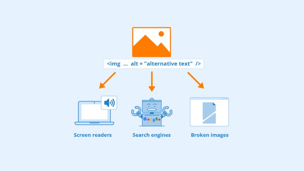
Alternative text for images is one of the most important accessibility features you should include on your website to ensure its compliance with web accessibility standards.
What is Alternative Text?
Alternative text, also known as alt text or alt tags, is a description of an image used by screen readers and other assistive technologies to convey its meaning and context to visually impaired users. It’s essential for people who rely on assistive technology as it enables them to access the content of an image that they would otherwise miss out on.
For example, imagine you have an infographic about the history of cybercrime on your website. Without alt text describing the infographic’s contents, people who are blind or visually impaired will miss out on this information.
Why Alternative Text Matters
Adding alternative text makes your website more inclusive and accessible for everyone. It ensures that visually impaired people can access all the information available in your images without relying on sight. Moreover, having alt text may also improve your search engine optimization (SEO) because search engines use alt texts as part of their algorithms when indexing websites.
Adding Alternative Text for Images
Now that you understand what alternative text is and why it matters, let’s move on to how you can add alternative text for images.
Step 1: Add Descriptive File Names
The first step in adding alternative text is naming your file appropriately. When you upload an image file onto your website, make sure that its name describes what’s in the image. For example, if you have an image of a cute puppy named “Daisy,” name the file “cute-puppy-daisy.jpg” instead of “IMG_1234.jpg.”
By doing this, you’re not only making it easier for screen readers to identify the image, but you’re also helping search engines understand what your images are about.
Step 2: Add Alternative Text
After uploading your image file, add alternative text to describe what’s in the image. Most website builders and content management systems (CMS) allow you to add alt text when adding images to your site.
For instance, if you have an image of a beautiful sunset on a beach, you can write something like “a beautiful sunset over a sandy beach.”
Step 3: Keep It Short and Descriptive
When writing alternative text, it’s essential to keep it short (around 100 characters or less) and descriptive. Avoid using generic descriptions like “image of” or “picture of.” Instead, focus on describing the content and context of the image.
For example:
- Instead of writing “image of a person,” write “portrait of a smiling woman.”
- Instead of writing “picture of a car,” write “red sports car driving down a winding mountain road.”
Step 4: Don’t Use Repetitive Descriptions
Avoid using repetitive descriptions that are already visible on the page. If an image is captioned or has descriptive text next to it, there is no need to repeat that information in the alt text.
For instance:
- If you have an image labeled as “team members,” don’t describe each person in detail in the alt text.
- If you have an embedded video with captions describing its contents, don’t replicate that information in the alt text.
Step 5: Test Your Alt Text
After adding alternative text to your images, test them using a screen reader to make sure that it’s conveying the correct information. Most operating systems come with screen readers that you can use to test your website’s accessibility.
If you’re not sure how to use a screen reader, there are several online resources and tutorials available to help you get started.
Captions and Transcripts for Videos
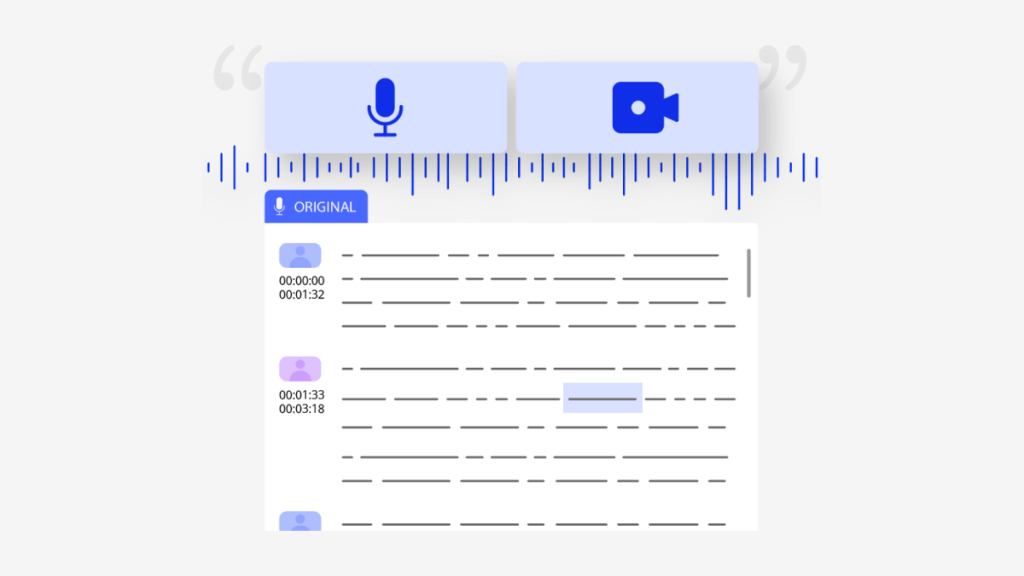
Video content is becoming increasingly popular, with businesses and individuals using it to showcase their products, services, and ideas. However, not everyone can enjoy video content in the same way. Individuals who are deaf, hard of hearing, or have auditory processing disorders may find it difficult or impossible to understand the audio in videos. This is why captions and transcripts are essential for making video content accessible to everyone.
Why Captions and Transcripts are Critical for Website Accessibility
Captions and transcripts make video content more accessible by providing a text alternative to the audio in videos. Captions display the spoken words on-screen, while transcripts provide a written record of what was said in the video. Both captions and transcripts help people who are deaf or hard of hearing understand the audio in videos.
But captions and transcripts are not just important for people with hearing impairments. They are also crucial for individuals who have auditory processing disorders or those who prefer to read instead of listening to audio content.
Moreover, some people choose to watch videos on mute, while others may be in a noisy environment where they cannot hear the audio clearly. In such cases, captions offer a way for everyone to engage with your video content without missing any crucial information.
By providing captions and transcripts, you ensure that your website is more inclusive, welcoming, and accessible to all users, regardless of their abilities.
Tips for Creating Effective Captions
Creating effective captions requires attention to detail and an understanding of accessibility requirements. Here are five tips for creating effective captions:
1. Ensure Accuracy
The most critical aspect of captioning is accuracy. Your captions must accurately convey what was said in the video without missing any essential information. This includes proper spelling, grammar, punctuation, and capitalization.
While it is easy to use automatic captioning tools, these tools are known to produce inaccurate captions. Hence, it is best to use human editors for captioning to ensure the accuracy of your captions.
2. Use Appropriate Pacing
Pacing is another essential aspect of captioning. Captions should match the spoken words in the video and appear at a pace that allows viewers enough time to read them comfortably. Captions that appear too quickly or too slowly can be challenging to read and may cause viewers to miss important information.
3. Be Mindful of Formatting
The format of your captions can affect their readability. Using a simple font, such as Arial or Verdana, with a white or black background is recommended for clarity. Avoid using complex fonts or backgrounds that may make it challenging to read your captions.
4. Use Correct Caption Styling
Proper styling of your captions is essential for compliance with accessibility standards. Captions should be displayed in sentence case (only the first word capitalized) and aligned correctly on-screen (typically centered).
Additionally, sound effects and speaker identification should be included in the captions for clarity.
5. Include Relevant Information
Your captions should include all relevant information provided in the audio of your videos. Any spoken dialogue, sound effects, or background music should be accurately transcribed and displayed alongside the video content.
Tips for Creating Effective Transcripts
Creating effective transcripts also requires attention to detail and adherence to accessibility standards. Here are four tips for creating effective transcripts:
1. Include All Relevant Information
A transcript should include everything said in the video, including dialogue from all speakers, sound effects, and any music played during the video.
Transcripts don’t need to follow exact formatting guidelines as long as they’re easy to read, with clear headings separating sections of dialogue or other content types. If you’re unsure about how to format your transcript, you can check out examples of transcripts from other websites or consult with a professional captioning service.
2. Use Proper Punctuation and Grammar
Transcripts should be free from any spelling errors, typos, or grammatical mistakes. Proper punctuation is also necessary to ensure the correct interpretation of the text.
3. Format the Transcript Appropriately
Formatting is essential for making transcripts easy to read. The transcript should be laid out in a way that is easy on the eyes, with clear headings separating different sections.
4. Provide Timestamps for Sections of Dialogue
Timestamps are an important component of transcripts as they allow users to navigate through the video with ease. Timestamps indicate when each section of dialogue begins and ends, making it easier to locate specific parts of the video.
Captions and transcripts are crucial for making video content accessible to everyone, regardless of their abilities. By following the tips mentioned above, you can create effective captions and transcripts that meet accessibility standards and make your website more inclusive.
Clear and Concise Content
One of the measures you can implement is crafting clear and concise content. Visitors will not engage in content if they find it difficult to read or understand. For individuals who have disabilities, this could pose a more significant problem than for those without disabilities. Clear and concise content is the key to making your website more accessible.
The Importance of Clear And Concise Content
Clear and concise content is necessary for all users, regardless of whether or not they have a disability. Unclear or lengthy blocks of text can be discouraging for readers who might lose interest in what they’re reading. Making sure that your website’s written information is straightforward and easy to read will make it easier for people with disabilities who might have difficulties reading lengthy sentences, complex vocabulary, or small fonts.
Clear-and-concise writing also enhances search engine optimization (SEO) by improving user experience (UX). UX is an important element in Google’s algorithms when it comes to search ranking. By simplifying your website’s written information structure, you’ll improve the chances of bringing traffic from search engines like Google, Bing, etc.
Tips for Achieving Clarity
We’ve compiled a list of tips that will enable you to achieve clarity on your website:
Use Short Sentences And Paragraphs
Using short sentences allows readers to understand the meaning behind them quickly. Short paragraphs are also easier on the eyes than longer ones because they break up the text and make it more manageable.
Use Active Voice
Active voice is essential for creating clear and concise content. It creates a sense of energy and directness for the reader, making it easier to understand what’s being said.
Avoid Jargon
Jargon, industry-specific language, or complex vocabulary can be confusing to readers who may not be familiar with it. Instead, use simple language that anyone can understand.
Use Headings
Headings help to break down content into smaller, more manageable sections that are easier to digest. They also provide an opportunity for you to use keywords related to your content’s primary topic, which enhances search engine optimization.
Use Lists
Using lists makes your website’s information more organized and readable. Lists also make it easier for readers who might have difficulty reading long sentences or paragraphs.
Use Images
Images provide an alternative way of conveying information in a visually appealing way. Make sure that you add descriptions of the images so that they’re accessible to those using screen readers.
Examples
The following examples illustrate how clear-and-concise writing improves your website’s accessibility:
Example 1: Before
Our company offers industry-leading solutions with effective enterprise management capabilities in creating customized systems tailored to meet client requirements while ensuring quality through a robust development process.
Example 1: After
Our company specializes in developing custom software solutions for businesses. We work closely with clients to create management systems that meet their specific needs while ensuring quality through a rigorous development process.
By simplifying the first example’s language, the second example provides clarity about what the company does and how it goes about doing it.
Example 2: Before
The expansion of our product line will offer incremental value across our entire customer base by improving our customers’ overall experience with our products and services.
Example 2: After
Our new product line will improve your experience with our products and services and add more value to your purchase.
By using simple language, the second example provides a clearer message about the product line’s value proposition.
Clear and concise content is essential for making your website accessible to people with disabilities. By following the tips provided and implementing them on your website, you’ll be improving not only accessibility but also search engine optimization (SEO).
Clear-and-concise writing makes it easier for everyone to read and understand your content. Remember, by making your website more accessible, you’re opening up your business or organization to a broader audience.
Consistent Navigation Structure
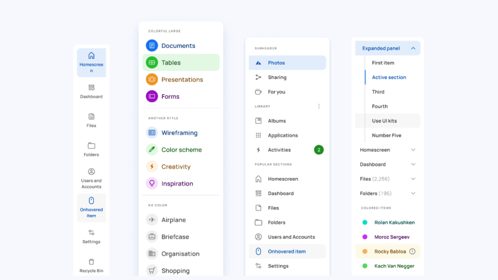
A consistent navigation structure is essential for making a website more accessible to everyone. It allows users to easily navigate through the pages and find the information they are looking for. A well-structured navigation system ensures that your website is easy to use, allows visitors to find what they need quickly, and enhances their user experience.
Why Consistent Navigation is Vital for Accessibility
Consistency in navigation is critical when it comes to accessibility. It helps users with disabilities or impairments, such as visual or cognitive impairments, navigate through the site effectively. With a clear and simple layout, users can move around the site quickly without getting lost or confused.
Additionally, a consistent navigation structure makes it easier for search engines like Google to crawl your site, which improves your website’s ranking in search results. It further increases the visibility of your website, which makes it more accessible to people who are using search engines.
Tips for Creating a Consistent Navigation Structure
Creating a consistent navigation structure does not have to be complicated. Here are some tips you can follow:
1) Use Clear Labels
Labels are an essential aspect of any navigation system as they help visitors understand what they can expect when they click on a link. When creating labels, ensure that you use clear and concise language that accurately reflects the content of each page.
For example:
- Home
- About Us
- Contact Us
- Services
- Products
Using descriptive labels makes it easier for visitors with disabilities or impairments to understand where links lead them.
2) Keep Navigation Simple
A simple navigation system is more accessible than one that is overly complicated. Ensure that you keep your navigation system simple by avoiding too many menus or submenus that can be confusing.
Aim for no more than seven or eight main navigation items, and keep the submenus to a minimum.
3) Be Consistent
Consistency in navigation makes it easier for users to understand where they are on the site and how to navigate through it. Ensure that you are consistent with labels, placement, and styling of your navigation links throughout the site.
If you decide to change your navigation system, ensure that you do so consistently across all pages of your site.
4) Use Logical Groupings
Grouping similar pages or content together makes it easier for visitors to find what they need. For example, grouping all your products under a “Products” tab or grouping all your services under a “Services” tab.
Logical grouping also helps visitors who use screen readers by allowing them to jump straight to the content they need without having to navigate through unrelated sections.
5) Provide Breadcrumbs
Breadcrumbs are an essential aspect of any website’s navigation system. They provide users with an overview of where they are on the site and how they got there.
Breadcrumbs make it easy for visitors with disabilities or impairments, such as cognitive impairments, to understand where they are on the site and how to get back to previous pages.
6) Test Your Navigation System
Finally, testing your navigation system is crucial in ensuring its accessibility. Conduct user testing by inviting people with disabilities or impairments to test your website’s navigation system and provide feedback.
Examples of Consistent Navigation Systems
Here are some examples of consistent navigation systems:
Dropbox
Dropbox uses simple and straightforward labels that accurately reflect the content of each page. Their submenus are also kept simple, providing only essential options like account settings and help/support.

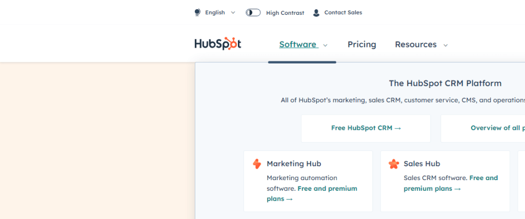
Hubspot
Hubspot’s navigational structure groups pages into categories such as Marketing, Sales, and Service. This logical grouping makes it easy for users to find what they need quickly.
GitHub
GitHub’s navigation system uses a simple structure with all the essential links on one page. The labels are clear and concise, making it easy for users to understand where each link leads them.

Creating a consistent navigation structure is vital in making your website more accessible to everyone. By following the tips and steps outlined in this section, you can ensure that your website’s navigation system is accessible and user-friendly.
Remember to use clear labels, keep navigation simple, be consistent, use logical groupings, provide breadcrumbs, and test your navigation system regularly. By doing so, you will create a website that is easy to use and navigate for everyone, including those with disabilities or impairments.
Keyboard Accessibility
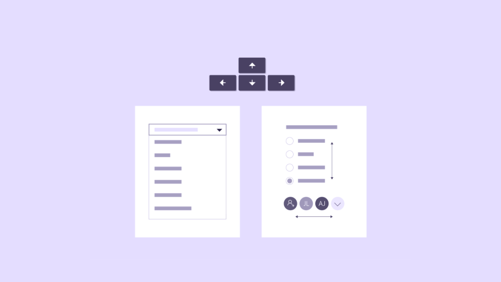
One crucial aspect of web accessibility is keyboard accessibility. A keyboard is the primary input device for many people with disabilities, and they rely on it to navigate through your website. It’s, therefore, crucial to making sure that your website can be fully operated with a keyboard alone.
1. Enable Keyboard Navigation
The first step in ensuring keyboard accessibility on your website is enabling keyboard navigation. Keyboard navigation means that users can navigate through your site using only the Tab key and arrow keys without the need for a mouse or touchpad.
To enable keyboard navigation, make sure that all links and interactive elements are focusable using the Tab key. When a link or element is focused, it should be clear which item has focus by highlighting the item in some way, such as changing its color or adding an outline.
2. Use Accessible Forms
Forms are an essential part of many websites but can be challenging for users who rely on keyboards to navigate them. You can make forms more accessible by making sure that they are easy to navigate using only the keyboard.
Make sure that users can navigate between form fields using only the Tab key and that each form field has an associated label element. The label should describe what information should be entered into the form field.
Additionally, use HTML5 input types when appropriate, such as ’email’ or ‘tel,’ as they provide built-in validation features and help users understand what type of input is expected.
3. Ensure Accessible Dropdown Menus
Dropdown menus are often used to present large amounts of content in an organized manner, but they can be difficult for keyboard-only users to navigate.
To ensure accessibility, use semantic HTML markup for the menu and its items. Avoid using non-semantic markup such as divs or spans, which can make it challenging for keyboard-only users to navigate.
Additionally, make sure that dropdown menus can be opened and closed using only the keyboard, and allow for easy navigation through the menu items using the arrow keys.
4. Provide Keyboard Accessible Video and Audio Players
Video and audio players are increasingly common on websites these days but can be challenging for keyboard-only users to control. To ensure accessibility, provide keyboard shortcuts for controlling video and audio playback.
For example, you could use the space bar to pause or play a video or audio clip or use the arrow keys to move forward or backward in the media file. These shortcuts should be clearly documented on your website so that users are aware of them.
5. Test Your Website for Keyboard Accessibility
Finally, it’s crucial to test your website thoroughly for keyboard accessibility. You can use automated testing tools like Axe or Wave to check your site’s accessibility or perform manual testing by navigating through your site using only a keyboard.
Manual testing is particularly important as it allows you to experience your site from a user’s perspective and identify any navigation issues that automated tools may miss.
Proper Use of Heading Tags

The heading tags (H1, H2, H3, H4, H5, and H6) are used to structure content hierarchy on a website. They play a crucial role in improving website accessibility by making it easier for users to navigate and understand the content. Proper use of heading tags is essential for search engine optimization (SEO) and readability.
Understanding the Importance of Heading Tags
Heading tags are essential for web accessibility because they provide structure to the content on a page. They help users understand the hierarchy of the information presented on a page and make it easier for them to find what they are looking for.
Moreover, search engines use heading tags to understand the content on a page better. By properly structuring your content with headings, you can improve your website’s SEO and make it more visible to potential customers.
Best Practices for Using Heading Tags
Here are some best practices you should follow when using heading tags:
1. Use Only One H1 Tag Per Page
The H1 tag should be used only once per page as it represents the main heading or title of a page. Using multiple H1 tags can confuse users and search engines about what is most important on your webpage.
2. Use Subheadings Appropriately
Use subheadings (H2 through H6) appropriately based on their context within the page. Each heading should provide meaningful information about the content below it.
For instance, if you have a blog post about how to bake a cake, your headings might look like this:
H1: How To Bake A Cake
H2: Ingredients
H3: Flour
H3: Sugar
H3: Eggs
H2: Steps
H3: Preheat the Oven
H3: Mix the Ingredients
H3: Pour the Batter into a Pan
In this example, the main heading (H1) provides an overview of the content, while the subheadings (H2 to H3) provide more specific information about each section.
3. Use Descriptive Text
Use descriptive text that accurately reflects the content below each heading. Avoid using generic phrasing such as “Introduction” or “Conclusion” as it does not provide much context for users with disabilities who rely on screen readers.
For instance, instead of using “Introduction,” you can use “Welcome to our Website” to give users a better understanding of what your website offers.
4. Use Heading Tags Sequentially
Use heading tags sequentially so that they reflect the hierarchy of the content on your webpage. Start with an H1 tag, followed by H2, H3, and so on.
5. Don’t Skip Headings
Don’t skip headings, as it can confuse users and make it harder for them to understand your content’s structure. Every section should have a heading that accurately reflects its content.
6. Don’t Use Heading Tags for Styling
Do not use heading tags for styling purposes, such as changing font sizes or colors. Doing so can confuse assistive technologies used by visually impaired users and make it harder for them to navigate your website.
Remember to use only one H1 tag per page, use subheadings appropriately, use descriptive text, use heading tags sequentially, don’t skip headings, and don’t use heading tags for styling purposes.
By following these guidelines, you can create accessible and SEO-friendly websites that are easy to navigate for everyone.
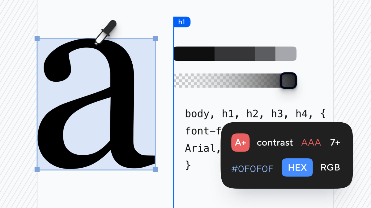
Color Contrast for Readability
One of the essential accessibility features in web design is color contrast. In this article, we will discuss why color contrast is important and how you can ensure that your website’s colors meet accessibility standards.
Why Does Color Contrast Matter for Accessibility?
Color contrast refers to the difference between the foreground (text or images) and background colors on a website. If the colors have poor contrast, it can make it challenging for users with visual impairments to read or perceive information on your site. For example, people with color blindness may not be able to distinguish between red and green text if their contrast ratio is too low.
Moreover, individuals with low vision or other visual disabilities such as cataracts or glaucoma may find it challenging to read text if there isn’t enough contrast between the text and background colors. Therefore, it’s crucial to ensure that your website has high color contrast so that all users can access your content without difficulty.
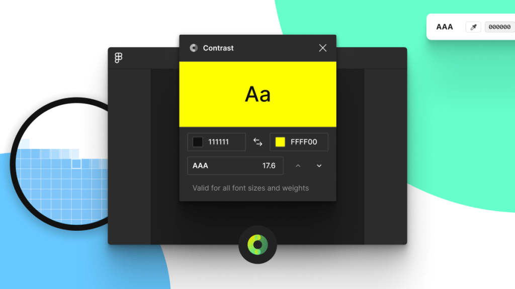
Understanding Color Contrast Ratios
The Web Content Accessibility Guidelines (WCAG) has established standards for color contrast ratios on websites. These guidelines are used by web developers and designers worldwide to ensure that their websites are accessible.
To measure the color contrast ratio of two colors, WCAG defines a formula:
( L1 + 0.05 ) / ( L2 + 0.05 )
L1 represents the relative luminance of the lighter color while L2 represents the relative luminance of the darker color.
The resulting number indicates how much more prominent one color appears than another on a scale from 1:1 to 21:1. A ratio of 1:1 indicates that the two colors have the same brightness level, while a ratio of 21:1 indicates a high contrast between the two colors.
According to WCAG, for regular text, the contrast ratio should be at least 4.5:1. For large text (18pt or larger, or 14pt bold or larger), the minimum required contrast ratio is 3:1.
Tips to Ensure Proper Color Contrast
Here are some tips to help you ensure that your website’s colors meet accessibility standards:
Use High-Contrast Colors
Using high-contrast colors increases readability and makes it easier for users with visual impairments to read your content. Black and white are traditional high-contrast color choices that work well together but using other combinations that result in high color contrasts is also acceptable.
For example, if you want a black background on your website, use white or light-colored text, so it’s easier to read. Conversely, if you’re using a white background, use dark-colored text.
Avoid Low-Contrast Color Combinations
Using low-contrast color combinations can make it challenging for users with visual impairments to perceive information on your site. Avoid using colors that are too similar in brightness or hue as they may be difficult for some users to distinguish.
For example, avoid pairing red and green or blue and purple together as these combinations can be difficult for people with red-green or blue-purple color blindness to perceive correctly.
Use Tools to Check Contrast Ratios
Several online tools can help you check the color contrast ratios on your website. These tools allow you to input your website’s hex codes and will generate a report detailing which areas of your website need improvement in terms of color contrast ratios.
One popular tool is the WebAIM Contrast Checker. The tool provides an accessibility score along with suggestions to improve your website’s color contrast.
Test Your Website with Real Users
While tools can help you assess your website’s color contrast, it’s also important to test it with real users. You can conduct user testing sessions to gather feedback from individuals with visual impairments or color blindness who can provide valuable insights into how accessible your website is.
Color contrast is an essential element of web design that directly influences the accessibility of a website. By following the tips discussed in this section, you can ensure that your website meets accessibility standards and can be easily accessed by users with visual impairments or color blindness.
Descriptive Link Text
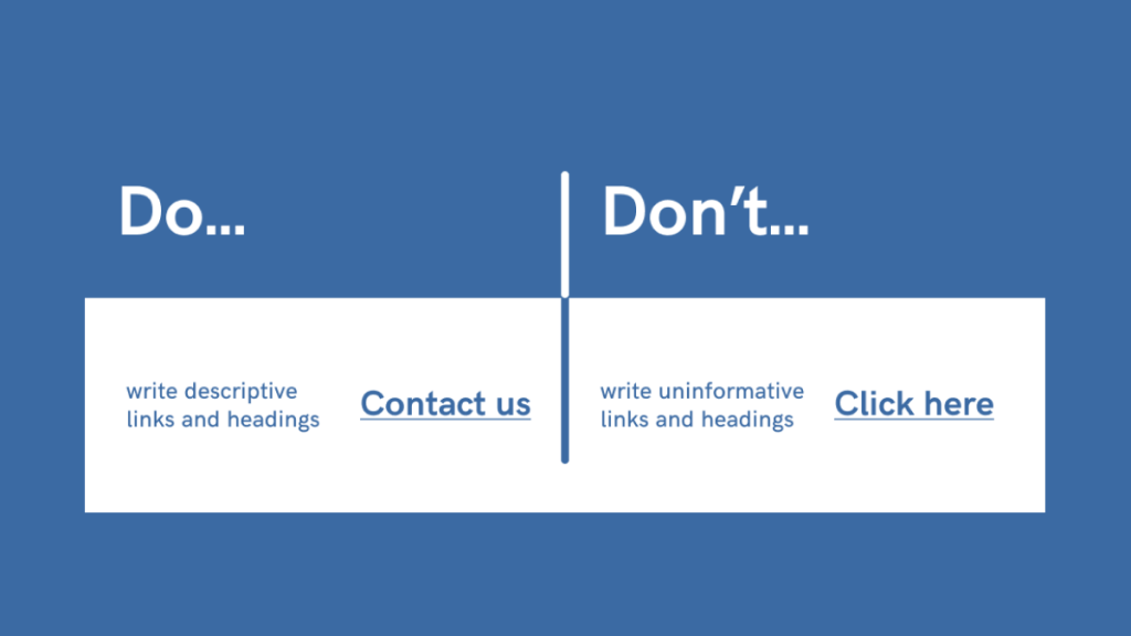
Descriptive link text refers to the clickable text that makes up a hyperlink on a webpage. When users click on hyperlinked text, they are redirected to another location on that page or an entirely different page. Descriptive link text provides users with information about where they will be taken when they click on the hyperlink.
For example, consider the following two hyperlinks:
The first hyperlink uses non-descriptive link text, while the second hyperlink uses descriptive link text. The second hyperlink provides users with a clear idea of what they can expect when clicking on the link.
Why is Descriptive Link Text Important for Website Accessibility?
Descriptive link text plays a crucial role in website accessibility because it helps all users understand the purpose of each hyperlink without having to rely solely on visual cues. This is particularly important for users who rely on assistive technologies such as screen readers or keyboard navigation.
Screen readers are software programs that read out loud the content of a webpage for those who have vision impairments or reading difficulties. Screen readers can identify hyperlinks based only on their clickable nature and their associated text. When a screen reader encounters a hyperlink with non-descriptive link text, the user may not understand where the hyperlink leads, thus making it difficult to navigate the website.
Keyboard-only users, who rely on keyboard navigation instead of a mouse, need to be able to recognize hyperlinks based on their associated text. For example, they may use the tab key to move between hyperlinks on a webpage. If link text is generic or non-descriptive, these users may miss out on important information that could help them navigate the website more effectively.
Tips for Creating Descriptive Link Text
Here are some tips for creating descriptive link text that will make your website more accessible:
- Be Specific: Use specific words that describe the destination of the hyperlink. Avoid using generic phrases such as “click here” or “read more.” Instead, use descriptive phrases like “download our free e-book” or “learn about our new features.”
- Keep it Short: Make sure your link text is concise and to-the-point. Longer link text can be confusing and difficult to understand.
- Use Keywords: Incorporate relevant keywords into your link text so that users can quickly identify what information they will find when they click on it.
- Avoid Repetition: Avoid using the same link text multiple times on a page as this can be confusing for users who rely on assistive technology.
- Be Clear: Make sure your link text provides clear information about where the user will be taken when clicking on it.
- Test Your Links: Before publishing your website, test all of your hyperlinks to ensure that they are working correctly and that their associated descriptive link text accurately reflects their destination.
Examples of Descriptive Link Text
Here are some examples of good descriptive link text:
- Download our free guide to website accessibility
- Learn more about our team and company culture
- Sign up for our monthly newsletter
- View our latest products and services
- Donate to our charity partner
Descriptive link text is an essential component of website accessibility. By creating clear and concise link text that accurately reflects the destination of the hyperlink, website owners can ensure that users with disabilities can navigate their website effectively.
Adjustable Text Sizes
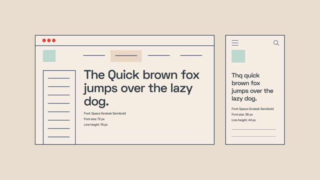
Adjustable text sizes refer to the ability of users to increase or decrease the size of the text on a web page. This feature is particularly important for individuals with visual impairments who may struggle to read small fonts or see thin lines. By providing adjustable text sizes, you make it easier for these users to access and consume your content.
Moreover, adjustable text sizes also benefit users who are browsing your site on different devices or screen resolutions. For instance, a user accessing your site from a mobile device may need larger fonts than someone browsing on a desktop computer.
By making your website accessible through adjustable fonts, you ensure that all users can read and engage with your content regardless of their device or visual ability.
How to Implement Adjustable Text Sizes
Implementing adjustable text sizes requires some basic knowledge of HTML and CSS coding. Here are some steps you can take:
Step 1: Use Relative Font Sizing
When defining font sizes in HTML and CSS, it’s best practice to use relative sizing rather than absolute pixel measurements. Relative sizing refers to setting font size relative to other elements on the page rather than specifying an exact pixel size.
For instance, instead of using:
p {
  font-size: 16px;
}
use:
p {
  font-size: 1rem;
}
The rem unit refers to the root element’s font size, which is typically set to 16 pixels by default. Using relative sizing makes it easier for users to adjust the font size without breaking the page layout.
Step 2: Provide a Text Size Toggle
Another way to implement adjustable text sizes is by providing a text size toggle on your website. This feature enables users to increase or decrease the font size with a single click.
One way to achieve this is by using JavaScript or jQuery to modify the font size of specific elements on the page. For example, you can use something like this:
function increaseFontSize() {
  var currentSize = parseInt($('body').css('font-size'));
  $('body').css('font-size', currentSize + 1 + "px");
}

function decreaseFontSize() {
  var currentSize = parseInt($('body').css('font-size'));
  $('body').css('font-size', currentSize - 1 + "px");
}
This code attaches click handlers to two buttons that increase or decrease the body’s font size by one pixel each time.
Alternatively, you can also use third-party libraries like BigText that provide pre-built text resizing functionality.
Step 3: Test Your Website
Once you’ve implemented adjustable text sizes, it’s essential to test your site thoroughly to ensure everything works as expected. Perform user testing with individuals with visual impairments and disabilities and gather feedback on how easy it is for them to adjust the font sizes.
You can also use tools like Wave and aXe that scan your website for accessibility errors, including issues related to adjustable text sizes.
Compatibility with Assistive Technologies

Assistive technologies such as screen readers, speech recognition software, and braille displays have become essential tools for people with visual and auditory impairments, physical disabilities, and other conditions that make it difficult for them to use conventional interfaces.
If you want to ensure that your website is accessible to all users, it’s essential that you take compatibility with assistive technologies into account.
Why Compatibility with Assistive Technologies is Important
There are many reasons why compatibility with assistive technologies is important. Firstly, it ensures that people with disabilities can access your content in a way that suits their needs. This means that they can browse your website and interact with its features just like anyone else.
Secondly, making your website compatible with assistive technologies is a legal requirement in many countries. In the United States, for example, the Americans with Disabilities Act (ADA) requires businesses to make their websites accessible to people with disabilities in order to avoid discrimination lawsuits.
Finally, ensuring compatibility with assistive technologies is simply good business sense. By making your website accessible to everyone, you’re opening up your content and services to a much wider audience. This could potentially increase your customer base and improve your brand reputation.
Tips on Ensuring Compatibility
Here are some tips on how you can ensure compatibility with assistive technologies:
1. Use Semantic HTML Markup
Semantic HTML markup helps screen readers identify the structure of a web page and convey that information accurately to users. This means using appropriate tags such as <header>, <nav>, <main>, <article>, <section> etc., which provide meaning for each element of the page.
For example, if you’re using an image as a navigation button, make sure to include alt text that describes the purpose of the button. Similarly, for videos, provide captions or transcripts so that users can understand the content.
2. Use ARIA Attributes
Accessible Rich Internet Applications (ARIA) attributes help assistive technologies interpret dynamic content and user interface components more accurately. They allow developers to add semantic information about how elements should be interpreted by assistive technologies.
For example, ARIA landmarks allow screen readers to identify important sections of a web page such as headers, footers or main content areas.
3. Test Your Website with Assistive Technologies
The best way to ensure compatibility with assistive technologies is to test your website with these tools. You can use screen readers like VoiceOver (for Mac) or NVDA (for Windows) to test how your website sounds and works with speech output.
You can also use tools like Wave (Web Accessibility Evaluation Tool) or AChecker to check your site’s compliance with accessibility standards, such as WCAG 2.1 (Web Content Accessibility Guidelines).
4. Provide Multiple Ways of Accessing Content
Users with disabilities may prefer different ways of accessing content, depending on their individual needs. Some may prefer text-based content, while others may prefer video or audio.
Therefore, it’s important to provide multiple ways of accessing your content whenever possible. For example, you could provide transcripts alongside videos or offer a downloadable PDF version of a page’s content.
5. Train Your Team on Accessibility
Ensuring accessibility requires a team effort, so it’s important that everyone involved in creating and updating your website understands the importance of accessibility and how to implement best practices.
Provide training sessions on accessibility issues and solutions so that everyone in the team is aware of the issues at hand and knows how they can help make the site more accessible.
6. Stay Up-to-Date with Accessibility Standards
Accessibility standards change over time as technology evolves and new needs arise. It’s important to stay up-to-date with these changes so that you can ensure your website remains accessible over time.
Keep an eye on updates from groups such as the World Wide Web Consortium (W3C), which regularly releases new guidelines and recommendations for website accessibility.
By ensuring compatibility with assistive technologies, you’re not only making your website more accessible to people with disabilities, but also improving the user experience for everyone. By following these tips and staying up-to-date with accessibility standards, you can create a website that is inclusive and accessible to all.
Final thoughts on creating inclusive websites
It might seem like a lot of information to take in at once, but truth be told – a lot of it comes down to practical steps. Just the question alone, “Is this design friendly towards users with disabilities and/or visual impairments?”, can help you solve a lot of issues when it comes to inclusive design.
It’s also a well-known fact that platforms like WordPress (the most popular CMS in the world) have been steadily catching up with WCAG standards, but there is still more work to do. Even more so when you consider that themes from 2-3 years ago were not built with the best accessibility practices in mind.
One thing is for sure, though, the future of web design is inclusive.