


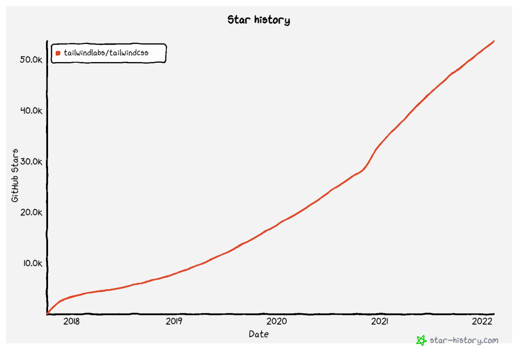
Tailwind CSS has taken the front-end community by storm. The utility-based CSS framework aims to streamline modern web development. And with how popular it has gotten over the last 4 years, I think it has succeeded in that regard.
Tailwind CSS surpassed Bulma, Semantic UI, Foundation, and other prominent CSS frameworks in just a few years. It is now the 2nd most popular framework in the world, with Bootstrap holding a sturdy number one position.
So, how exactly does Tailwind CSS work? The most basic explanation would be to compare to Boostrap. Whereas Bootstrap comes with pre-defined layouts, Tailwind emphasizes class utilities. As such, you are always controlling how your layout elements will look.
In other words, Tailwind is unopinionated and doesn’t enforce a design structure. For the most part, you have to decide how to style a specific component. And for that, you’re given pre-built utility classes. You can do most layouts without ever writing anything into a custom stylesheet. However, this can have its limits in terms of design richness and flexibility.
As such, you’re more than likely going to have to write custom styles, eventually. But, that’s not the only way to take your Tailwind designs to the next level. Another solution is to use a component library or a UI kit. And there are quite a few of them built for Tailwind CSS.
UI Kit vs Component Library
The main difference is that full-scale component libraries implement a design system. In other words, a strict layout structure that is suitable for dynamic projects.
Whereas a UI kit is generally a collection of custom elements. And you can use those elements to deliver rapid prototypes and mockups for website designs.
Should you use a CDN?

While it's possible to implement the following resources with a stylesheet CDN, it is not recommended. By installing through npm or other package managers, you can individually select which components you need. And, in turn, avoid loading the entire stylesheet.

Do you have to write the component code yourself?

So, this depends on the kit itself. Some of the solutions mentioned in this article do not provide pre-built code. In other words, you get the HTML structure but not the function. It's only a few of the libraries, but I thought I'd make this absolutely clear so as not to cause confusion.
My library / kit is not on this list
I generally try to do as thorough research as possible. Contact me if a library or UI kit is missing from this list. I’m happy to take a look and then include it here. My primary goal is that all the resources are available for free. That’s the only criterion.
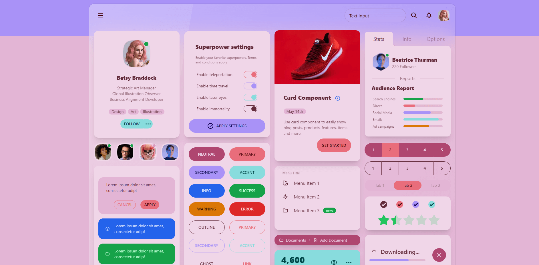
Tailwind UI
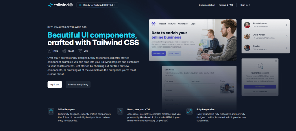
Tailwind UI has over 500 components in total; the documentation has component code for React, Vue, and raw HTML. The project has over 61,000 stars on GitHub and gets around 4 million weekly downloads on npm. *
We will kick things off with the official library from Tailwind Labs. With several hundred custom components, it’s also one of the most complete libraries. The only caveat is that if you wish to gain full access, you will need to cough up around $150.
You can get access to the preview components. Each one has both a demo and code that you can import. In total, there are about 100+ free components, including product cards, custom dropdowns, navigation bars, form layouts, and more.
* Just to clarify for everyone, Tailwind UI is part of Tailwind CSS itself; if you want to work with the components from scratch, you need to get Headless UI (also listed on this page).
Tailwind UI is compatible with React, and Vue, and has support for native HTML. Though, if you are going to use raw HTML – you need to consider your options for accessibility.
daisyUI
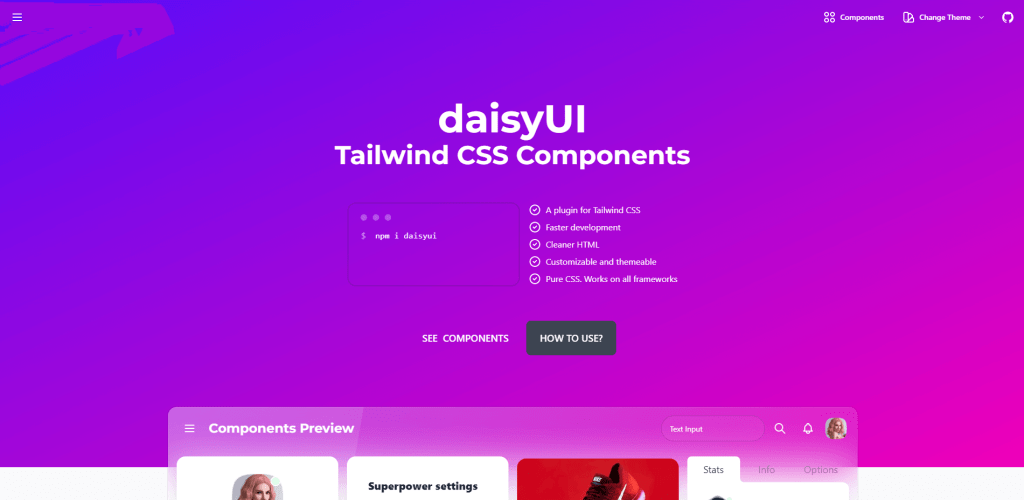
daisyUI has over 47 components, not including custom themes; the documentation has component code for HTML & JSX. The project has over 15,000 stars on GitHub and gets around 70,000 weekly downloads on npm.
This is quite an interesting addition to this list. You’ll first notice that daisyUI uses a custom – simpler – syntax for its components. In fact, whereas you’d need to write several utilities to style a button with raw Tailwind – daisyUI does it with a single “btn” tag.
As such, this library is meant to be used as a plugin for Tailwind CSS. All the components are written and specified in vanilla CSS. This means that daisyUI can be integrated into any workflow as long as you are using the base Tailwind library.
My personal favorite is the themes aspect of daisyUI. Typically, what you expect from any kind of framework/library are at least light and dark themes.
Pouya Saadeghi has taken it a step further by adding more than 20 custom themes. And each theme adjusts the style and appearance of each of the 45 components.
Mamba UI
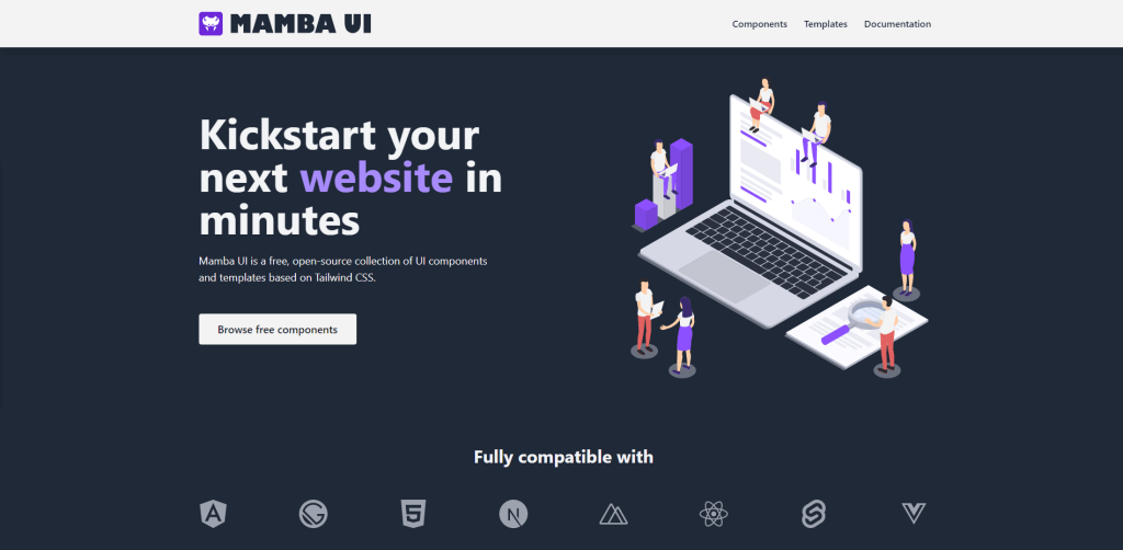
Mamba UI has over 155 components in more than 40 categories; the documentation has component code for Vue, JSX, and HTML. The project has over 300 stars on GitHub.
Mamba UI is designed to help streamline the UI workflow.
It’s built to be used by both web developers, and web designers alike. The library includes components for the most frequently used layout elements.
And, on top of that, implements a modular structure to ensure that you can style each component to your needs. Mamba UI sees use not only for landing page designs, but also for personal portfolios, eCommerce sites, and more.
In terms of individual components, Mamba UI has exceptional choices. Article cards, loading bars, header sections, statistics. Even more intricate elements like timelines, news sections, and gallery displays. And it’s entirely free.
To work with this library, you need first to set up Tailwind CSS for your project, and then grab the components directly from the documentation page.
Headless UI
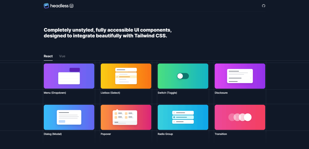
Headless UI has over 10 components (unstyled); the documentation has component code for React & Vue. The project has over 17,300 stars on GitHub and gets around 730,000 weekly downloads on npm.
Here we have another project from the folks at Tailwind Labs. This time, it’s a library for pre-built headless UI components. In other words, these are unstyled layout components you must design from scratch.
While the selection of components is relatively low, this library is unlike traditional component kits. Each component has a separate docs page that details all the available props, state management options, and API integrations. Additionally, there’s guidance on how to structure your components for best accessibility practices.
Headless UI is what you want to use if you’re looking to build interactive apps right from the start, with the ability to control component logic directly through the library rather than writing all the code yourself.
Tailwind Elements
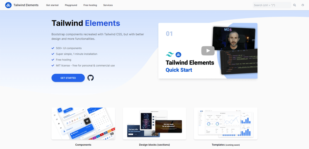
Tailwind Elements has over 500 components (across all categories); the documentation has component code for HTML, with the option to install it as a library. The project has over 9,800 stars on GitHub and gets around 17,000 weekly downloads on npm.
Tailwind Elements come packed with hundreds of UI components. On top of this, the kit also provides various design blocks. These blocks, in particular, are pre-made layout sections, which will help you save time when bootstrapping a new layout design.

I think Tailwind Elements strives for a fairly minimal look and feel. The documentation shows you how to get it going with npm, or you can use the CDN also to get a quick look at how the kit works in practice. Sadly, there don’t seem to be any components pre-written for frameworks like React, but it can be installed as a separate library for your project.
The nice thing about having the raw HTML code in the docs is that you can copy and paste it into your standalone projects.
Xtend UI
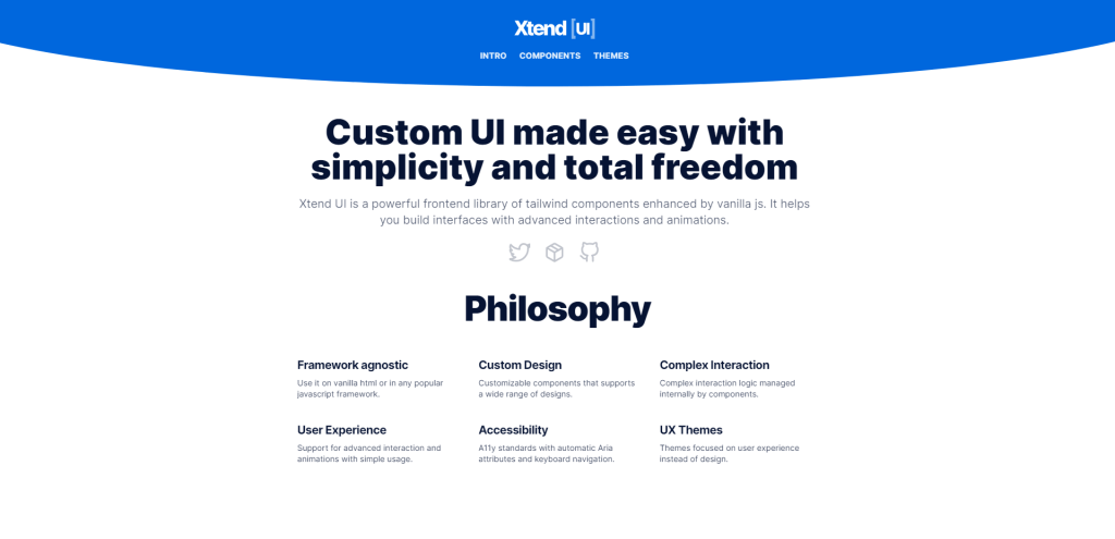
Xtend UI has over 34 components; the documentation has component code for JSX. The project has over 200 stars on GitHub and gets around 440 weekly downloads on npm.
Xtend UI is an excellent starting kit if you love the idea of using Tailwind CSS together with vanilla JavaScript. The components in this kit are amplified with various effects (animations, transitions) and are ideal for modern web projects.
It’s surprising that Xtend UI hasn’t picked up the pace compared to other similar libraries. The docs are very well written, and each component is designed to include several options.
Flowbite
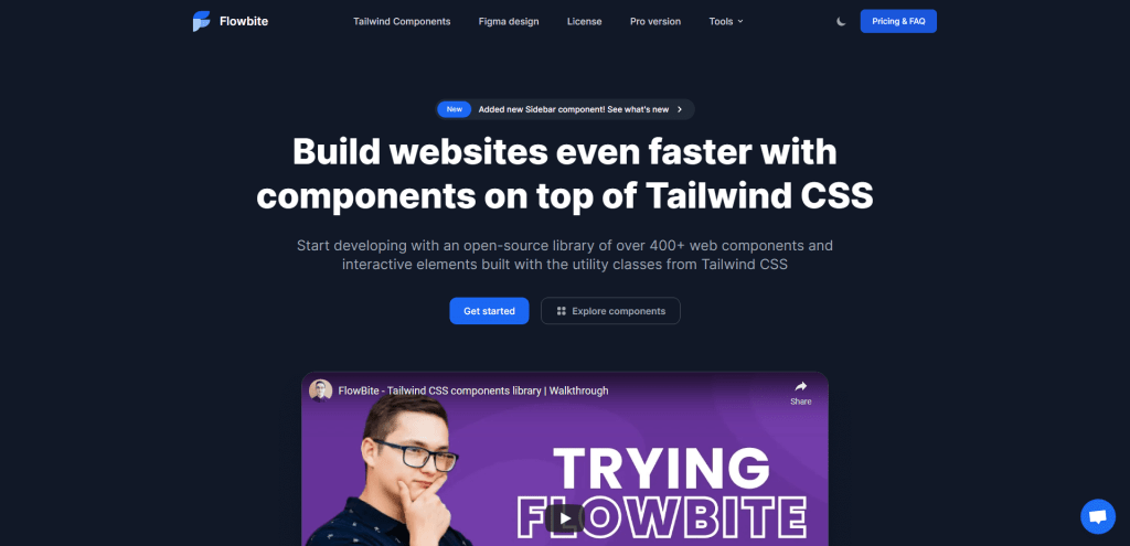
Flowbite has over 450 components; the documentation has component code for HTML with options to install as a library for the most popular frameworks. The project has over 2,800 stars on GitHub and gets around 50,000 weekly downloads on npm.
Flowbite is arguably one of the most complete component libraries for Tailwind. The number of free resources that have been prepared is insane. The library has pre-built support for frameworks like Laravel, React, and Vue.js.
On top of that, you can also grab a copy of the Figma design files. This will ensure that designers can work their magic before sending the mockups to developers.
If you like the component style, consider checking out their Pro plan! In this plan, you unlock full access to their components. And, additionally, get access to all Figma files, Hugo themes, and custom UI components for applications and eCommerce.
Flowbite components are available in raw HTML or as libraries for React, Next.js, Vue, Laravel, Svelte, Rails, Django, and Flask.
Tailwind UI Kit
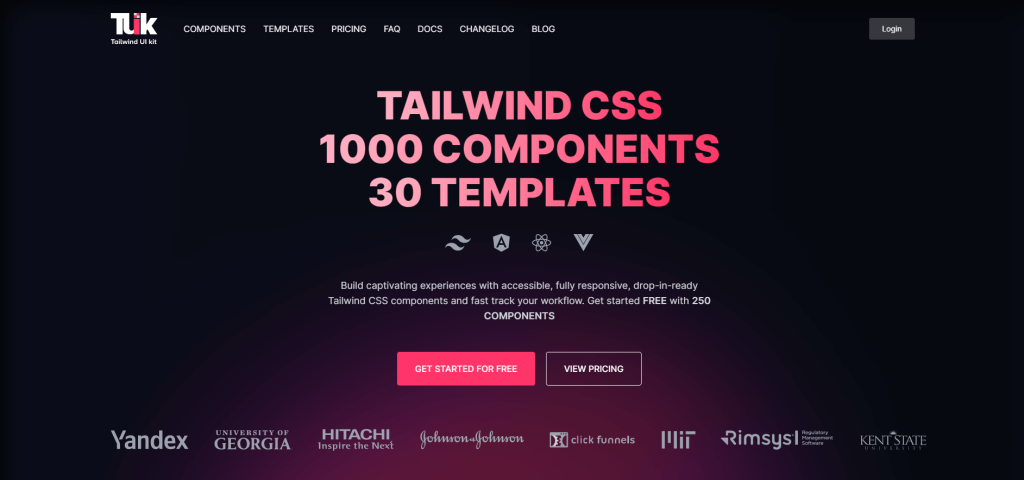
Tailwind UI Kit has over 1,300 components; the documentation has component code for HTML, Vue, Angular, and React.
One of the first things that stand out about TUK is the diversity of elements. The kit is divided into 3 categories: web apps, marketing, and eCommerce. Each category boasts its own component selections tailored to a specific use case.
To get full access, you will need to become a paying customer. However, free users can take TUK for a spin with access to more than 200 freebie components. And that includes everything from layout containers, cards, modals, and much more.
Meraki UI
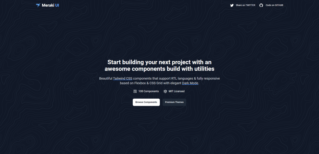
Meraki UI has over 135 components; the documentation has component code for HTML. The project has over 1,500 stars on GitHub.
First impressions are always important, and Meraki UI is as clean as they come. The components in this library are optimized for responsive design and native RTL integration.
For responsiveness, Meraki is using both Grid and Flexbox. The result is a flush selection of interfaces. In total, there are about 20 different element categories. Starting with basics like buttons and cards, but also including a variety of section layouts and pricing models.
Last but not least, this kit is not designed as a library. So, all the components must be imported into your JS framework manually. Still, the design style for this kit is refreshingly clean, and should do wonders to help you bootstrap app previews and more!
Tailblocks
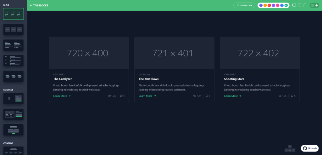
Tailblocks has over 60 components; the documentation has component code for HTML. The project has over 7,500 stars on GitHub.
One of my favorite things about Tailwind CSS is that you can easily copy and paste design snippets. There’s a lot of debate about how “friendly” the syntax is to newcomers. But, I can’t help but appreciate that you can often copy an example component without breaking things. E.g. There is no dependency on complex stylesheets.
And this also sums up the purpose of Tailblocks. It’s a neat component library that gives you the building blocks for scaling a website layout from scratch.
In particular, I love Tailblocks because of how diverse it is in layout presentation. The components (blocks) are designed to have a bit of life to them, so you can immediately use the library to start designing a new layout without worrying about semantic styling.
Tailblocks even goes as far as providing alternative color styles. Which, again, are based entirely on the native Tailwind CSS stylesheet. So, no additional styling is required from you.
HyperUI
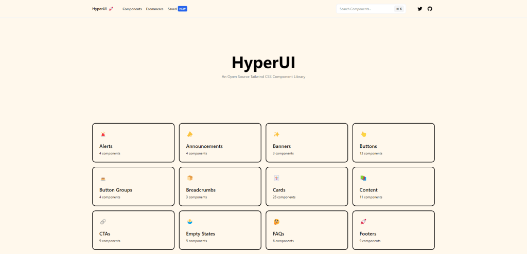
Hyper UI has over 350 components (with hundreds of styles in total); the documentation has component code for HTML. The project has over 3,300 stars on GitHub.
HyperUI is an open-source project provided to the Tailwind community by Mark Mead. It is practically the same exact concept as Tailblocks. You can pick and choose from 30~ different component categories. And, each category includes anywhere from 3 to 10 different styles for the given component.
What I love about HyperUI are the customization options.
Suppose you go to the homepage and select a specific component. You can customize it to narrow down the container size for specific needs. Afterward, view the code, and the snippet is provided to you pre-made. Simple but effective!
Kimia UI
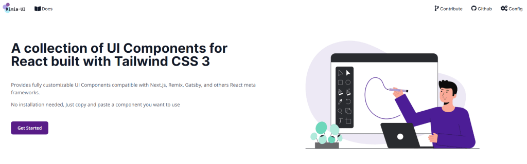
Kimia UI has over 30 components, not including custom themes; the documentation has component code JSX (compatible with Next, React, Remix, and similar frameworks). The project has over 300 stars on GitHub.
Kimia UI is built specifically for React-based frameworks (meta frameworks). As such, each component has a pre-built React module (JSX) which you can import into your project directly.
All in all, it’s a fairly minimal kit. It would have been nice to have it as a separate npm library, or at the very least slightly better docs, but then again – can’t complain about free stuff too much.
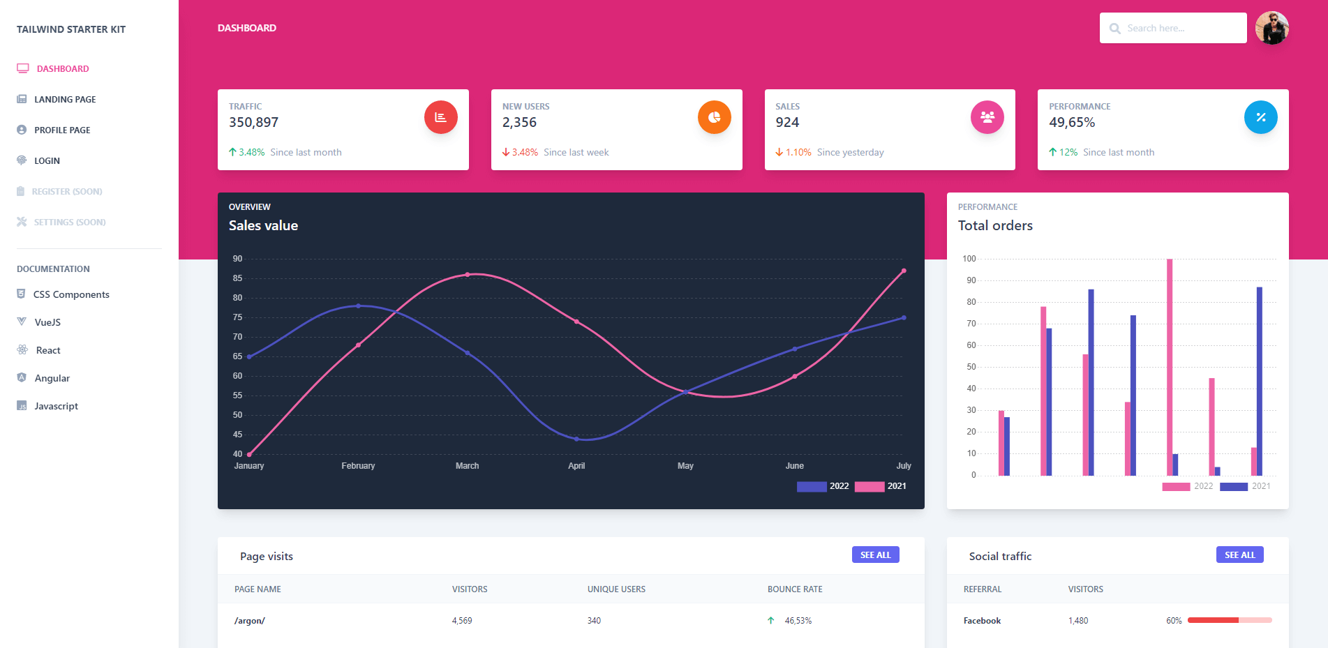
Tailwind Starter Kit
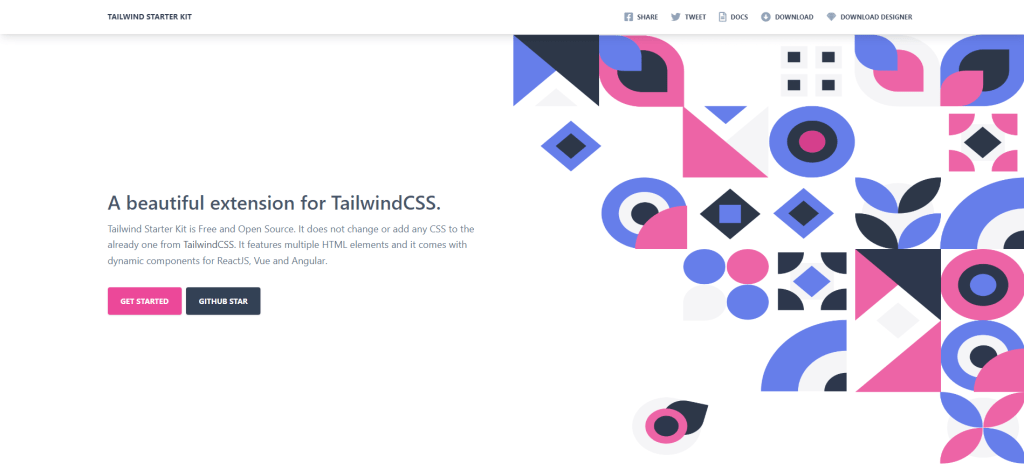
Tailwind Starter Kit has over 120 components; the documentation has component code for HTML, Vue, React, Angular, and vanilla JS. The project has over 5,000 stars on GitHub.
So, remember how I said not to use stylesheet CDN? To give you an idea, this starter kit is more than 40MB in size when uncompressed!
Of course, you would never need to include every single style that’s available. The actual stylesheet size for this kit and its components is 80kb.
You need to set up a Tailwind CSS project to use Tailwind Starter Kit you can also use it for an existing Tailwind CSS project. Tailwind Starter Kit is all based on Tailwind CSS classes, and there is no complex setup for using it you just need to set up a new Tailwind CSS project and then copy/paste the component from Tailwind Starter Kit documentation into your project.
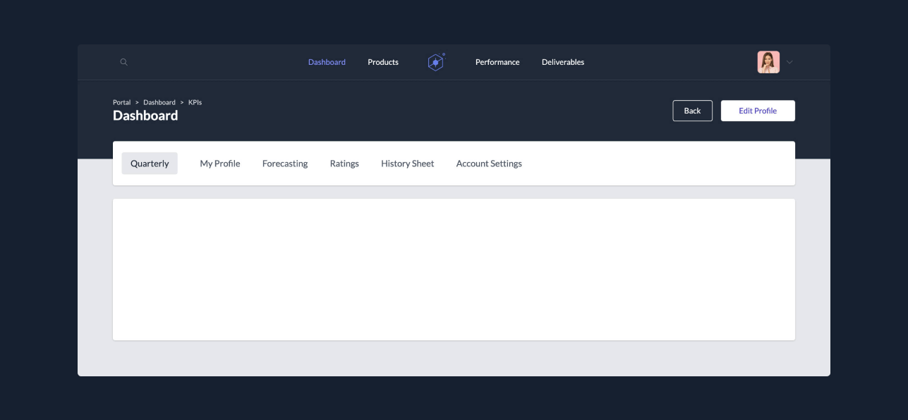
Creative Tim has also prepared a few examples pages for this kit, in categories like Profile, Landing, Dashboard, and Login. The preview shown above should give you an idea o the overall design quality for each component.
Material Tailwind
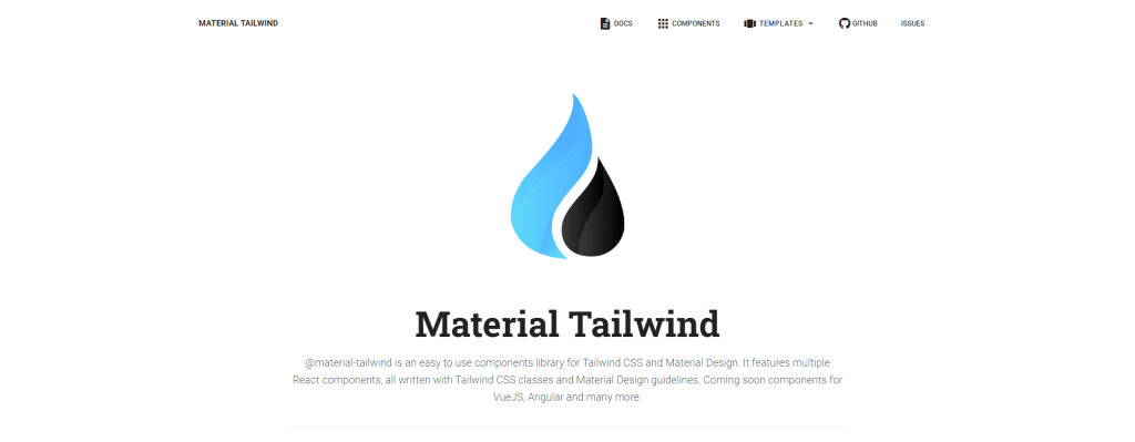
Material Tailwind has over 20 components; the documentation has component code for HTML & React. The project has over 1,200 stars on GitHub and gets around 8,100 weekly downloads on npm.
I can’t think of a single framework that hasn’t eventually adopted the Material Design style guide. And, for Tailwind – we have the team at Creative Tim to thank.
Material Tailwind is exactly that. An implementation of the Material Design based on the Tailwind CSS structure. For the time being, coded components are available for React only. However, the team has stated that more frameworks will follow.
If you want to get a feel for the style flow, take a look at their templates section. It’s a bunch of pre-made sites to showcase how the final design will look.
Konsta UI
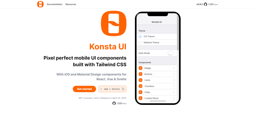
Konsta UI has over 30 components (mobile only!); the documentation has component code for HTML & React. The project has over 1,300 stars on GitHub and gets around 700 weekly downloads on npm.
Frameworks like Tailwind CSS aren’t just useful for web-based projects. If you want to build a mobile application with Tailwind CSS – the Konsta UI library is one to keep an eye on.
It is built to support React, Vue, and Svelte. And is based on the design structure of iOS and a mix of Material Design. Each component has a pre-made code snippet that showcases how it works in the most basic form.
The author of Konsta UI has emphasized that this library would work best to be used alongside Ionic or Framework7. So, in a sense, you can use this library for both hybrid projects, but also Web Native applications.
Preline
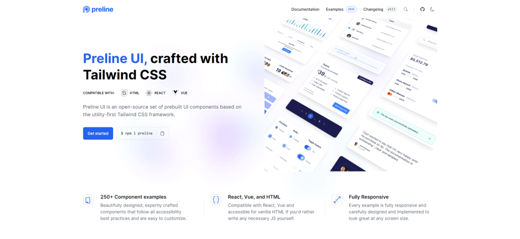
Preline has over 250 components; the documentation has component code for HTML. The project has over 980 stars on GitHub and gets around 2,100 weekly downloads on npm.
Preline UI is a freshly released UI component library on top of Tailwind CSS. It’s unclear whether the promotion was part of the marketing strategy for this library, but I’ve seen it trending on Twitter, and many major publishers also picked up on it. So, let’s dig a little deeper.
The first thing that stands out is the number of components – as more than 200 custom examples are already pre-designed. And, second, the quality of the design is impeccable. Just with the default components (without your own styling), you can easily apply Preline to any project, from personal sites to agency projects.
You’ll also have the option to work with custom Theme files and an integrated Dark Mode structure so that you can design both versions simultaneously.
Tailwind is on the rise
What are the next four years for Tailwind going to look like? We know that v3.0 was released recently. This release brought in improvements for performance, and browser integration, among other new features. Is this only the beginning?
If there is one thing we can learn from this framework is that developers aren’t opposed to learning new systems. Sure, the syntax might take a while to truly master. But, the speed at which you can build a fully functional layout is unprecedented.
And given Tailwind’s popularity, it’s super quick to find useful resources in the context of component libraries and individual design elements. As of March 2023, Tailwind CSS gets over 5.5 million weekly downloads on npm. And that’s just for the base library alone.