

Design systems have undeniably revolutionized the way we approach UI/UX design and development. Whether you’re a designer looking for a coherent visual language, or a developer seeking reusable components, a robust design system is your key to increased efficiency and seamless collaboration.
In this roundup, we will dive deep into an array of top design systems that have significantly impacted the industry. While Material UI and Ant Design might be the first names that come to mind, there are numerous other systems offering unique strengths and capabilities. So, if you’re looking to broaden your toolkit or simply stay updated with the evolving landscape of design systems, this comprehensive list is a must-read. Let’s dive in.
P.S. – I’ve covered many other UI kits and design systems that are specific to frameworks, most notably:
- React Component Libraries
- Tailwind CSS Component Libraries / UI Kits
- Vue Component Libraries / UI Kits
Polaris
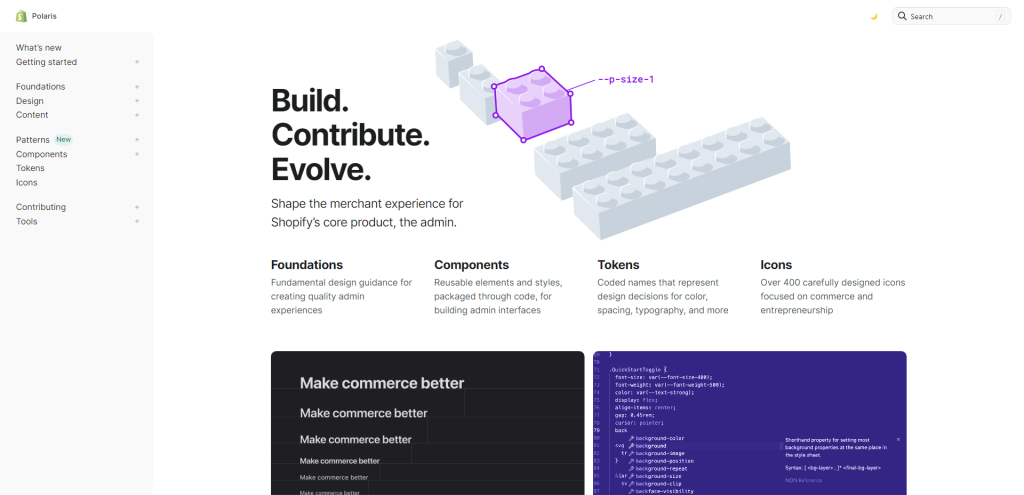
Polaris includes essential design guidance, code libraries, development opinions, and API documentation that guide the creation of high-quality merchant experiences. It offers many benefits to both internal stakeholders within Shopify as well as externally to app developers and designers.
Using Polaris, you can create reusable admin elements and styles, packaged through code, as well as utilize coded tokens to represent design decisions, such as color, spacing, typography, among others. Furthermore, the system includes over 400 carefully designed icons focussed on commerce and entrepreneurship.
Pluralsight
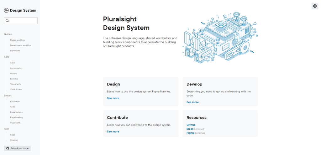
The Pluralsight Design System is a cohesive design language with shared vocabulary and building block components to accelerate the building of Pluralsight products. It provides resources for designers, developers, and contributors to learn how to use the design system Figma libraries, get up and running with the code, and contribute to the design system.
Pluralsight also offers a course on UX Design Systems where you can learn about the importance of design systems and style guides, creating a cohesive design system and documentation, and managing the design system for different teams and contexts.
Elastic UI
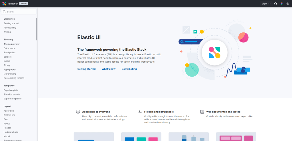
Elastic UI (EUI) is a design library that provides UI React components and static assets to build web layouts with brand consistency while meeting a wide array of contexts’ needs. The framework is accessible to everyone and strives to meet WCAG 2.1 guidelines on semantics, keyboard functionality, and color contrast. It offers high contrast, color-blind safe palettes, and has been tested on most assistive technology.
EUI is flexible and configurable and its code is friendly to the novice and expert alike. The framework provides components for buttons, cards that make repeatable content more presentable, charts, flexible layouts using flex groups, grids and items, forms such as input tags, layouts, and validation, an SVG icon library, pages that help layout entire application pages, tables from individual components or high-level wrappers, simple HTML text like paragraphs and lists, all wrapped in a single text component for styling.
Radix UI
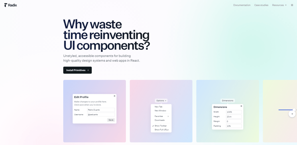
Radix Primitives is a great resource to build high-quality design systems and web apps in React. With Radix components, you will save time and money, so you can ship a better product faster. It is no secret that user interfaces are hard to build, especially when accessibility details and complex logic are considered.
To address this, Radix Primitives offers robust and fully-typed UI components with accessibility out of the box, allowing you to focus on your unique engineering challenges and ship faster. The API is well-thought-out, and all components share a similar structure that ensures a consistent and predictable experience. The components are also fully unstyled, granularly composable, and customizable, making them a great fit for any project.
Thumbprint
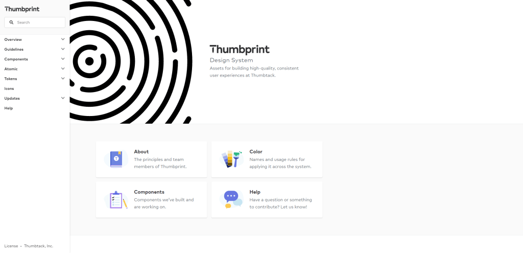
If you’re looking for a way to streamline your design and development process, Thumbprint might be just what you need. It’s a living design system that provides a standardized process for building high-quality, consistent user experiences at Thumbtack. By reducing decision-making friction, it frees teams to focus on higher-order problems while increasing quality and consistency for Thumbtack’s customers.
The main principles behind Thumbprint are as follows. First, build with a consistent process. Use toolkits to identify, prioritize, and scope work, considering stakeholder feedback, accessibility requirements, and future use cases. Second, communicate and document everything. Clear references and dependable tools are critical to success. This is achieved by creating a shared language, responding quickly to questions, communicating changes, and refining documentation. Third, encourage collaboration and feedback. Contributions and constructive criticism establish trust with teams and promote the system as a shared resource with a transparent process.
One key aspect of Thumbprint is accessibility. Building for the widest audience possible means considering concepts beyond just small font sizes. For example, designers and developers must keep target sizes for buttons and other interactive elements large enough to use efficiently. Additionally, by using semantic HTML elements and important attributes where appropriate, Thumbprint enables alternative ways to navigate content and provides notes in documentation to alert developers to potential issues.
GitHub Primer
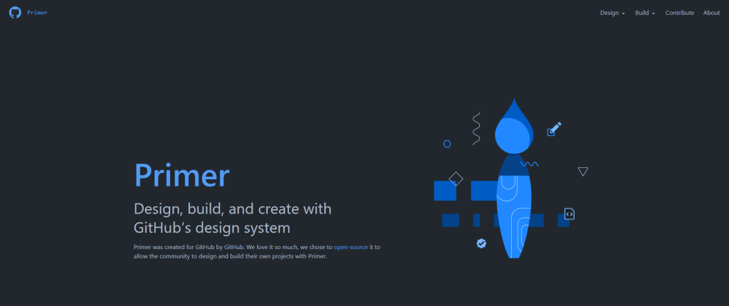
Created and maintained by GitHub’s Design Infrastructure and Design Engineering teams, Primer is an open-source collection of principles, standards, and recommendations for designing GitHub. It provides a cohesive experience for millions of people who use GitHub every day, regardless of their physical or cognitive abilities, devices, or internet connections.
Primer offers a CSS framework, React components, ViewComponents, and Figma components, all of which provide building blocks for any web project. It also places great importance on inclusive and accessible design, with a focus on designing for efficiency.
Making use of familiar patterns and cohesive, accessible, responsive, and efficient design, Primer helps you to streamline the creation of responsive-friendly designs that can be accessed across different device form factors and user preferences. By promoting flow, focus, and an experience that is fast and compact, Primer’s patterns and components provide accessible solutions that don’t dilute efficient UI interactions.
Fluent
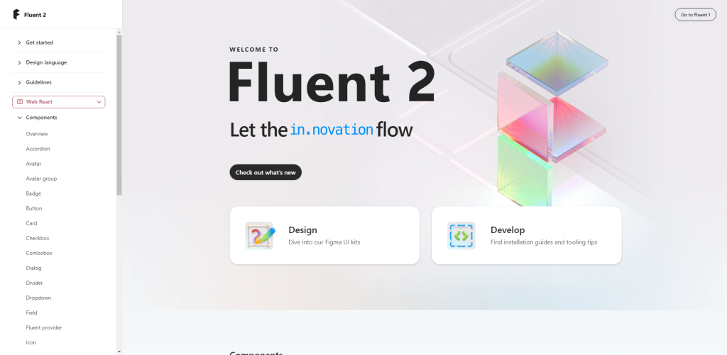
Fluent 2 is the latest evolution of Microsoft’s design system, providing a smooth and hassle-free experience from design to development, across different platforms and apps. With sweeping changes throughout the system, Fluent 2 aims to empower makers at all angles and enhance collaboration. The new features include a cohesive color system, token system, standardized corners, customizability, robust usage guidance, and accessibility notation. Fluent 2’s superpower comes from its ability to adapt to different platforms, ensuring a fluid and natural experience for customers no matter where they are.
Fluent 2 provides designers with a UI kit containing design assets that map to code libraries, built in Figma. The platform-specific UI kit offers styles compatible only with that specific platform. You can enable the UI kits from the Libraries dialog in the Assets panel, and most components are kept close to surface, not nested more than two levels. Also, in Fluent 2 UI kit structures, component properties and variants provide flexibility to optimize component configurations for specific needs, and the properties available in the UI maps to the code.
Evergreen
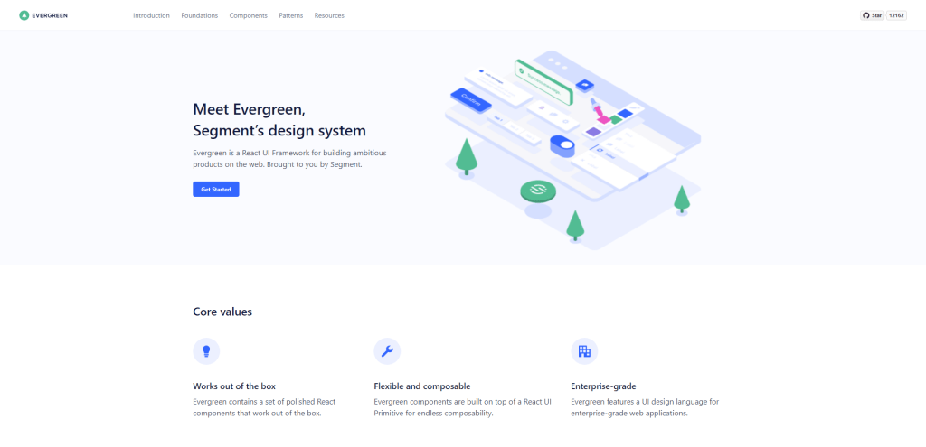
If you are looking for a React UI framework for building ambitious web products, Evergreen could be the answer. Created by Segment, Evergreen encapsulates a set of ready-to-use polished React components. It is also highly flexible and composable, thanks to its React UI Primitive. This feature makes it great for building many variations of UI and gives developers endless options for customization.
Evergreen also promotes a UI design language for enterprise-grade web applications, featuring a set of principles that guide its decision-making, such as flexibility, sensible defaults, and a contributor-friendly approach. Additionally, Evergreen includes a variety of components like Buttons, Badges, and Alerts and patterns such as Empty States, Table Layout, and Error Messages.
Atlassian
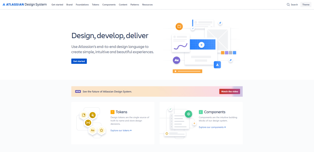
Atlassian’s Design System offers a comprehensive guide to designing simple, intuitive, and beautiful experiences using the end-to-end design language. The system is composed of several parts, including Foundations, Tokens, Components, Content, and Patterns, each with a specific function.
Atlassian’s Design System also offers a collection of tools, kits, plugins, and guides to help simplify the creation process for users, including Figma tooling, Fonts, Illustration library, Logo library, and Presentation kit. Atlassian’s mission is to unleash the potential of every team, and the promise is that their tools and practices will help teams work together in an agile, open, and scalable way.
Ant Design
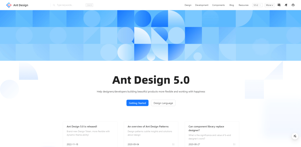
Ant Design is a comprehensive design system that empowers designers and developers to create beautiful, flexible products with ease and efficiency. The latest (5.0) version was released in November 18, 2022; this update brings in a host of new features, including a brand-new Design Token and enhanced dynamic theme capabilities.
The platform offers a broad range of practical components, tailored to fit diverse project requirements. With its extendable algorithm, customizing themes becomes more manageable, giving you control over elements such as primary colors and border-radius to shape your application’s look and feel.
By incorporating CSS-in-JS, Ant Design allows dynamic and mixed theme variations while maintaining optimal application performance. It also provides quick application guides for newcomers, ensuring a seamless onboarding experience.
In addition, Ant Design supports a rich ecosystem that enables rapid website application building. The platform boasts an array of design resources, including global styles, design patterns, and component libraries. Compatibility with React, Angular, and Vue further cements Ant Design’s versatility.
Material Design
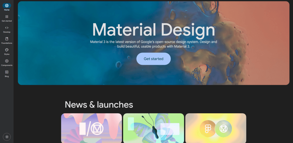
Material 3 is the latest iteration of Google’s open-source design system, providing tools and guidelines to streamline collaboration between designers and developers, while facilitating the creation of beautiful and functional products. It supports various platforms, including Android, Flutter, and the Web, while offering comprehensive UX guidance and UI component implementations.
The Material 3 update brings new features such as dynamic color, enhanced accessibility, large screen layouts, and design tokens, ultimately enabling more personal, adaptive, and expressive experiences. A noteworthy addition is the Material Theme Builder, which assists in migration or implementation of the M3 color system and dynamic color.
The design system offers resources like the Material blog, Figma design kit, starter guides, videos, and tools to help users design and develop with Material. Up-to-date component guidance and accessibility standards contribute to the system’s inclusive and foundationally accessible design approach.
Accessibility is a key aspect of Material Design, with principles for accessible design aimed at meeting the diverse needs of individuals with various abilities and life experiences. Material encourages consideration of customizable features, investment in research to understand user needs, and viewing accessibility requirements as a creative opportunity to improve human interaction with technology.
Pajamas
The Pajamas design system is GitLab’s comprehensive and up-to-date design language aimed at aiding contribution to the GitLab software. Built with multiple technologies, the system includes resources, components, and guidelines, which help ensure a single source of truth for everything associated with GitLab’s design. It encourages everyone to contribute through issue creation/discussions, component documentation, designs, and/or code, following GitLab’s philosophy of “everyone can contribute.”
The design system is regularly updated to support new UI components while deprecating outdated ones, thus ensuring consistency throughout the product. It provides voice and tone guidance for the UI that aligns with GitLab’s brand standards, accessibility guidelines, and developer and designer resources. In addition, Pajamas has a clear component lifecycle to submit new designs, propose changes to existing designs, and translate component designs into built components.
Carbon
Carbon is an open-source design system developed by IBM to enable faster and more consistent digital experiences. It consists of pre-built, reusable assets such as components, patterns, guidance, and code. Carbon users can customize their products to meet specific client use cases without wasting time building basic elements. The system is inspired by the element of carbon in nature, where it builds complex structures from simpler compounds.
In addition to being modular and flexible, Carbon is designed and built to be accessible to all and based on extensive research into users’ needs and desires. It maintains design kits in Figma and supports multiple code implementations such as React, Web Components, Angular, and Vue.
Clarity Design
The Clarity Design System from VMware is a reliable and comprehensive design system. It includes UX guidelines, an HTML/CSS framework, and Angular components that work together to help developers quickly and efficiently move from prototype to production. Its open-source framework allows developers worldwide to build on top of it for free. The product-based design system supports rapid development and is known for its technical depth and reliability.
One of Clarity’s strengths is its data-bound and performant Angular components that can add interactivity to any application. It also comes equipped with a CSS framework, themes, UI components, and a Sketch Template, contributing to its growing popularity and adoption rate.
Clarity Design System offers an extensive range of tools and services to aid in developing web applications, such as accessible design guidelines, documentation website, code documentation, and brand guidelines.
Summary
So, there you have it – our journey through this handpicked list of design systems. These resources are like treasure chests for modern UI/UX designers, filled with tools, ideas, and inspiration.
As we come to the end of this adventure, remember that the design world is a dynamic and exciting place. The design systems featured here are just the tip of the iceberg. There’s a whole universe of creativity out there waiting to be explored.
Whether you’re a seasoned pro or just starting on your design path, these systems are your companions in crafting outstanding user experiences. So, go ahead, dive in, and let your creativity flow. The future of design is in your hands, and it’s full of endless opportunities.